In Part 1 I did some exploratory data analysis on the World Happiness Report data for Chapter 2 of the 2023 edition.
That post got me thinking a bit about being more deliberate about my own initial workflow. Some people have project templates, but I mostly just need a starter script template. So I added some lines to my template script to really ingrain the habit of using those packages for the EDA phase. It’s below…feel free to borrow and of course modify to work
code for my r script template
### template for r analysis work. save as w/ appropriate name to project directorylibrary(tidyverse) # to do tidyverse thingslibrary(tidylog) # to get a log of what's happening to the datalibrary(janitor) # tools for data cleaning# EDA toolslibrary(DataExplorer)library(explore)library(skimr)# some custom functionssource("~/Data/r/basic functions.R")# sets theme as default for all plotstheme_set(theme_light)## ggplot helpers - load if necessarylibrary(patchwork) # to stitch together plotslibrary(ggtext) # helper functions for ggplot textlibrary(ggrepel) # helper functions for ggplot text### load data### clean data, redo as necesary after running basic EDA### EDA with DataExplorer, explore, skimr## DataExplorer summary of completes, missingseda1 <-introduce(DATA)view(eda1)## explorer summarywhr23_fig2_1 %>%describe_tbl()## skimr summaryDATA %>%select() %>%skim()## go back and clean if issues seen here #### dataexplorer plotsplot_bar(DATA)plot_histogram(DATA, nrow =5L)## dataexplorer correlationsDATA %>%select(or deselect as needed) %>%filter(!is.na(if needed)) %>%plot_correlation(maxcat =5L, type ="continuous", geom_text_args =list("size"=4))## dataexplorer scatterplotsplot_scatterplot( DATA %>%select(), by ="choose target for y axis", nrow =3L)## explorer shiny appexplore(DATA %>%select())### continue with deeper analysis here or start new r script
Recap of 1st EDA post
But let’s get back to examining what makes people happy. By way of a quick recap:
Data for Chapter 2 are made available every year, and include a 3-year rolling average of the ladder happiness score aggregated by country, other questions from the poll, and logged GDP for the country.
The EDA in part 1 showed:
There are not many missing values in the data.
All of the component variables except generosity have strong positive correlations with the happiness score.
Perception of corruption has, as expected, a negative association with happiness.
But…I spaced on adding one varaible to the dataset, the GINI index, which measures “the extent to which the distribution of income (or, in some cases, consumption expenditure) among individuals or households within an economy deviates from a perfectly equal distribution….a Gini index of 0 represents perfect equality, while an index of 100 implies perfect inequality.” (from the World Bank GINI data page, click the Details tab)
It was referenced in the statistical appendix but was not included in the dataset made available. The Chapter 2 authors used two GINI values:
a GINI of household income as reported to the Gallup survey and imputed via a STATA function, and
the World Bank’s GINI value, taken as the mean of GINI values from 2000 to 2022 to account for the spotty nature of by-country GINI values.
We can’t do the Gallup & STATA generated GINI because we can’t get the data and I don’t have STATA. So we’ll get the World Bank values, and add that into the data already created. Then we’ll do some more EDA looking at how GINI relates to variables in the set. I was going to do some more in-depth analysis in this post, but I want to keep posts short and focused. So analysis will be in a separate post.
We’ll start by loading the packages we’ll use here, as well as the WHR data we already created.
code for loading packages and WHR data
library(tidyverse) # to do tidyverse thingslibrary(tidylog) # to get a log of what's happening to the datalibrary(janitor) # tools for data cleaning# functions I use often enough to load them regularly...should probably write a personal packagesource("~/Data/r/basic functions.R")# load data whr23_fig2_1a <-readRDS(file ="~/Data/r/World Happiness Report/data/whr23_fig2_1.rds") %>%filter(!is.na(ladder_score))
Adding GINI
To get the GINI values you can go to the World Bank’s GINI page and downloaded the latest spreadsheet, or…
I’ll create a GINI average as per the WHR authors and I’ll also extract the latest GINI value from the set. I’m not sure right now which is ultimately the best to use, but that’s what a bit more EDA is for.
code for loading GINI values
# using the "extra = TRUE" option pulls in capital city & latitude longitude, # region, and World Bank income & lending indicators. We won't use them in this analysis but it's# worth knowing they're there.ginis = WDI::WDI(indicator='SI.POV.GINI', start=2000, end=2023, extra =TRUE) %>%as_tibble() %>%select(-status, -lastupdated) %>%# fix missing regions mutate(region =case_when(country =="Czechia"~"Europe & Central Asia", country =="Viet Nam"~"East Asia & Pacific",TRUE~ region)) %>%# remove aggregated regions filter(region !="Aggregates")%>%arrange(country, year) %>%rename(gini = SI.POV.GINI) %>%# create the latest and average columnsmutate(ginifill = gini) %>%group_by(country) %>%mutate(gini_avg =mean(gini, na.rm =TRUE)) %>%fill(ginifill, .direction ="downup") %>%ungroup() %>%filter(year ==2022) %>%mutate(gini_latest =ifelse(is.na(gini), ginifill, gini)) %>%select(country:gini, gini_latest, ginifill, gini_avg, everything()) %>%rename(country_name = country) %>%# clean up some country names to match with WHR datamutate(country_name =case_when(country_name =="Czechia"~"Czech Republic", country_name =="Congo, Dem. Rep."~"Congo (Kinshasa)", country_name =="Congo, Rep."~"Congo (Brazzaville)", country_name =="Cote d'Ivoire"~"Ivory Coast", country_name =="Egypt, Arab Rep."~"Egypt", country_name =="Eswatini"~"Swaziland", country_name =="Gambia, The"~"Gambia", country_name =="Hong Kong SAR, China"~"Hong Kong S.A.R. of China", country_name =="Iran, Islamic Rep."~"Iran", country_name =="Korea, Rep."~"South Korea", country_name =="Kyrgyz Republic"~"Kyrgyzstan", country_name =="Lao PDR"~"Laos", country_name =="Russian Federation"~"Russia", country_name =="Slovak Republic"~"Slovakia", country_name =="Turkiye"~"Turkey", country_name =="Venezuela, RB"~"Venezuela", country_name =="Viet Nam"~"Vietnam", country_name =="West Bank and Gaza"~"Palestinian Territories", country_name =="Yemen, Rep."~"Yemen",TRUE~ country_name))
I had hoped to pull in a few other indicators to add to the model. The main one I wanted was literacy. Unfortunately there were too many missing values in the UNESCO set…most European countries and a few other key countries. I then thought about public expenditure on education but was worried about colinearity with the GINI index (no, I didn’t test it). So we’ll stick with what we have and not cloud up the model and other analysis with too many exogenous variables. If this were a
So let’s add the GINI numbers to the WHR data we already have…
code for joining GINI to WHR data
whr23_fig2_1 <- whr23_fig2_1a %>%merge(ginis, all =TRUE) %>%as_tibble() %>%select(country_name, iso3c, region, region_whr, whr_year:lowerwhisker, logged_gdp_per_capita, gini_avg, gini_latest, everything()) %>%## fill in Taiwan, no longer in this set but still available ### at https://pip.worldbank.org/country-profiles/TWNmutate(gini_avg =ifelse( country_name =="Taiwan Province of China", 32.09833333, gini_avg)) %>%mutate(gini_latest =ifelse( country_name =="Taiwan Province of China", 31.48, gini_latest)) %>%filter(!is.na(ladder_score))
N.B…yes, I use merge() and not left/right/full_join()…I learned SAS before SQL and old habits die hard (shrug emoji).
N.B.2…Taiwan data is no longer available in most WB sets, either in the spreadsheet or via the API the packages access. It is still at the WB’s Poverty & Inequality Platform so I downloaded what I could and hard-coded. Why? Because I’m a little OCD when it comes to trying to minimize missing data.
Redo the EDA
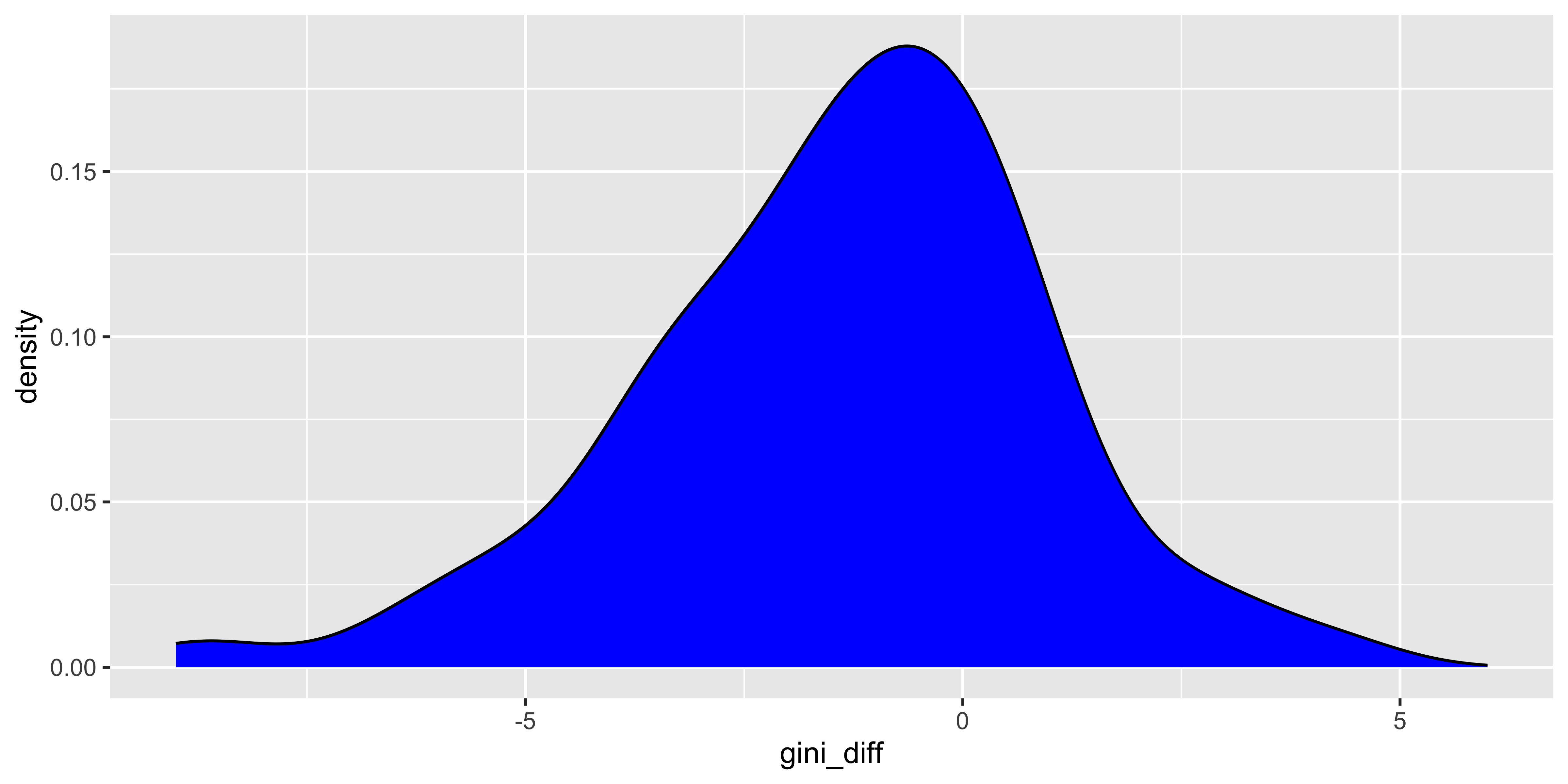
Anyway…now we have to do some quick EDA on the GINI values in relation to the data we have. First I want to take a quick look at the by-country difference between the latest GINI value and the mean value for the period since 2000. We subtract the average from the latest value, do a quick skimr check, a density plot on the latest-average difference…
Quick EDA observations from the skim and denisty plot:
The GINI scale is 0 to 100, and the spread in this WHR set is 24.7 to 62.4, almost exactly as the entire panel from the WB GINI dataset.
The means, medians, standard deviations, and ranges for average and latest are close enough.
The difference (latest - average) looks on the denisty plot to be clustered just below 0, and the median difference is only -1, so we’ll use the average.
We only lose 7 countries from the set by adding GINI.
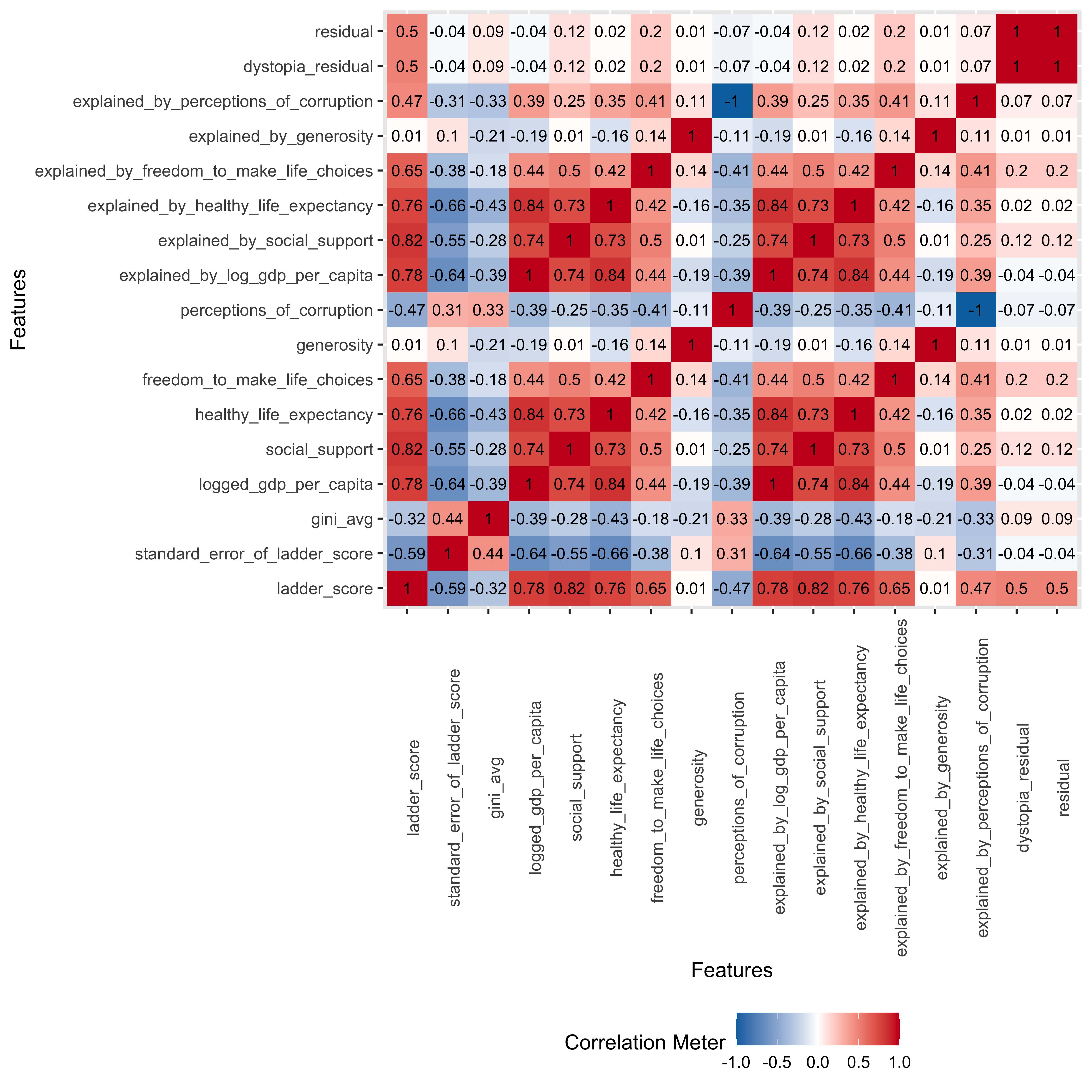
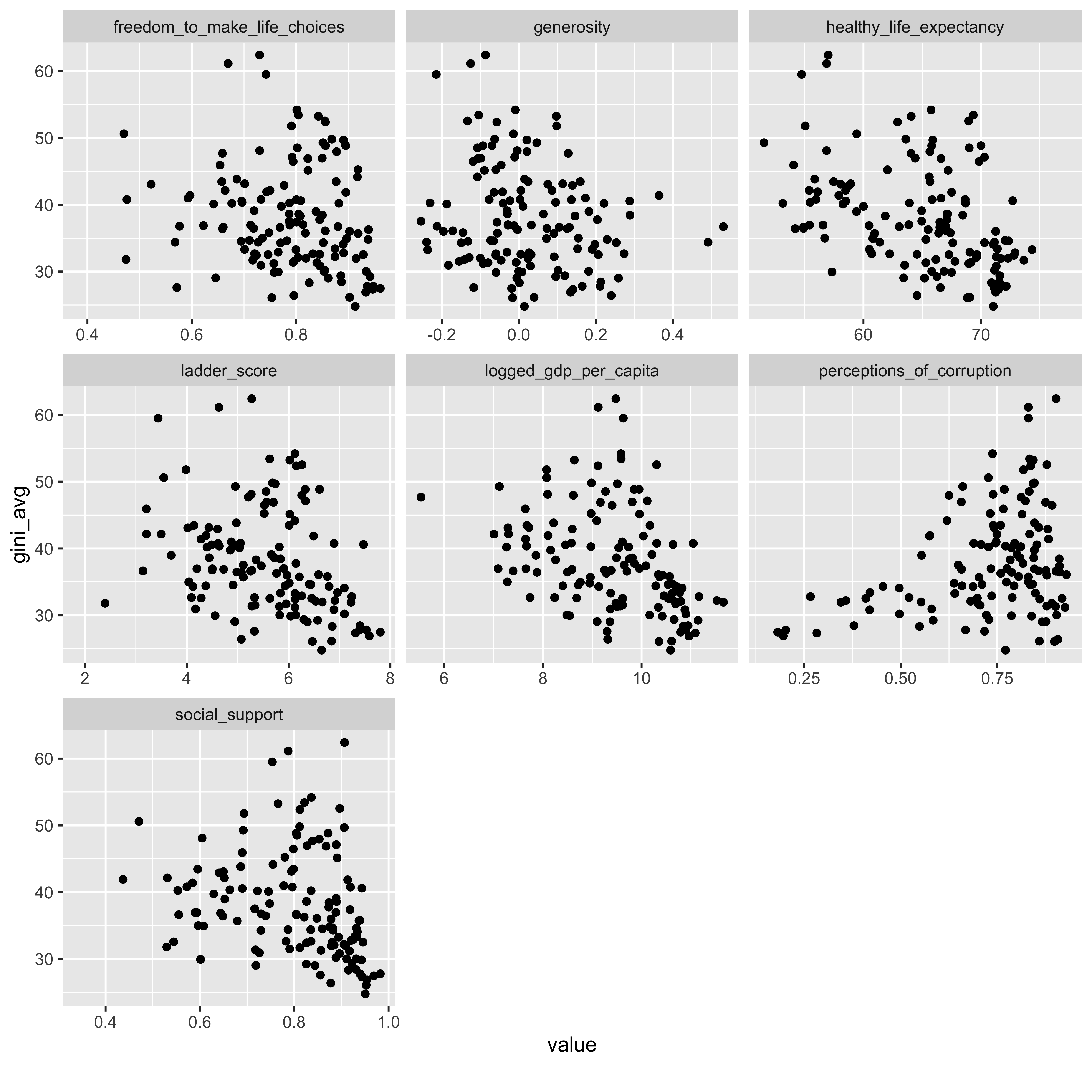
So let’s use the average and see how it relates to our WHR variables by doing first a correlation matrix from the DataExplorer package…
DataExplorer::plot_scatterplot( whr23_fig2_1 %>%select(gini_avg, ladder_score, logged_gdp_per_capita, social_support:perceptions_of_corruption), by ="gini_avg", nrow =3L)
We can see from the correlation matrix and the scatterplots that:
There is a mild but persistent relationship between a lower GINI score (less inequality) and the measures that correlate with more happiness…the happiness ladder score itself, life expectancy, freedom to make choices, etc.
The one negative relationship was with perceptions of corruption - that is, the higher the inequality measure in their country the more likely people answering the survey were to report that they perceived higher levels of corruption.
And interestingly, a lower GINI index correlated to a higher GDP per capita…so maybe it’s better for all to spread the wealth?
That’s it for basic EDA on the data. The next post will dig a bit deeper…look at some differences by region, and I’ll do a quick regression to try and predict happiness score and see how close I can get to the WHR model.