Now with new residual plots and unique days ridden
post
rstats
ggplot
regression
ols
bicycle
denmark
Author
gregers kjerulf dubrow
Published
April 25, 2024
My commute bike
I was pleasantly surprised by the response to the “My Year of Riding Danishly” post. It’s by far the most viewed post, owing in part to being mentioned on the R Weekly podcast. It’s also resulted in some follow-on work. Not bad for being the product of being forced to stay home while recuperating from my bike accident and needing a big project to dive into.
In addition to the podcast mention, I presented the work at the April 23rd Copenhagen R meetup. I put together the slides in Quarto, my first time using it for presentation slides. It took a bit of time figuring out some custom CSS and in-line tags, but I was happy with the result. You can see the html slides and the raw .qmd file on my github repo.
In the process of putting the slides together I decided I wanted to change how I presented the residuals and also to count and plot the number of unique days I rode in 2023. So let’s do that.
First, the new residuals. Originally I plotted actuals vs predicted, so not really showing the residuals. My approach here is to plot the residuals (actual minus predicted) against the actuals to check for heteroscedasticity (variance of errors not constant). The code and results for the regression models are in the original post, so no need to repeat that code here. But I do show the code for the scatterplots and gt tables below
The code for the scatterplots is below, and gt tables to help explain the time and kilojoules residual plots will sit next to the tables. The code for the gt tables is after the graphics.
When you look at the results, remember that a residual is the actual observation minus the predicted observation. Thus a positive residual means the model under-predicted the outcome, and a negative residual means the model over-predicted the outcome.
Also, if you want to see the plots in a bigger image, click on the plot…I have lightbox enabled on the site for easier graphic viewing if desired.
Show code for scatterplot
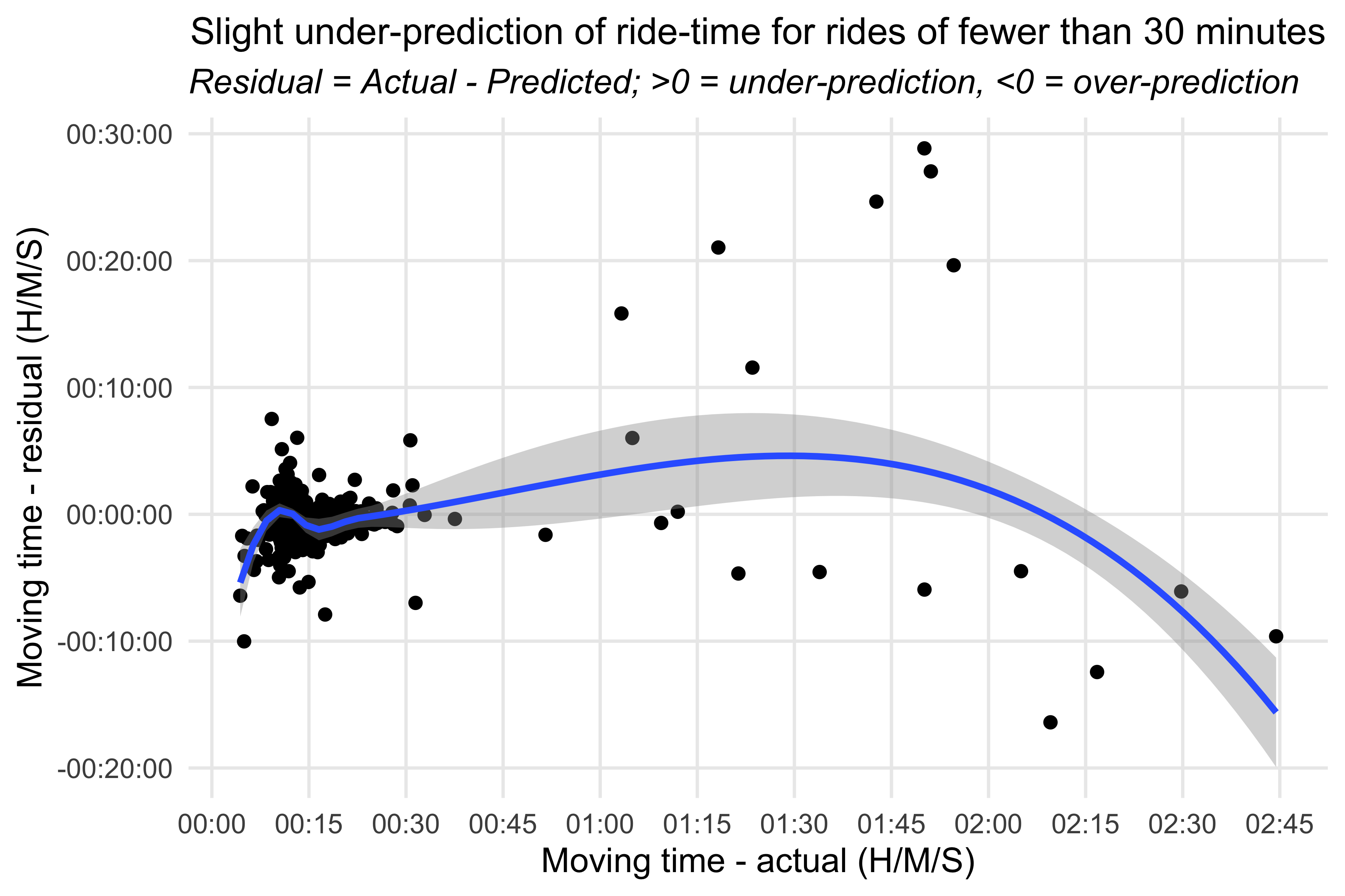
## time modelride_models_time_df %>%ggplot(aes(x=moving_time_hms_dtm, y=moving_time_resid_hms)) +geom_point() +geom_smooth() +scale_x_datetime(breaks = scales::breaks_width("15 min"),labels=scales::date_format("%H:%M")) +labs(title ="Slight under-prediction of ride-time for rides of fewer than 30 minutes",subtitle ="*Residual = Actual - Predicted; >0 = under-prediction, <0 = over-prediction*",x ="Moving time - actual (H/M/S)", y ="Moving time - residual (H/M/S)") +theme_minimal() +theme(panel.grid.minor =element_blank(),plot.title =element_text(hjust =0.5, size =12),plot.subtitle =element_markdown(),axis.text.x =element_markdown()) #> `geom_smooth()` using method = 'loess' and formula = 'y ~ x'
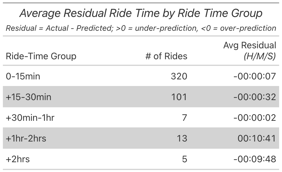
What struck me when looking at the scatterplot was the hitch in the smoothing line at about 10-minute ride length. The model went from over-predicting to almost being eactly equal to the actual. To get a better sense of things I grouped the rides into four buckets and looked at the average residual. For rides under 15 minutes the model was over-predicting by seven seconds, noise essentially. For rides between 15-30 minutes the model was off by 32 seconds. The largest deviance was under-predicting the longer rides, those of 1+ hours.
Show code for scatterplot
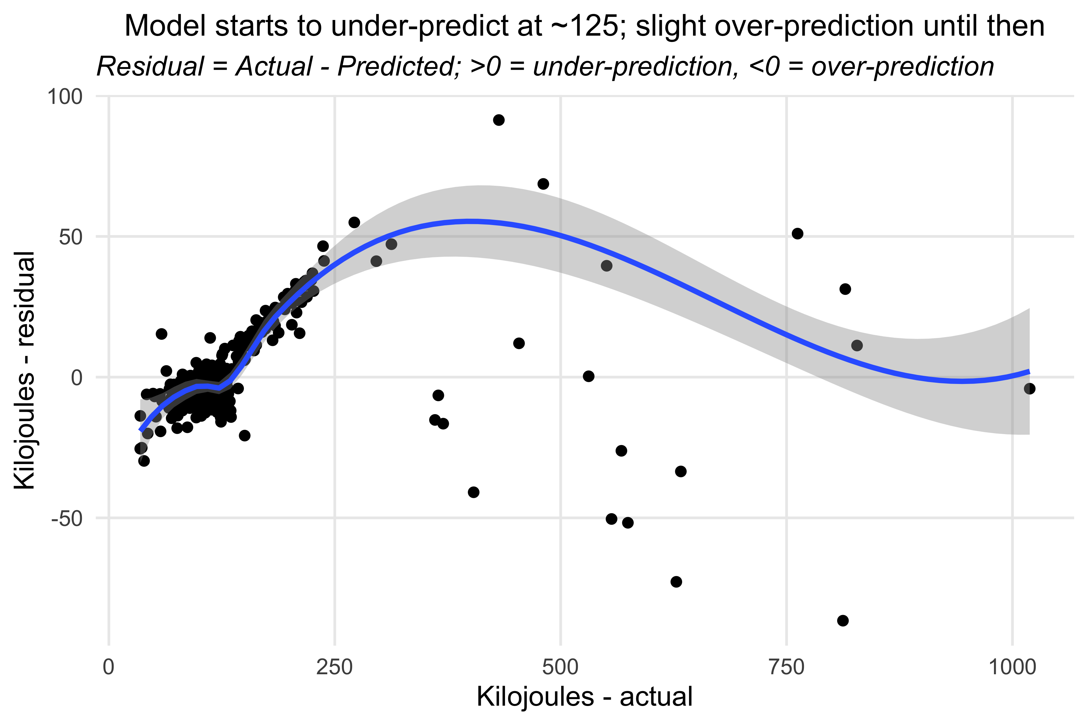
## kilojoules modelride_models_kjoules_df %>%ggplot(aes(x=kilojoules, y=kjoules_resid)) +geom_point() +geom_smooth() +labs(title ="Model starts to under-predict at ~125; slight over-prediction until then",subtitle ="*Residual = Actual - Predicted; >0 = under-prediction, <0 = over-prediction*",x ="Kilojoules - actual", y ="Kilojoules - residual") +theme_minimal() +theme(panel.grid.minor =element_blank(),plot.title =element_text(hjust =0.5, size =12),plot.subtitle =element_markdown(),axis.text.x =element_markdown())#> `geom_smooth()` using method = 'loess' and formula = 'y ~ x'
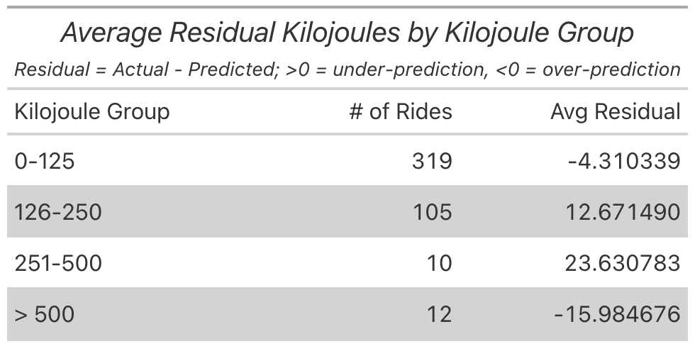
For the kilojoules model there was also a hitch in the smoothing line at around 125 actual kilojoues. So again I put the rides into groups to see where the model was most sensitive. We can see that when I expended under 125 kilojoues the model was minimally over-prediccting. But at 126 to 500 the model under-predicted how much energy I would burn.
Show code for scatterplot
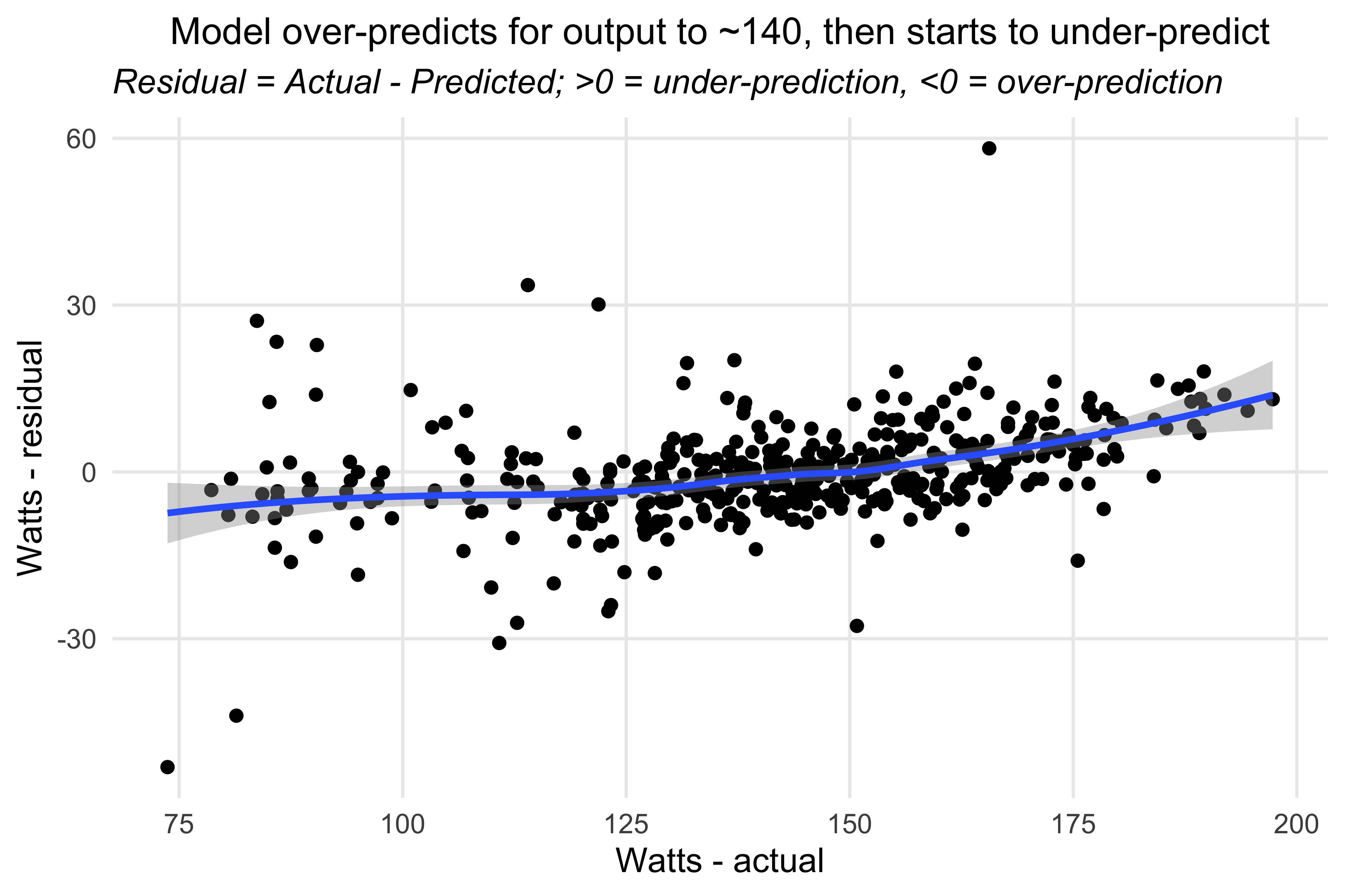
## watts modelride_models_watts_df %>%ggplot(aes(x=average_watts, y=watts_resid)) +geom_point() +geom_smooth() +labs(title ="Model over-predicts for output to ~140, then starts to under-predict",subtitle ="*Residual = Actual - Predicted; >0 = under-prediction, <0 = over-prediction*",x ="Watts - actual", y ="Watts - residual") +theme_minimal() +theme(panel.grid.minor =element_blank(),plot.title =element_text(hjust =0.5, size =12),plot.subtitle =element_markdown(),axis.text.x =element_markdown())#> `geom_smooth()` using method = 'loess' and formula = 'y ~ x'
For the watts model, the smoothing line was fairly, uh, smooth. So no need to dig too deeply. The model seemed to do alright predicting how much power I could generate.
Code for the gt tables is here if you want to see it.
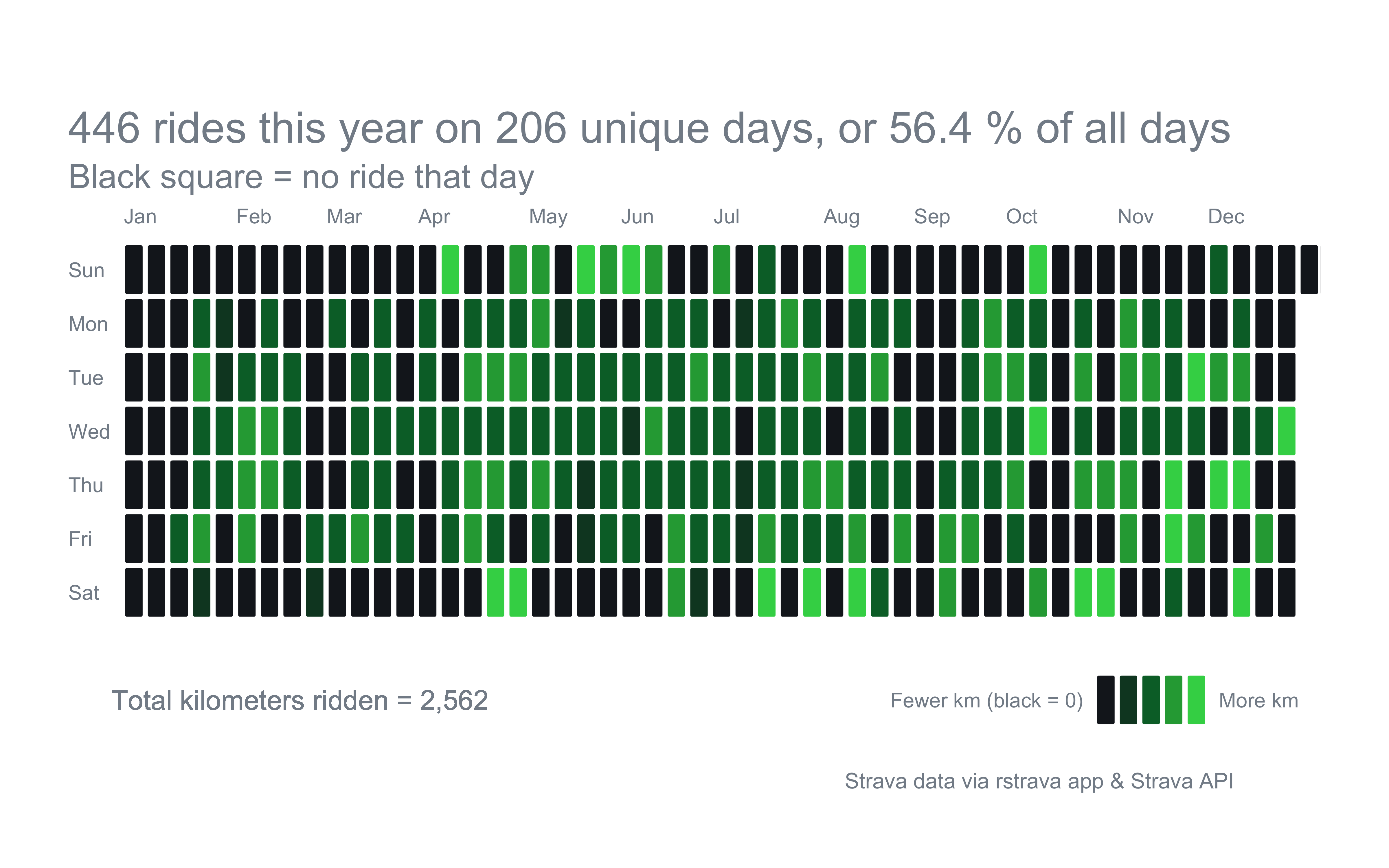
Now let’s look at the number of unique days ridden. I took some inspiration from Ryan Hart’s post that initially clued me into the rstrava app. He did a take on the github profile plot that shows how many days in a 12-month period you pushed commits, with darker coloring for more commits in a day.
I used most of his code, streamlining a few things, like creating fewer dataframes and calling on the main dataframe to populate text and legends.
Show code for setting up the data
# subset the main datasetridedates1 <- strava_data %>%filter(activity_year ==2023) %>%group_by(activity_date_p) %>%mutate(rides_day =n()) %>%ungroup() %>%select(distance_km, year = activity_year, month = activity_month_t, day = activity_wday, date = activity_date_p, rides_day)# create 365 day date scaffold scaffold_df <-data.frame(date =date(seq(from =as.Date("2023-01-01"), to =as.Date("2023-12-31"), by =1)))# join rides with date scaffold to show all days of the year and # add colors for fill based on km / day valueridedates <-full_join(ridedates1, scaffold_df) %>%mutate(distance_km =ifelse(is.na(distance_km), 0, distance_km)) %>%mutate(rides_day =ifelse(is.na(rides_day), 0, rides_day)) %>%group_by(date) %>%mutate(distance_day =sum(distance_km)) %>%distinct(date, .keep_all =TRUE) %>%ungroup() %>%mutate(color =case_when(distance_day ==0~"#171c22", distance_day >0& distance_day <=4.5~"#0E4429", distance_day >4.5& distance_day <=10~"#006D32", distance_day >10& distance_day <=20~"#26A642", distance_day >20~"#39D354")) %>%select(date, distance_day, rides_day, color)# for gridstart_day <-as.Date("2023-01-01")end_day <-as.Date("2023-12-31")# create main set for plotting the griddf_grid <-tibble(date =seq(start_day, end_day, by ="1 day")) %>%mutate(year =year(date),month_abb =month(date, label =TRUE, abbr =TRUE),day =wday(date, label =TRUE),first_day_of_year =floor_date(date, "year"),week_of_year =as.integer((date - first_day_of_year +wday(first_day_of_year) -1) /7) +1) %>%left_join(ridedates) %>%arrange(date) %>%mutate(num =row_number()) %>%mutate(day =as.character(day)) %>%mutate(day =factor(day, levels =c("Sun", "Mon", "Tue", "Wed", "Thu", "Fri", "Sat"))) %>%mutate(distance_year =round(sum(distance_day), 0)) %>%mutate(rides_year =sum(rides_day)) %>%mutate(ride_day =ifelse(rides_day >0, 1, 0)) %>%mutate(ride_days_unique =sum(ride_day)) %>%mutate(pct_days_ridden =round((ride_days_unique /365) *100, 1)) %>%select(-ride_day)df_labels <- df_grid %>%group_by(month_abb) %>%arrange(date) %>%filter(week_of_year ==1| day =="Sun") %>%slice(1)# legend colors and text objects df_legend <-data.frame(y =c(-1, -1, -1, -1, -1),x =c(44, 45, 46, 47, 48),color =c("#171c22", "#0E4429", "#006D32", "#26A642", "#39D354"))df_legend_labels <-data.frame(y =c(-1, -1),x =c(43, 49),label =c("Fewer km (black = 0)", "More km"),hjust =c(1, 0))df_legend <-data.frame(y =c(-1, -1, -1, -1, -1),x =c(44, 45, 46, 47, 48),color =c("#171c22", "#0E4429", "#006D32", "#26A642", "#39D354"))
Now that the data is sorted, let’s make a plot
Show code for scatterplot
ggplot() + statebins:::geom_rtile(data = df_grid,aes(y =fct_rev(day), x = week_of_year, fill = color), radius =unit(1.75, "pt"),color ="white", size =1) + statebins:::geom_rtile(data = df_legend,aes(y = y, x = x, fill = color),radius =unit(1.75, "pt"), color ="#FFFFFF", size =1) +geom_text(data = df_labels, aes(x = week_of_year, y =8, label = month_abb),hjust =0.3, color ="#848d97", size =3, check_overlap =TRUE) +geom_text(data = df_grid, aes(x =-1.9, y = day, label = day),color ="#848d97", size =3, hjust =0, check_overlap =TRUE) +geom_text(data = df_legend_labels, aes(x, y, label = label, hjust = hjust),color ="#848d97", size =3) +geom_text(data = df_grid,aes(x =0, y =-1, label =paste0("Total kilometers ridden = ", scales::comma(distance_year))),color ="#848d97", size =4, hjust =0) +scale_y_discrete(breaks =c("Mon", "Wed", "Fri")) +expand_limits(y =c(-2, 9)) +scale_x_continuous(expand =c(-2, NA)) +scale_fill_identity() +labs(title = glue::glue("{df_grid$rides_year}", " rides this year on {df_grid$ride_days_unique} unique days, or {df_grid$pct_days_ridden} % of all days"),subtitle ="Black square = no ride that day",caption ="Strava data via rstrava app & Strava API") +# coord_equal() +theme_void() +theme(plot.title =element_text(size =18, vjust =-6, color ="#848d97"),plot.title.position ="plot",plot.subtitle =element_text(size =14, vjust =-7, color ="#848d97", margin =margin(t =8, b =10)),plot.caption.position ="plot",plot.caption =element_text(size =9, color ="#848d97", vjust =10,hjust = .9, margin =margin(t =25)),legend.position ="none",plot.margin =unit(c(0.5, 1, 0.5, 1), "cm"),plot.background =element_rect(color =NA, fill ="#FFFFFF"))
There you have it…206 unique days of riding, which is 56% of the year. I won’t come close to matching that this year, but hopefully in 2025, when I’m fully healed.
Possible next steps for the this data could be comparing Denmark and California rides, using the gpx files to create my own maps…who knows. Hope this and the original post were an inpsiration on how to leverage data you create to tell a story.