It’s time again for the 30 Day Chart Challenge, a social-media-driven data viz challenge to create and share a data visualization on any topic, but somehow corresponding to the daily prompt as suggested by the organizers.
I did participate last year, though started late and did not get to every prompt. Like last year I am going to keep all the prompt posts in one mega-post, adding to it regularly. Perhaps not each day, but I will try to get to every prompt. Like last year:
I will post contributions to social media via my Bluesky, and LinkedIn accounts.
I will add contributions to this post, meaning the posting date will refresh to the date I’ve added the chart. So If I get to a lot or even all of them, this will be a long post.
Use the table of contents to the right to navigate to a specific chart.
Images are “lightboxed”, so click on them to enlarge. Click esc or outside the image to restore the page.
One major change is that this year I am going to only pull data from Danmarks Statistik (Statistics Danmark, the national statistics agency) via the danstat package for r. To the extent possible I’ll be focusing on education data. These constraints will help me by not having to figure out which data source to use each day.
It may not be a straight linear narrative and not every post will necessarily connect to the whole. I may not even know exactly what I have until I’m done. I have sketched out ideas for many of the prompts, but things may change as I go along. If the daily prompt just doesn’t lend itself to Danish education data, or Danish data at all, the subject for that chart will be something else.
As with all of my posts, I’m offering a tutorial/how-to as much as I am trying to convey insights from the data. If a topic or approach interests you, hopefully there’s enough explanation in the writing or the code so that you can do something similar or use it to hone your r skills.
Let’s get to the charts.
Prompt #1 - Fractions
The first week of prompts is devoted to comparisons, and the first day is fractions. I cheated a bit and replicated last year’s 1st prompt “Part-to-Whole”. But where last year I looked at educational attainment in the UK, this year it’s Denmark.
I won’t do too much explaining about education levels in Denmark, you can read up on them on the ministry’s page.
We’ll do a horizontal stacked bar chart displaying the highest education attained by Danes aged 25-69 as of 2023, with this population divided into four age groups.
To pull data from danstat, which accesses the Danmarks Statistik API, you have to know at least the table name and number. So it’s necessary to poke around Danmarks Statistik’s StatBank page and figure out which table has the data you need. The value added of the API and package is not having to download and keep flat files.
The table_meta command produces a nested tibble with values for each field in the table. To get the data you first create a list of fields and values (see the varaibles_ed object) then use the get_data command to actually fetch the data.
Show code for getting and cleaning data
library(tidyverse) # to do tidyverse thingslibrary(tidylog) # to get a log of what's happening to the datalibrary(janitor) # tools for data cleaninglibrary(danstat) # package to get Danish statistics via apilibrary(ggtext) # enhancements for text in ggplot# some custom functionssource("~/Data/r/basic functions.R")# metadata for table variables, click thru nested tables to find variables and ids for filterstable_meta <- danstat::get_table_metadata(table_id ="hfudd11", variables_only =TRUE)# create variable list using the ID value in the variablevariables_ed <-list(list(code ="bopomr", values =c("000", "081", "082", "083", "084", "085")),list(code ="hfudd", values =c("H10", "H20", "H30", "H35","H40", "H50", "H60", "H70", "H80", "H90")),list(code ="køn", values =c("TOT")),list(code ="alder", values =c("25-29", "30-34", "35-39", "40-44", "45-49","50-54", "55-59", "60-64", "65-69")),list(code ="tid", values =2023))# past variable list along with table name.# note that in package, table name is lower case, though upper case on statbank page.edattain1 <-get_data("hfudd11", variables_ed, language ="da") %>%as_tibble() %>%select(region = BOPOMR, age = ALDER, edlevel = HFUDD, n = INDHOLD)# arrange data for chart# collapse age and education levels into groupsedattain <- edattain1 %>%mutate(age_group =case_when(age %in%c("25-29 år", "30-34 år", "35-39 år") ~"25-39", age %in%c("40-44 år","45-49 år") ~"40-49", age %in%c("50-54 år","55-59 år") ~"50-59", age %in%c("60-64 år","65-69 år") ~"60-69")) %>%mutate(ed_group =case_when(edlevel =="H10 Grundskole"~"Grundskole/Primary", edlevel %in%c("H20 Gymnasiale uddannelser","H30 Erhvervsfaglige uddannelser","H35 Adgangsgivende uddannelsesforløb") ~"Secondary", edlevel =="H40 Korte videregående uddannelser, KVU"~"Tertiary - 2yr", edlevel %in%c("H50 Mellemlange videregående uddannelser, MVU","H60 Bacheloruddannelser, BACH") ~"Tertiary - Bachelor", edlevel =="H70 Lange videregående uddannelser, LVU"~"Tertiary - Masters", edlevel =="H80 Ph.d. og forskeruddannelser"~"Tertiary - PhD", edlevel =="H90 Uoplyst mv."~"Not stated")) %>%group_by(region, age_group, ed_group) %>%mutate(n2 =sum(n)) %>%ungroup() %>%select(-n, -age) %>%distinct(region, age_group, ed_group, .keep_all = T) %>%rename(n = n2) %>%mutate(ed_group =factor(ed_group,levels =c("Grundskole/Primary", "Secondary", "Tertiary - 2yr","Tertiary - Bachelor", "Tertiary - Masters", "Tertiary - PhD", "Not stated")))
Now that we have a nice tidy tibble, let’s make a chart. The approach is fairly straight-forward ggplot. I used tricks like fct_rev to order the age groups on the chart, and the scales and ggtext packages to make things look nicer.
Show code for making the chart
## chart - all DK, horizontal bar age groups, percent stacks percent by deg leveledattain %>%filter(region =="Hele landet") %>%group_by(age_group) %>%mutate(age_total =sum(n)) %>%mutate(age_pct =round(n/age_total, 2)) %>%select(age_group, ed_group, age_pct) %>%# the line below passes temporary changes to the data object through to the chart commands {. ->> tmp} %>%ggplot(aes(age_pct, fct_rev(age_group), fill =fct_rev(ed_group))) +geom_bar(stat ="identity") +scale_x_continuous(expand =c(0,0),breaks =c(0, 0.25, 0.50, 0.75, 1),labels =c("0", "25%", "50%", "75%", "100%")) +geom_text(data =subset(tmp, age_pct >0.025),aes(label = scales::percent(round(age_pct , 2))),position =position_stack(vjust =0.5),color="white", vjust =0.5, size =12) +scale_fill_brewer(palette ="Set3") +labs(title ="Danes under 40 have a higher rate of post-Bachelor educational attainment than other age groups",subtitle ="Highest education level attained by age groups",caption ="*Data from Danmarks Statistik via danstat package*",x ="", y ="Age Group") +theme_minimal() +theme(legend.position ="bottom", legend.spacing.x =unit(0, 'cm'),legend.key.width =unit(4, 'cm'), legend.margin=margin(-10, 0, 0, 0),legend.text =element_text(size =12), legend.title =element_text(size =16),plot.title =element_text(hjust = .5, size =20),plot.subtitle =element_text(size =16),plot.caption =element_markdown(size =12, face ="italic"),axis.text.x =element_text(size =14),axis.text.y =element_text(size =14),panel.grid.major =element_blank(), panel.grid.minor =element_blank()) +guides(fill =guide_legend(label.position ="bottom", reverse =TRUE, direction ="horizontal", nrow =1, title ="Highest Educational Attainment", title.position ="top")) rm(tmp)
As you might expect, younger Danes tend to have higher levels of educational attainment than Danes over 60. That’s not uncommmon in countries with post-secondary education policies designed to increase access and attainment. As in the US this is a post-WWII development, though accelerated in the 1960s and after.
It’s been successful public policy in Denmark for many decades to increase access to schooling beyond the Grundskole (primary years…to about grade 9 in a US context). More than 45% of Danes between 25-40 have at least a Bachelor’s degree, and 20% have a Master’s. There would of course be more nuance in disaggregated age groups, but I wanted to keep this first story a bit more simple.
created and posted March 24, 2025
Prompt #2 - Slope
Building on what we saw in Prompt 1 for educational attainment by age group in 2023, let’s use the slope prompt to compare 2023 to 2005, the furthest back we can get educational attainment by age statistics via Danmarks Statistik’s StatBank.
The process for getting data is more or less the same as in Prompt 1, so I won’t repeat the code here. The only thing I did differently was collapse the 2-year and Bachelor’s degrees into one “college” category and collapsed Master’s and PhD into one post-bacc group.
For this chart I want to see if there are differences in highest educational attainment level by age group in two distinct years. Instead of one chart with too many lines, essentially a spaghetti graph, I made four charts and used the patchwork package (created by a Dane!) to facet out the individual charts into a (hopefully) coherent whole.
Keep in mind that while of course many people will be represented in both 2005 and 2023, this is not a longitudinal study. It’s a snapshot of the Danish population by age groups at two distinct points in time.
We have the data, and it’s time to build the charts. But instead of copy-pasting the ggplot code to build each charts, let’s create a function and use that four times.
Show code for the chart function
# plotdf is the placeholder name in the function for the data you pass to run itslope_graph <-function(plotdf) { plotdf %>%ggplot(aes(x = year, y = age_ed_pct, group = age_group, color = age_group)) +geom_line(size =1) +geom_point(size = .2) +scale_x_continuous(breaks =c(2005, 2023),labels =c("2005", "2023")) +scale_y_continuous(limits =c(0, .5),labels = scales::label_percent()) +scale_color_brewer(palette ="Set2") +labs(x ="", y ="") +theme_minimal() +theme(legend.position ="bottom", legend.spacing.x =unit(0, 'cm'),legend.key.width =unit(3, 'cm'), legend.margin=margin(-10, 0, 0, 0),legend.text =element_text(size =10), legend.title =element_text(size =12),plot.title =element_text(hjust = .5, size =16),plot.subtitle =element_markdown(size =14, vjust =-.5),plot.caption =element_markdown(size =12, face ="italic"),axis.text.x =element_text(size =11),axis.text.y =element_text(size =11),panel.grid.major =element_blank(), panel.grid.minor =element_blank(),strip.background =element_blank()) +guides(color =guide_legend(label.position ="bottom", reverse =FALSE, direction ="horizontal", nrow =1,title ="Age Group", title.position ="top"))}
Now let’s put the function to use. We’ll create four plots, then stitch them together. Each plot will have its own descriptive title and subtitle, and the final chart will have one as well. Notice that we’re using the titles to tell a quick story or share an insight, not to dryly name what the chart is doing. The ggtext package gives us markdown enhancements for chart elements like the title and subtitle.
Show code for making the final chart
# create individual plots with titles and annotationsplot_grundsk <- edattain2 %>%filter(ed_group2 =="Grundskole/Primary") %>%slope_graph() +labs(title ="Primary school (thru grade 10)",subtitle ="*In 2023 Danes of all ages were much less likely to have stopped their education at<br>primary school than they were in 2005.<br>*")plot_hs <- edattain2 %>%filter(ed_group2 =="Secondary") %>%slope_graph() +labs(title ="Gymnasium & Vocational (High School)",subtitle ="*From 2005 to 2023, there was a steep decline in the percentage of Danes<br> aged 25-49 who were finished with education at the high school level, especially<br> Danes under 40. For Danes older than 50 there was a very slight increase.*")plot_colldegs <- edattain2 %>%filter(ed_group2 =="Tertiary - 2yr/Bach") %>%slope_graph() +labs(title ="2-year & Bachelor's Degrees",subtitle ="*For Danes of all age groups, but especially those under 50, there was a<br> noticable increase in the percentage earning 2 or 4 year degrees.*")plot_masters <- edattain2 %>%filter(ed_group2 =="Tertiary - Masters+") %>%slope_graph() +labs(title ="Master's & PhD Degrees",subtitle ="*The percentage of Danes earning a Master's or PhD increased across all age groups between 2005 and 2025;<br> the increase was strongest among Danes under 50.*")plot_grundsk + plot_hs + plot_colldegs + plot_masters +plot_annotation(title ="Danes of all ages have become more likely to continue their education beyond primary level. Danes under 50 have over time become likely to earn a Master's.",subtitle ="*Highest level of education earned by age groups, in 2005 and 2023.*",caption ="*Data from Danmarks Statistik via danstat package. Groups are not longitudinal - age is for the person in the year of data collection.*") &theme(plot.title =element_text(size =16), plot.subtitle =element_markdown(),plot.caption =element_markdown(),# plot.background add the grey lines between plotsplot.background =element_rect(colour ="grey", fill=NA))
The story here is hopefully clear. In 2005, more Danes, especially Danes 60+ years of age, had ended their education at primary level. By 2023 many more Danes were likely to have progressed beyond the primary level, and younger Danes especially were finishing Bachelor’s degrees and earning Master’s degrees.
It’s been government policy to support furthering education levels via free tuition and living stipends. This is made possible by a democratic-socialism approach to the economy, with higher tax rates on some earners than you might see in the US or UK, but for those taxes you received and your kids get at least 4 years of college paid for, and a small living stipend to boot.
In the US public higher education affordability models vary from state to state. Some states try to keep cost-of-attendance low via more direct state support. But not all students get full rides, even with need-based aid. I am much more a fan of the socialized approach to college affordability. the data shows it works in terms of increasing overall educational attainment.
created and posted March 24, 2025
Prompt #3 - Circular
Went wild with the circles here, sixty of them altogether. I took inspiration from this Albert Rapp post on using a bubble chart in place of a heat map.
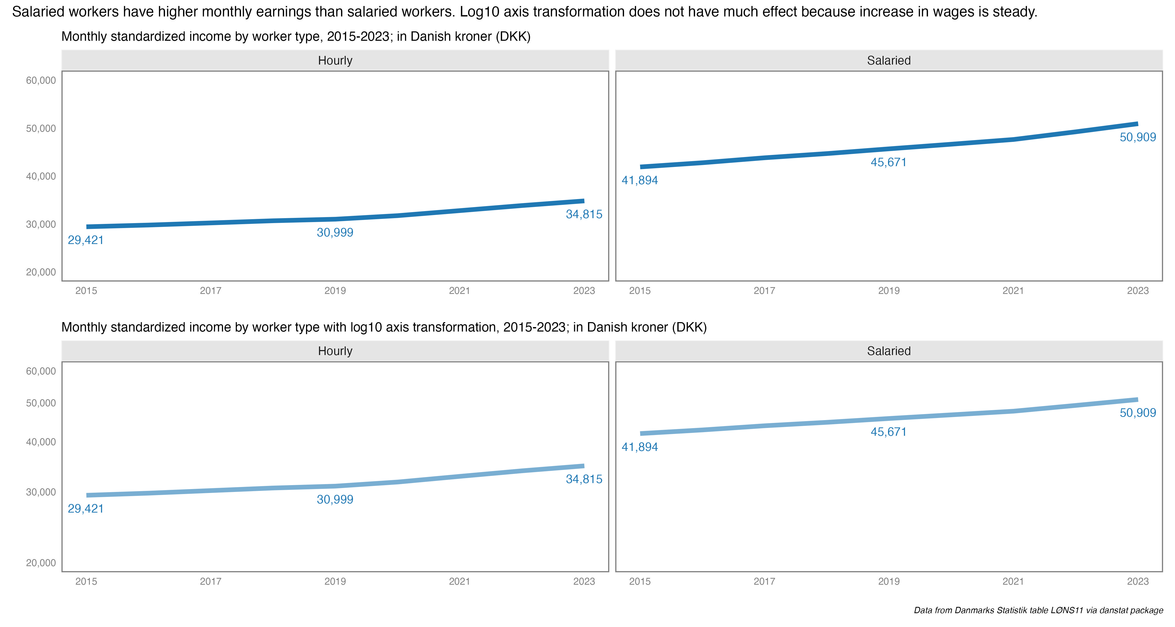
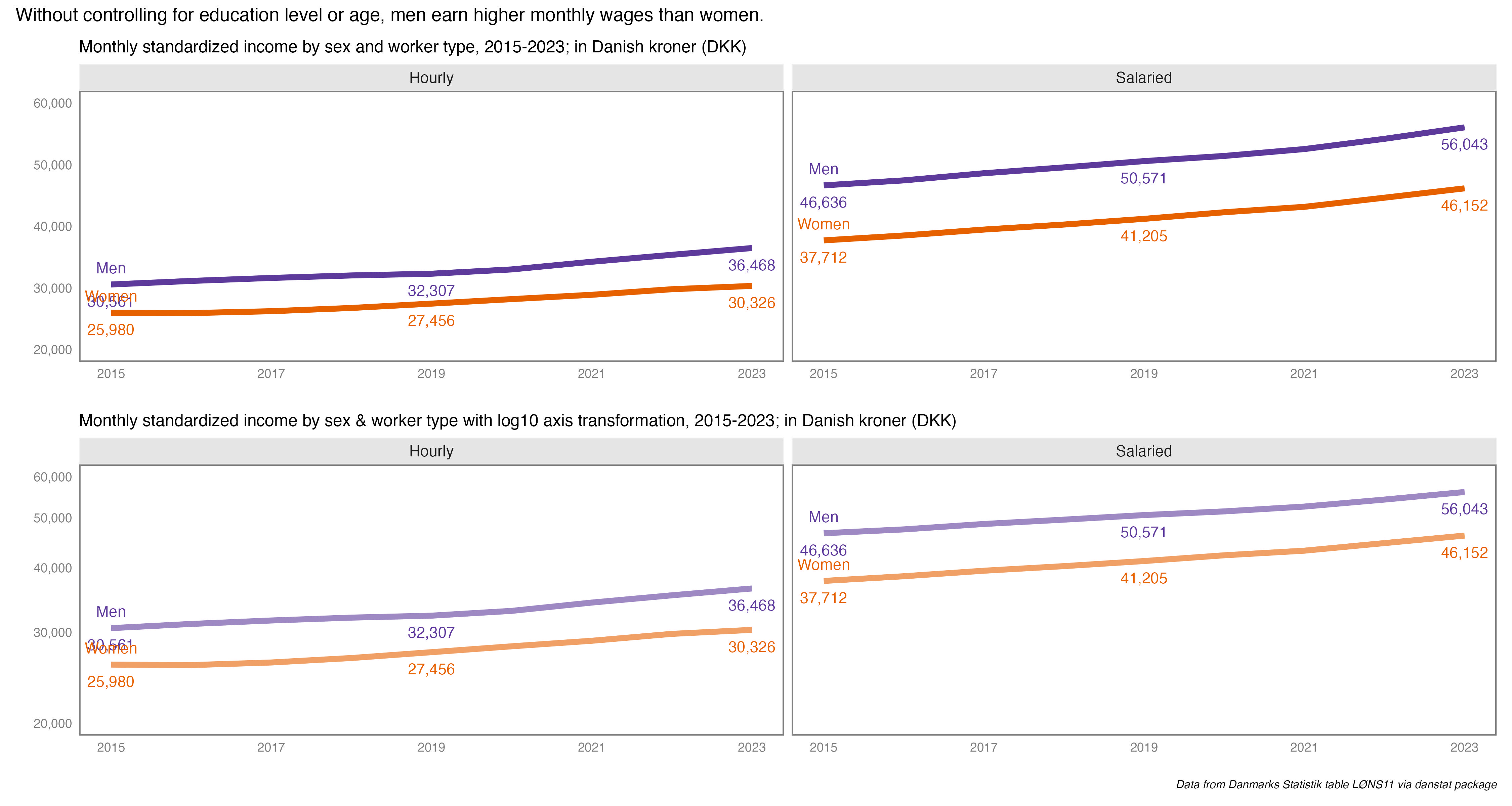
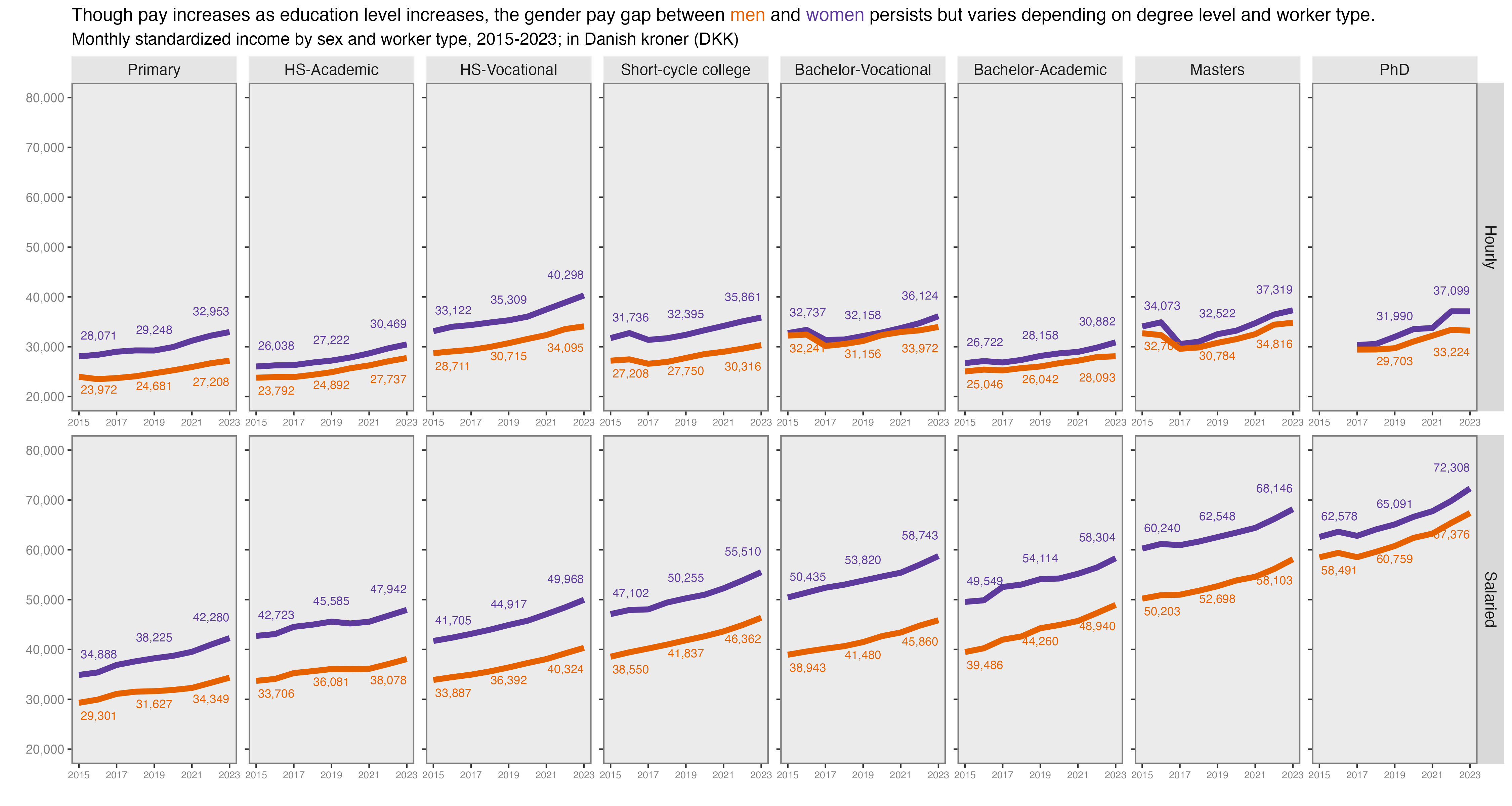
We are still pulling data from from Danmarks Statistik via the danstat package. This time we’ll use the “Labour & income” domain to look at earnings by employment sector and highest level of education attained, the LONS11 table; løn is the Danish word for wage or salary. Of the twenty-five available earnings indicators, we’re using the MDRSNIT field, which is standardized monthly earnings. I couldn’t easily find the documentation on exactly how it was imputed, but given the analysis is across sectors, I thought it made the most sense. We’ll also pull in whether the employee was salaried or hourly (spoiler alert…it matters).
Let’s first get and clean the data.
Show code for getting and cleaning data
library(tidyverse) # to do tidyverse thingslibrary(tidylog) # to get a log of what's happening to the datalibrary(janitor) # tools for data cleaninglibrary(danstat) # package to get Danish statistics via apilibrary(ggtext) # enhancements for text in ggplot# some custom functionssource("~/Data/r/basic functions.R")# lons11table_meta <- danstat::get_table_metadata(table_id ="lons11", variables_only =TRUE)# create variable list using the ID value in the variablevariables_ed <-list(list(code ="uddannelse", values =c("H10", "H20", "H30", "H40", "H50", "H60", "H70", "H80")),list(code ="sektor", values =c(1016, 1020, 1025, 1046)),list(code ="lønmål", values ="MDRSNIT"), # avg monthly# list(code = "køn", values = c("M", "K")),list(code ="afloen", values =c("TIME", "FAST")),list(code ="tid", values =2023))sal1 <-get_data("lons11", variables_ed, language ="en") %>%as_tibble() %>%clean_names()# earnings came in character form, so changing to numeric and rounding up to whole numbers# group the ed levels and change the names, and change names on sector. make them factors with orders.sal2 <- sal1 %>%mutate(income =as.numeric(indhold)) %>%mutate(income =round(income, 2)) %>%mutate(sector =case_when( sektor =="Corporations and organizations"~"Private sector", sektor =="Government including social security funds"~"Gov't - National", sektor =="Municipal government"~"Gov't - Municipal", sektor =="Regional government"~"Gov't - Regional")) %>%mutate(sector =factor(sector,levels =c("Gov't - Municipal", "Gov't - Regional","Gov't - National", "Private sector"))) %>%mutate(ed_level =case_when(uddannelse =="H10 Primary education"~"Primary", uddannelse =="H20 Upper secondary education"~"HS-Academic", uddannelse =="H30 Vocational Education and Training (VET)"~"HS-Vocational", uddannelse =="H40 Short cycle higher education"~"Short-cycle college", uddannelse =="H50 Vocational bachelors educations"~"Bachelor-Vocational", uddannelse =="H60 Bachelors programs"~"Bachelor-Academic", uddannelse =="H70 Masters programs"~"Masters", uddannelse =="H80 PhD programs"~"PhD")) %>%mutate(ed_level =factor(ed_level,levels =c("Primary", "HS-Academic", "HS-Vocational","Short-cycle college", "Bachelor-Vocational", "Bachelor-Academic", "Masters", "PhD")))
Ok, we have the data, onto making the circles. Again, we’re doing a bubble chart that functions as a heat map by pegging the bubble size to the value of the earnings. I also added text labels next to the bubbles.
Show code for making the chart
sal2 %>%ggplot(aes(x = sector, y = ed_level)) +geom_point(aes(col = income, fill = income, size = income), shape =21) +theme_minimal() +scale_size_area(max_size =15) +labs(x ="", y ="",title ="More education = higher monthly earnings across all sectors. Larger effect for salaried vs hourly workers",subtitle ="Monthly standardized earnings by education level & earner category",caption ="*Data from Danmarks Statistik via danstat package*") +facet_wrap(~ afloen) +theme(legend.position ='top',legend.justification =c(.95,0),plot.title =element_text(size =20),plot.subtitle =element_text(size =16),plot.caption =element_markdown(size =12, face ="italic")) +guides(col =guide_none(),size =guide_none(),fill =guide_colorbar(barheight =unit(0.5, 'cm'),barwidth =unit(10, 'cm'),title.position ='top',title ="Standardized Monthly Earnings (Danish Kroner)")) +scale_fill_continuous(limit =c(25000, 80000),breaks =c(30000, 40000, 50000, 60000, 70000, 80000)) +geom_text(data =subset(sal2, !is.na(income)),aes(label =paste0(round(income, 0), " DKK")), nudge_x =0.35, size =3)
I see the story here being that education level matters when it comes to how much Danish workers earn in a month. If you work in the private sector, having a Masters 8,000 to 10,000 more DKK per month than Bachelor’s degrees. The difference is even greater working for regional government agencies. Also, hourly workers with the same education earn less per month than salaried workers. But without the component parts of the total earnings I can’t explain exactly why.
The bottom line is, as we’re seeing so far in the charts, there’s both an increase in the number of people earning college and post-bacc degrees, and the payoff seems to be there for the extra year of school it takes for most programs.
But again, given that education is socialized and subsidized through taxes, the opportunity cost for that extra year is nothing, because the basic higher education coverage is for five years, for tuition and living stipend. And higher wage earners pay more taxes, helping to boost everyone’s opportunity to earn the degrees they desire, without being worried about cost.
It’s worth mentioning here, that there’s discussion ongoing in the Danish government to squeeze education spending and spots available in the gymnasiums (essentially high school) that feed university programs. I need to read up on that a bit more as I tell this Danish education story while doing the chart challenge.
Oh, the exchange rate is usually around 6.5 or so DKK to USD. So while it may seem amazing to earn 50000 per month, and while that’s not bad in this market, adjust your bearings if you’re thinking in USD or EURO.
created and posted April 2, 2025
Prompt #4 - Big or Small
For this post I’ll stay with a circle theme and make a simple circle packing chart, sort of a heat map or tree map but with circles, the size of the circles corresponding to the variable value. I’m using the code-through from the R Graph Gallery to get going, as I’ve never done this type of chart before. The packcircles package does the computational work to create the circle objects.
Keeping with the thematic constraint I’ve set, I’ll once again be using Danish education data from Danmarks Statistik via the danstat package.
This chart will display Bachelor’s degrees awarded in 2023, by top-line degree field (Science, Humanities, Education, etc). For instance, Law is a sub-field in Social Sciences, one of many. To make it a bit easier I’ll limit this chart to academic Bachelor’s, not the vocational degrees. There’s definitely a more focused project worth doing that displays the sub-fields within the top-line areas, shown as nested smaller circles within larger circles, or something interactive. for now this will suffice.
To start, let’s get the data. It’s from a different table than the last chart, so I’ll show the work.
Show code for getting and cleaning data
library(tidyverse) # to do tidyverse thingslibrary(tidylog) # to get a log of what's happening to the datalibrary(janitor) # tools for data cleaninglibrary(danstat) # package to get Danish statistics via apilibrary(packcircles) # makes the circles!library(ggtext) # enhancements for text in ggplotlibrary(ggrepel) # helps with label offsets# some custom functionssource("~/Data/r/basic functions.R")# this table is UDDAKT60, set to all lower-case in the table_id calltable_meta <- danstat::get_table_metadata(table_id ="uddakt60", variables_only =TRUE)# create variable list using the ID value in the variable# the uddanelse codes are the top-line degree fields.variables_ed <-list(list(code ="uddannelse", values =c("H6020", "H6025", "H6030", "H6035","H6039", "H6059", "H6075", "H6080", "H6090")),list(code ="fstatus", values =c("F")),list(code ="tid", values =2023))# start with a larger dataset in case we want to do more analysis or viz with itdegs1 <-get_data("uddakt60", variables_ed, language ="en") %>%as_tibble() %>%# shorten the given degree field namesmutate(deg_field =case_when(UDDANNELSE =="H6020 Educational, BACH"~"Educ.", UDDANNELSE =="H6025 Humanities and theological, BACH"~"Humanities", UDDANNELSE =="H6030 Arts, BACH"~"Arts", UDDANNELSE =="H6035 Science, BACH"~"Science", UDDANNELSE =="H6039 Social Sciences, BACH"~"Social Science", UDDANNELSE =="H6059 Technical sciences, BACH"~"Tech Science", UDDANNELSE =="H6075 Food, biotechnology and laboratory technology, BACH"~"Food/Biotech/LabTech", UDDANNELSE =="H6080 Agriculture, nature and environment, BACH"~"Agricultural Science", UDDANNELSE =="H6090 Health science, BACH"~"Health Sciences")) # keep only what we ween to do the circlesdegs2 <- degs1 %>%select(group = deg_field, value = INDHOLD, text)# this creates x & y coordinates and circle radius values.degs_packing <-circleProgressiveLayout(degs2$value, sizetype='area')# new tibble putting it togetherdegs3 <-cbind(degs2, degs_packing)# not sure exactly what this does, but it's an important stepdegs.gg <-circleLayoutVertices(degs_packing, npoints=50)
Ok, we now have a nice clean tibble, time for the plot. What took the most time here was working on the labels…getting them to the correct size, adjusting for circle size. You’ll notice one label set off to the side thanks to the ggrepel package.
Show code for making the chart
ggplot() +geom_polygon_interactive(data = degs.gg,aes(x, y, group = id, fill=id, tooltip = data$text[id], data_id = id),colour ="black", alpha =0.6) +scale_fill_viridis() +geom_text(data = degs3 %>%filter(value >6000),aes(x, y, label =paste0(group, "\n", format(value, big.mark=","))),size=7, color="black") +geom_text(data = degs3 %>%filter(between(value, 2410, 3350)),aes(x, y, label =paste0(group, "\n", format(value, big.mark=","))),size=7, color="black") +geom_text(data = degs3 %>%filter(between(value, 600, 2410)),aes(x, y, label =paste0(group, "\n", format(value, big.mark=","))),size=6, color="black") +geom_text_repel(data = degs3 %>%filter(between(value, 200, 400)),aes(x, y, label =paste0(group, "\n", format(value, big.mark=","))),size=4, color="black",max.overlaps =Inf, nudge_x =-110, nudge_y =50,segment.curvature =0,segment.ncp =8,segment.angle =30) +labs(x ="", y ="",title ="Social Sciences were the most popular Bachelor's degrees awarded by Danish universities in 2023",subtitle ="*Labels not diplayed: Education = 134, Food Science = 61*",caption ="*Data from Danmarks Statistik via danstat package*") +theme_void() +theme(legend.position="none", plot.margin=unit(c(0,0,0,0),"cm"),plot.title =element_markdown(size =16),plot.subtitle =element_markdown(size =12),plot.caption =element_markdown(size =8)) +coord_equal()
There you have it, academic Bachelor’s degrees awarded by Danish universities in 2023. The Social Sciences category accounts for more than twice as many degrees as the next field. Again, the next interesting step would be to visualize the disaggregation of the main fields, and see what subfields are the most popular. It would also be interesting to track the numbers over time, see which majors rose or fell.
created and posted April 2, 2025
Prompt #5 - Ranking
For this prompt I desperately wanted to do something relating to music from the band The English Beat because of Ranking Roger. But I’d already committed to the Danish education bit, and Spotify shut down all the interesting API endpoints and don’t seem to be reanimating them any time soon. Something about “safety”, but it’s likely AI crawlers, the same ones increasing hosting costs for Wikipedia and other websites as they steal content for their models. And funny for Spotify to complain about someone else using their work to monetize a product.
But anyway, let’s talk ranks. Specifically let’s look at the rankings of Bachelor degrees awarded in Denmark in 2023. I’ll focus on the academic (4-year) degrees because I wanted to look at majors within broader disciplines and look at differences by gender.
Again, data comes from Danmarks Statistik via the danstat package.
So first, let’s get the data. It’s from the same table used in prompt 4 but retreived slightly differently so I’ll show it again. This time we’re getting all the majors within the broader disciplines so in the list call we use list(code = "uddannelse", values = "*").
Show code for getting and cleaning data
library(tidyverse) # to do tidyverse thingslibrary(tidylog) # to get a log of what's happening to the datalibrary(janitor) # tools for data cleaninglibrary(danstat) # package to get Danish statistics via apilibrary(packcircles) # makes the circles!library(ggtext) # enhancements for text in ggplotlibrary(ggrepel) # helps with label offsets# some custom functionssource("~/Data/r/basic functions.R")# this table is UDDAKT60, set to all lower-case in the table_id calltable_meta <- danstat::get_table_metadata(table_id ="uddakt60", variables_only =TRUE)# create variable list using the ID value in the variable.variables_ed <-list(list(code ="uddannelse", values ="*"),list(code ="fstatus", values =c("F")),list(code ="køn", values =c("M", "K")),#list(code = "alder", values = c("TOT")),list(code ="tid", values =2023))bacdegs1 <-get_data("uddakt60", variables_ed, language ="en") %>%as_tibble()bacdegs <- bacdegs1 %>%# clean up the degree text and code fieldmutate(deg_code =str_extract(UDDANNELSE, "^[^ ]+")) %>%mutate(deg_name =sub("^\\S+\\s+", '', UDDANNELSE)) %>%mutate(deg_name =str_remove(deg_name, ", BACH")) %>%mutate(deg_name =str_remove(deg_name, " BACH")) %>%mutate(deg_group =case_when( deg_code %in%c("H6020", "H6025", "H6030", "H6035", "H6039","H6059", "H6075", "H6080", "H6090") ~"Main", deg_code =="H60"~"All",TRUE~"Sub")) %>%# create discipline category for making individual plots.mutate(deg_field =case_when(str_detect(deg_code, "H6020") ~"Education",str_detect(deg_code, "H6025") ~"Humanities",str_detect(deg_code, "H6030") ~"Arts",str_detect(deg_code, "H6035") ~"Science",str_detect(deg_code, "H6039") ~"Social Sciences",str_detect(deg_code, "H6059") ~"Technical sciences",str_detect(deg_code, "H6075") ~"Technical sciences",str_detect(deg_code, "H6080") ~"Agriculture & Veterinary",str_detect(deg_code, "H6090") ~"Health science",TRUE~"no")) %>%rename(degs_n = INDHOLD, sex = KØN)
Now that we have tidy data, let’s make the charts. This time out it’s horizontal bar charts, ordered by number of degrees awarded. Note that because I’m faceting by gender, and because I want to show the top majors in descending order for each gender, I use the scales = "free_y" option in the facet function.
A few things before we see the work. First, I had hoped to write a function and output all the by-discipline charts but it was too complicated to get each chart to look exactly as I wanted, and I realized I’d have to do lots of individual formatting anyway. So sadly it’s “copy-paste-amend” for all the charts. I’ll only show the code for the chart showing all degrees and for one of the discipline charts, as the rest of the discipline charts were essentially the same, just minor edits on the geom_text() code.
Second, I had to make a design choice regarding the x axes. I decided to keep them standard to the maximum number of degrees by major within each discipline, so the x axes for men & women is the same. To me, having different x axes maximums in the same chart was distorting the scope of the bars, making different numbers look the same.
Third, I am only displaying degree counts, not percentages. I went back and forth on that as well, and decided to go with the counts and save the percentages for the “Diverging” prompt on Day 9.
Show code for making the charts
bacdegs %>%filter(deg_group =="Main") %>% {. ->> tmp} %>%ggplot(aes(x = degs_n, y =reorder_within(deg_name, degs_n, sex), fill = sex)) +geom_bar(stat ="identity") +scale_fill_manual(values =c("#E66100", "#5D3A9B")) +scale_y_reordered() +scale_x_continuous(labels = comma) +labs(x ="", y ="",title ="All Bachelor degrees by field & sex, 2023",subtitle = glue::glue("*Total degrees earned = 19,199: Men = 8,694, Women = 10,505*"),caption ="*Data from Danmarks Statistik via danstat package*") +facet_wrap(~ sex, scales ="free_y") +geom_text(data =subset(tmp, degs_n >3000),aes(label =comma(degs_n)), hjust =1.5, color ="white") +geom_text(data =subset(tmp, degs_n <3000),aes(label =comma(degs_n)), hjust =-.5, color ="black") +theme_minimal() +theme(panel.grid =element_blank(),legend.position ="none",plot.subtitle =element_markdown(),plot.caption =element_markdown())# agriculture and veterinary sciencesbacdegs %>%filter(deg_group =="Sub") %>%filter(deg_field =="Agriculture & Veterinary") %>% {. ->> tmp} %>%ggplot(aes(x = degs_n, y =reorder_within(deg_name, degs_n, sex), fill = sex)) +geom_bar(stat ="identity") +scale_fill_manual(values =c("#E66100", "#5D3A9B")) +scale_y_reordered() +scale_x_continuous(labels = comma) +labs(x ="", y ="",title ="Agriculture & Veterinary Science Bachelor degrees by field & sex, 2023",subtitle = glue::glue("*Total degrees earned = 308: Men = 55, Women = 253*")) +facet_wrap(~ sex, scales ="free_y") +geom_text(data =subset(tmp, degs_n >100),aes(label =comma(degs_n)), hjust =1.5, color ="white") +geom_text(data =subset(tmp, degs_n <100),aes(label = degs_n), hjust =-.5, color ="black") +theme_minimal() +theme(panel.grid =element_blank(),legend.position ="none",plot.subtitle =element_markdown())
This first chart shows all degrees awarded by discipline and sex. The most immediate thing to notice is that more Bachelor degrees were awarded to women than to men. But that tracks with a chart I did last year, showing rates of educational attainment by sex and it’s similar to other countries, including the US.
Social science degrees were the most popular for both men and women. After that it changes a bit. Humanities were 2nd most popular for women, Technical Sciences next for men. And so forth. To be honest, it’s kind of a shock to see degree fields so starkly gendered now. I would have though some disciplines would have been a bit more evenly split. Again, we’ll dive deeper into the percentage differences on Day 9 for the “Diverging” prompt.
In the tab set below are the rest of the charts, one for each major discipline. If you’re interested you can comb through and see which majors were most popular in each discipline. They are lightboxed, so click on the image to enlarge it, and click esc or outside the image to restore it to the page.
The only ones I did not make were for Education and the Food-Biotech-Lab Tech degrees as each only had one major with degrees awarded. In Education there were 134 degrees awarded, 117 to women, 17 to men. For Food-Bio-Lab Tech there were 61 degrees total, 20 to Men, 41 to Women all in a general Food & Nutrition Science major.
This makes me think I could have done this in Tableau and let the user filter by discipline. Or I could have done parameterized charts in Quarto. Either way I could have added other degree levels. Lots of data prep, but it would be a useful chart. Maybe after the 30 Day Challenge is over.
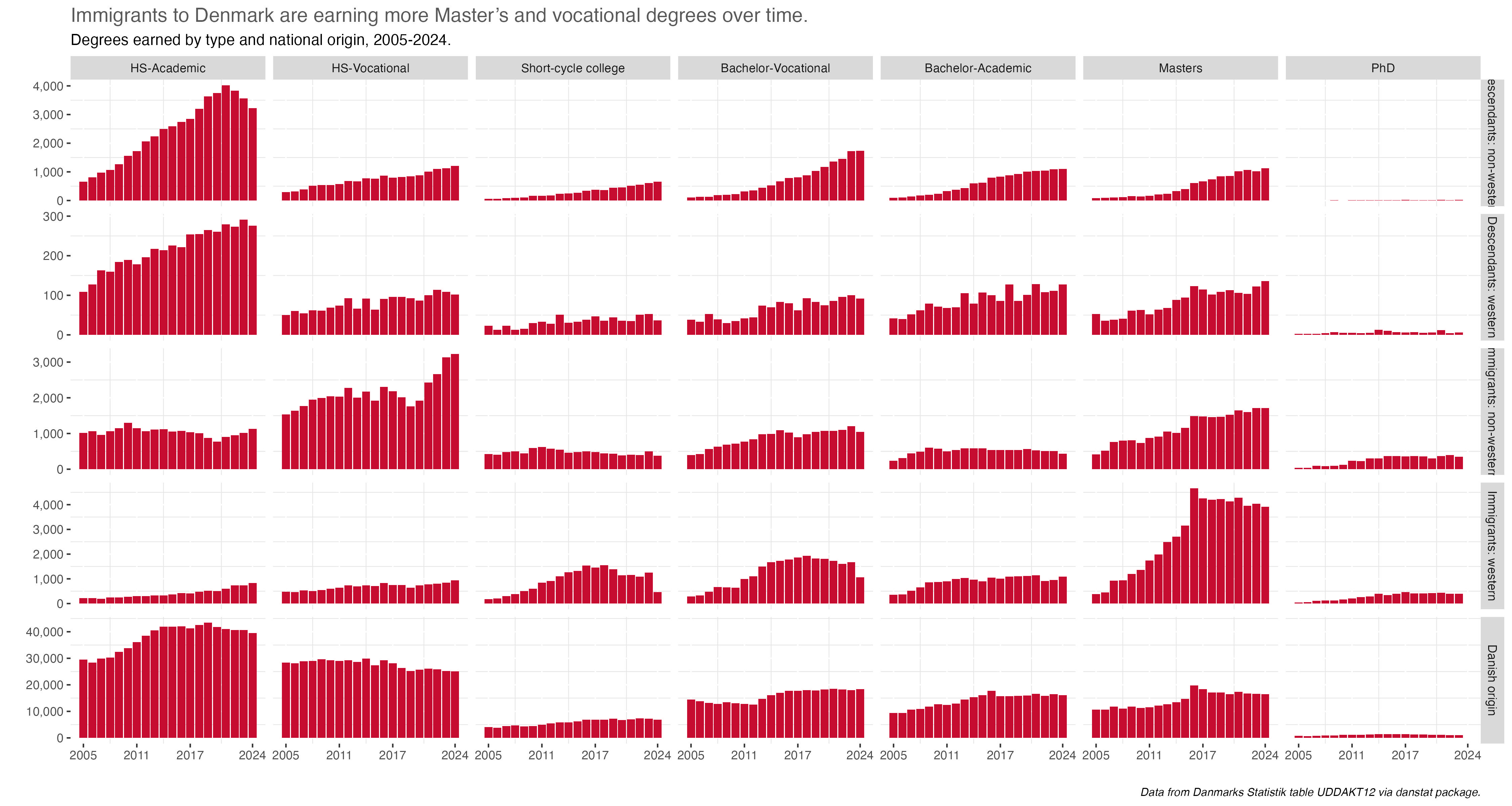
The obvious association with Florence Nightingale is that of nursing, so today let’s look at health-care degrees, and who gets them. I’m especially interested in degrees for a job called in shorthand here SOSU, or “social- og sundhedsassistent”. Essentially a nurses aid/nursing assistant. When I was in the hospital after my bicycle accident in 2024 I noticed almost all SOSUs were women and many first or second-generation immigrants.
Which makes sense when you think of recent immigrants to any country and the types of jobs the first wave immigrants, mainly those who don’t come in with college degrees or professional credentials, tend to get…merchants, housekeeping, health care assistants. They establish a stable life and their kids tend to get more education and higher paying jobs. It’s the immigration story told often over the decades and in many countries.
I feel like I need to make clear here that this is not intended to “other” immigrants to Denmark. I want to help explain SOSU degrees in the conext of their paths to economic and social stability through education and decently paying stable jobs.
Again, data comes from Danmarks Statistik via the danstat package. This time we’ll look at table UDDAKT35, which has degrees completed and includes immigration category.
First we’ll get the data.
Show code for getting and cleaning data
# Nursing and SOSU degrees by gender and immigrant statuslibrary(tidyverse) # to do tidyverse thingslibrary(tidylog) # to get a log of what's happening to the datalibrary(janitor) # tools for data cleaninglibrary(danstat) # package to get Danish statistics via apilibrary(ggtext) # enhancements for text in ggplotlibrary(scales)library(tidytext)# some custom functionssource("~/Data/r/basic functions.R")# UDDAKT35 - get english and danish versions of metadata to make sure we get the right degree codes.table_meta <- danstat::get_table_metadata(table_id ="uddakt35", variables_only =TRUE)table_meta_dk <- danstat::get_table_metadata(table_id ="uddakt35", variables_only =TRUE, language ="da")# create variable list using the ID value in the variablevariables_ed <-list(list(code ="uddannelse", values =c("H30", "H3010", "H301020")),list(code ="fstatus", values =c("F")),list(code ="køn", values ="*"),list(code ="herkomst", values ="*"),list(code ="tid", values =c(2019, 2020, 2021, 2022, 2023, 2024)))# fetch the data using the variable listsosu1 <-get_data("uddakt35", variables_ed, language ="en") %>%as_tibble() %>%clean_names()# set up the main dataset...create a main degree field, clean up the national origin fieldsosu_all <- sosu1 %>%rename(sex = kon, national_origin = herkomst, year = tid, n = indhold) %>%select(-fstatus) %>%mutate(deg_code =str_extract(uddannelse, "^[^ ]+")) %>%mutate(deg_name =case_when( deg_code =="H30"~"VET All", deg_code =="H3010"~"Health care/Educ All", deg_code =="H301020"~"SOSU")) %>%mutate(national_origin =ifelse( national_origin =="Persons of Danish origin", "Danish origin", national_origin)) %>%mutate(national_origin =factor(national_origin,levels =c("Total", "Danish origin", "Descendant","Immigrants", "Unknown origin"))) %>%mutate(sex =ifelse(sex =="Sex, total", "Total", sex))
We have the base frame now from which to make a few charts. All of them will cover the years 2019 to 2024. The chart code isn’t all that complicated so I won’t include them in this post. If you’re interested you can find them in the github repo for this year’s challenge.
We’ll first look at total SOSU degrees, then SOSU as a percent of all the vocational degrees in it’s main group. We’ll also look at sex and national origin.
The key insight that jumps out here is the more than 200% increase in SOSU degrees awarded during this period. The one thing I’m not sure of here if that has to do with any policy change or something else that helped the numbers increase so much over the last five years.
How about SOSU degrees about relative to all H30 vocational programs?
SOSU degrees were 2% of the H30 vocational category in 2019 and 4% in 2024. The H30 group grew by almost 1,900 (6%) during that period, meaning SOSU degrees were responsible for more than the growth of all degrees in this group.
So who gets SOSU degrees in terms of gender and national origin status? Unsurprisingly, given the very gendered nature of nursing health care assistant jobs, about 90% of SOSU degrees go to women.
What about national origin? First it helps to explain how that’s defined in Denmark for these statistics (page is in Danish). Someone of Danish origin has at least 1 parent born in and a citizen of Denmark, regardless of where the person was born. A Descendant is considered someone to born in Denmark but neither parent is a citizen or born in Denmark. However if at least one of a Descendant’s parents acquire Danish citizenship, then that person is now of Danish origin. Finally, an Immigrant is considered as someone born abroad and neither parent is a citizen of or born in Denmark. Immigrants can of course gain citizenship, but I’m not sure if they then become considered of Danish origin for these statistics.
For the past few years, immigrants have comprised about 30% or so of all who earned a SOSU degree.
So how do these gender and national origin percentages compare to all H30 vocational programs?
Well, the H30 degrees are not only much more balanced, a slight majority are awarded to men.
As for national origin…
…immigrants are growing as a percent of all who earn H30 vocational degrees, at 14% in 2024 up from 8% in 2019. but that’s less than half the 34% percent of SOSU degrees awarded to immigrants.
So to sum up, its as expected; a vast majority of SOSU degrees go to women, and the percentage of SOSU degrees going to immigrants has been rising.
There’s plenty more to examine here, for instance:
How do SOSU degree demographics compare to nursing degrees and other medical fields?
What’s the demographic picture in other vocational fields? Or in academic secondary, or academic higher education?
created and posted April 5, 2025
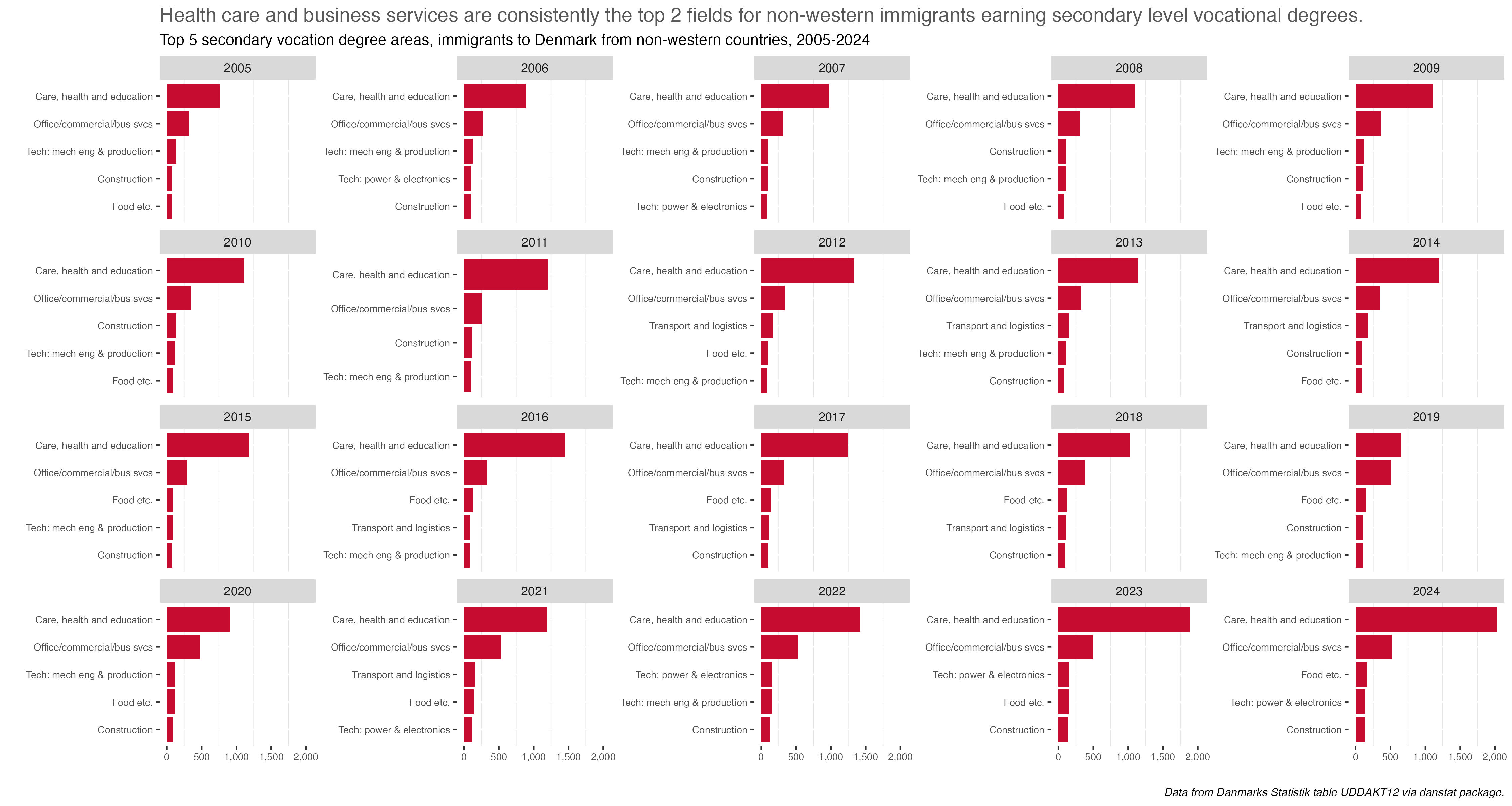
Prompts #7 & 8 - Outliers & Histogram
These next six prompts are under a general theme of Distributions, or how data is arrayed or spread out by one of more factors.
Taking another look at vocational degrees, it turned out to be best to combine these first two prompts, outliers and histogram, into one post. So we’ll use the same table UDDAKT35, from Danmarks Statistik via the danstat package.
This time we’ll look at all degrees awarded and see the overall distribution (histogram), and degrees which had the most and fewest awarded (outliers). So reversing the prompts I guess, but keeping with the spirit of the challenge.
As always, we’ll fetch and clean the data first. Some slight changes to the previous prompt where we used this table. This time we’ll get all degree programs and just for 2024. We won’t worry about demographics this time.
Show code for getting and cleaning data
library(tidyverse) # to do tidyverse thingslibrary(tidylog) # to get a log of what's happening to the datalibrary(janitor) # tools for data cleaninglibrary(danstat) # package to get Danish statistics via apilibrary(ggtext) # enhancements for text in ggplotlibrary(scales)library(tidytext)# some custom functionssource("~/Data/r/basic functions.R")# UDDAKT35 - get english and danish versions of metadata to make sure we get the right degree codes.table_meta <- danstat::get_table_metadata(table_id ="uddakt35", variables_only =TRUE)table_meta_dk <- danstat::get_table_metadata(table_id ="uddakt35", variables_only =TRUE, language ="da")# create variable list using the ID value in the variable# getting all education programs, pare downvariables_ed <-list(list(code ="uddannelse", values ="*"),list(code ="fstatus", values =c("F")),list(code ="tid", values =2024))# fetch all the datavet1 <-get_data("uddakt35", variables_ed, language ="en") %>%as_tibble() %>%clean_names()# clean up a bit, create category fields to help with chartsvet_all <- vet1 %>%mutate(deg_code =str_extract(uddannelse, "^[^ ]+")) %>%filter(!grepl("H29", deg_code)) %>%filter(!grepl("Total", deg_code)) %>%mutate(deg_level =if_else(str_length(deg_code) ==5, "Main", "Sub")) %>%mutate(deg_level =if_else(deg_code =="H30", "All", deg_level)) %>%mutate(deg_name =sub("^\\S+\\s+", '', uddannelse)) # create outlier categories. only majors with +0 degreesvet_majors <- vet_all %>%filter(deg_level =="Sub") %>%filter(indhold >0) %>%mutate(degs_mean =mean(indhold),degs_std =sd(indhold),degs_pctl10 =quantile(indhold, 0.10),degs_pctl90 =quantile(indhold, 0.90)) %>%mutate(outlier =case_when( indhold >= degs_pctl90 ~"outlier+ > 90thpctl", indhold <= degs_pctl10 ~"outlier- < 10thpctl",TRUE~"not outlier")) %>%mutate(outlier =factor(outlier,levels =c("outlier+ > 90thpctl", "not outlier", "outlier- < 10thpctl")))
The vet_majors dataframe created at the end is what we’ll use for outlier analysis – it keeps only the majors (not the top-line category) and only for degrees awarded greater-than 0. As we’ll see in the histogram, the distributions were so skewed I set outlier status at equal-or-above the 90th percentile and equal-or-below the 10th percentiles.
Ok, let’s build the histogram. I added vertical lines at the median and mean to highlight the skew.
Show code for making the histogram
vet_majors %>%ggplot(aes(indhold)) +geom_histogram(fill ="#CC79A7", bins =100) +geom_vline(aes(xintercept =mean(indhold)), color="black") +geom_vline(aes(xintercept =median(indhold)), color="#A9A9A9") +labs(x ="", y ="",title ="Eight programs with +1,000 degrees awarded accounted for 43% of the H30 Vocational degrees awarded in 2024",subtitle ="*Total H30 degrees awarded in 2024 = 30,570*",caption ="*Data from Danmarks Statistik table UDDAKT35 via danstat package*") +scale_y_continuous(expand =c(.001, 0), limits =c(0, 20),breaks =c(0, 1, 3, 6, 9, 12, 15, 18, 20)) +scale_x_continuous(breaks =c(0, 500, 1000, 2000, 3000, 4000, 5000, 6000),labels = comma) +theme_minimal() +theme(plot.title =element_markdown(size =16, hjust =0),plot.subtitle =element_markdown(size =14, hjust =0),plot.caption =element_markdown(),legend.title =element_blank(),legend.position =c(.98, .05),legend.justification =c("right", "bottom"),legend.direction ="horizontal",legend.box.just ="right",legend.margin =margin(6, 6, 6, 6),panel.grid =element_blank(),panel.border =element_blank())
Most of the fields awarded fewer than 500 degrees. Only 8 awarded more than 1,000. So a heavy left skew to the distribution.
So which fields had the most and least relative to the others? The code is below, we’ll talk about the chart below the image. I used the white-space resulting from the array of data as space for the legend and explanatory notes. For those annotations I created a couple of text vectors to plug in, one with coloring to use as richtext in the annotate call.
Show code for making the outlier chart
# horizontal bar with fills based on outlier status, bars for mean and median# for annotation,caption1 <-paste(strwrap("Health, education, business (office, retail, trading (mercantile)), and craft trades (electrician, carpentry, mechanic) are by far the most popular vocational degree choices.", 75), collapse ="\n")caption2 <- glue::glue("<span style = 'color:#A9A9A9;'>Median = 97 </span><span style = 'color:#000000;'> Mean = 392</span>")vet_majors %>%ggplot(aes(x = indhold, y =reorder(deg_name, indhold), fill = outlier)) +geom_bar(stat ="identity") +scale_fill_manual(values =c("#0072B2", "#CC79A7", "#D55E00")) +geom_vline(aes(xintercept =mean(indhold)), color="black") +geom_vline(aes(xintercept =median(indhold)), color="#A9A9A9") +scale_x_continuous(limits =~c(0, max(.x) +0.1), breaks =pretty_breaks(),expand =c(0, 0), labels = comma) +labs(x ="", y ="",title ="Total H30 degrees awarded in 2024 = 30,570",caption ="*Data from Danmarks Statistik table UDDAKT35 via danstat package*") +annotate("text", x =2000, y ="Storage, port and terminal education",label = caption1, size =5, hjust =0) +annotate("richtext", x =4700, y ="Train preparation educations",label = caption2,size =4.5, label.color =NA) +theme_minimal() +theme(plot.title =element_markdown(size =16),plot.caption =element_markdown(),axis.text.y =element_text(size =7),legend.title =element_blank(),legend.position =c(.98, .05),legend.justification =c("right", "bottom"),legend.direction ="horizontal",legend.box.just ="right",legend.margin =margin(6, 6, 6, 6),panel.grid =element_blank(),panel.border =element_blank())
What we see is there are outliers, if we define an outlier as outside the 10th or 90th percentiles. We knew from prompt 6 that SOSU degrees (social health and education) would account for the greatest proportion of vocational degrees, so no surprise that’s tops. We also see business & commerce related fields as well as craft & trades also being very popular. Glazier and fitness instructor are among the low outliers, below the 10th percentile in the distribution.
A quick note on what might look like odd degree names. Obviously the original names were in Danish. But the translation to English isn’t always perfect. So for example, gartneruddannelsen translates to “Gartner Education” but what it should be is “Gardening”, or training to be a florist or work in landscaping. “Trading Education” comes from handelsuddannelsen which is essentially training to be a merchant - sourcing, logistics, etc.
created and posted April 5, 2025
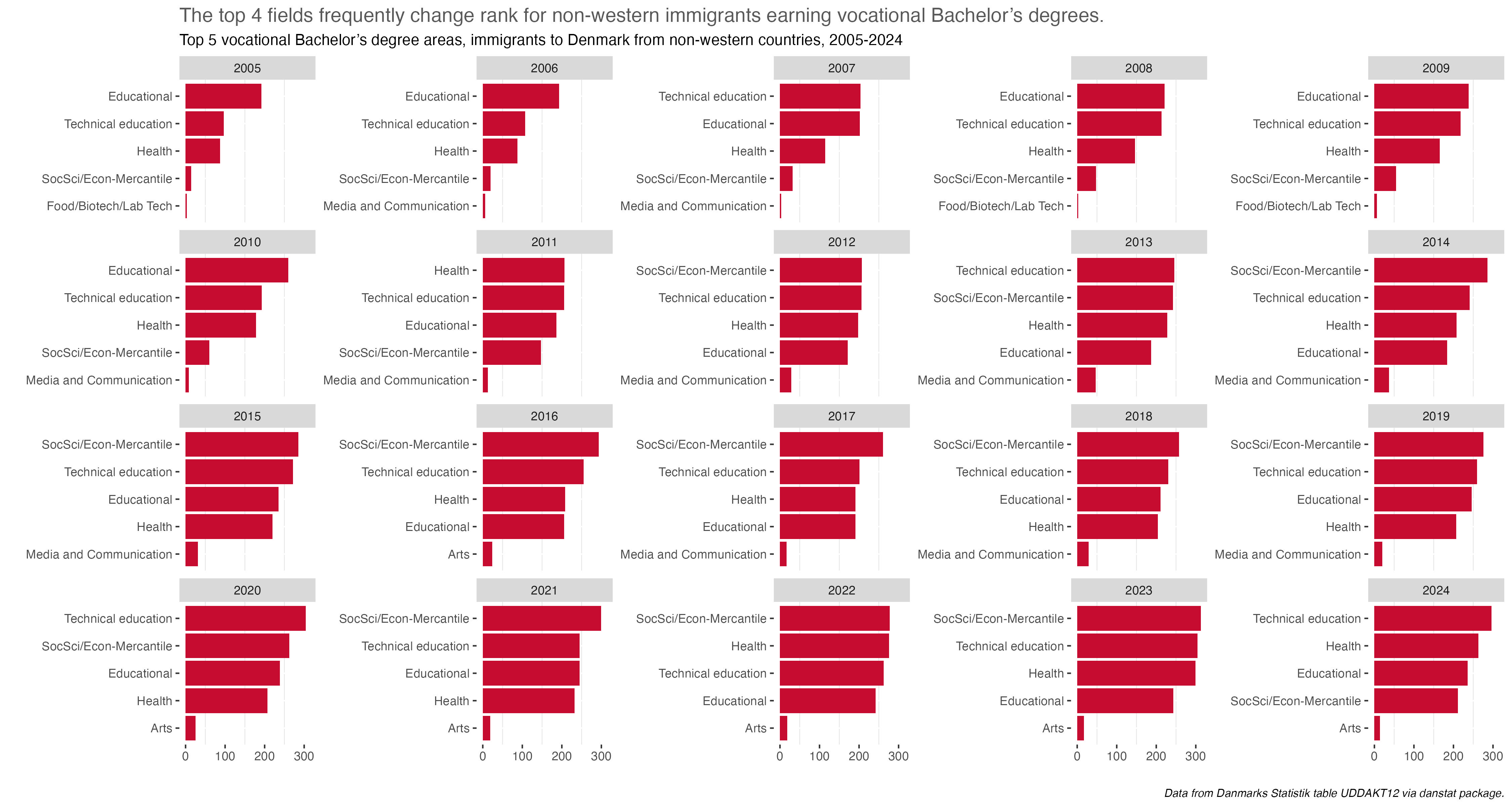
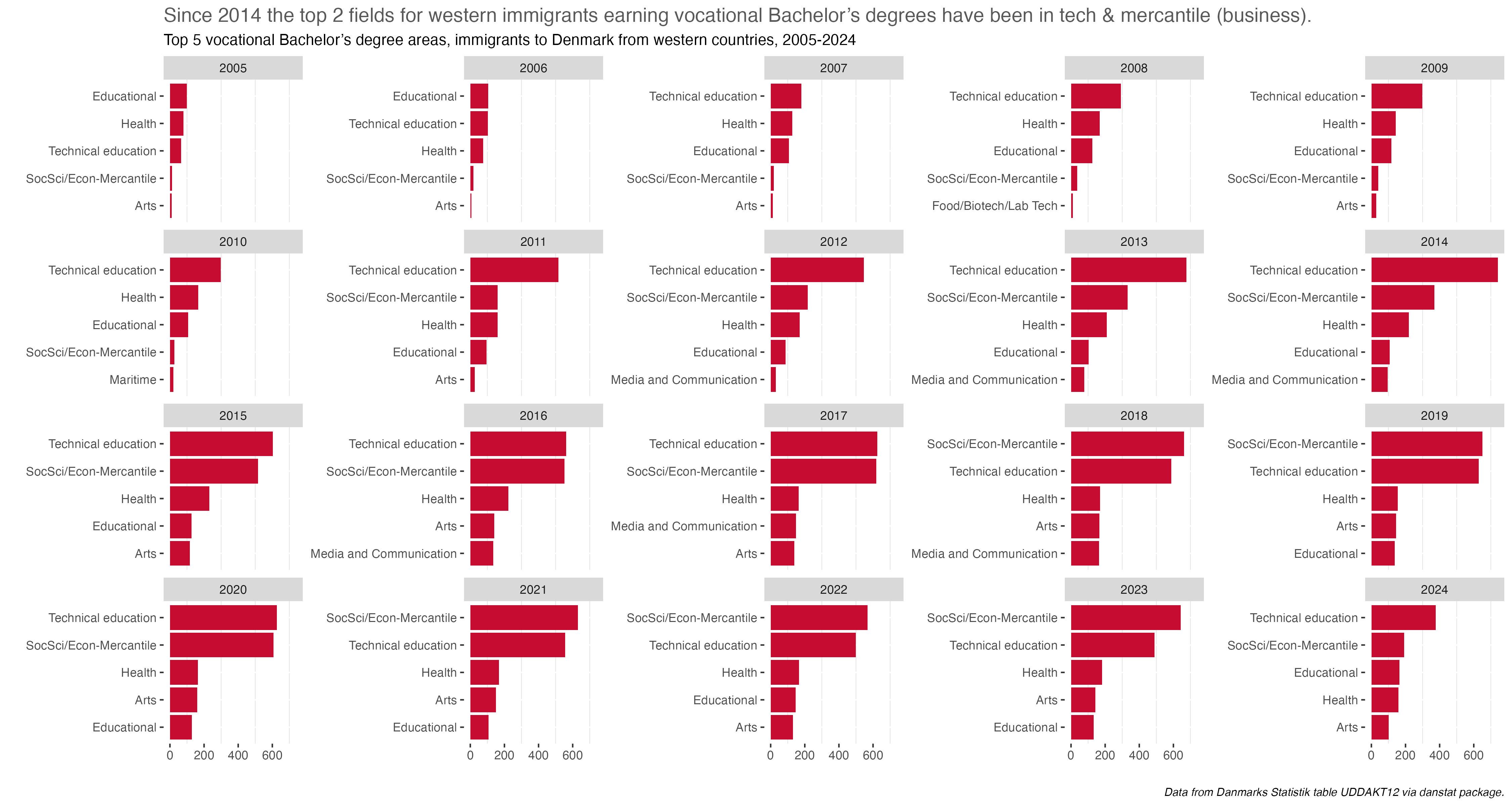
Prompt #9 - Diverging
For the Diverging prompt last year I looked at educational attainment by gender in Denmark. This year I’ll do a similar chart, and we’ll take a different look at the same data used in the Day 5 Ranking prompt. Here though, instead of arraying degrees and majors in terms of raw counts, we’ll look at the percentage differences between gender by discipline and major.
We will go back to the UDDAKT60 table from Danmarks Statistik via the danstat package.
It’s a bit of a long post because I’m walking though the process of building the nine discipline charts via a function. If you’re most interested in the charts, scroll through the how-to parts.
Show code for getting and cleaning data
library(tidyverse) # to do tidyverse thingslibrary(tidylog) # to get a log of what's happening to the datalibrary(janitor) # tools for data cleaninglibrary(danstat) # package to get Danish statistics via apilibrary(packcircles) # makes the circles!library(ggtext) # enhancements for text in ggplotlibrary(ggrepel) # helps with label offsets# some custom functionssource("~/Data/r/basic functions.R")# this table is UDDAKT60, set to all lower-case in the table_id calltable_meta <- danstat::get_table_metadata(table_id ="uddakt60", variables_only =TRUE)# create variable list using the ID value in the variablevariables_ed <-list(list(code ="uddannelse", values ="*"),list(code ="fstatus", values =c("F")),list(code ="køn", values =c("M", "K")),#list(code = "alder", values = c("TOT")),list(code ="tid", values =2023))# fetch the data, use the janitor package to clean the namesbacdegs1 <-get_data("uddakt60", variables_ed, language ="en") %>%as_tibble() %>%clean_names()# build the main dataset for chartingbacdegs <- bacdegs1 %>%select(-fstatus) %>%# create categories for filtering - deg_group is category for all, discipline, or major # deg_name is major, deg_field is discipline, mutate(deg_code =str_extract(uddannelse, "^[^ ]+")) %>%mutate(deg_name =sub("^\\S+\\s+", '', uddannelse)) %>%mutate(deg_name =str_remove(deg_name, ", BACH")) %>%mutate(deg_name =str_remove(deg_name, " BACH")) %>%mutate(deg_group =case_when( deg_code %in%c("H6020", "H6025", "H6030", "H6035", "H6039","H6059", "H6075", "H6080", "H6090") ~"Main", deg_code =="H60"~"All",TRUE~"Sub")) %>%mutate(deg_field =case_when(str_detect(deg_code, "H6020") ~"Education",str_detect(deg_code, "H6025") ~"Humanities",str_detect(deg_code, "H6030") ~"Arts",str_detect(deg_code, "H6035") ~"Science",str_detect(deg_code, "H6039") ~"Social Sciences",str_detect(deg_code, "H6059") ~"Technical sciences",str_detect(deg_code, "H6075") ~"Food/Biotech/Lab Tech",str_detect(deg_code, "H6080") ~"Agriculture Nature Environment",str_detect(deg_code, "H6090") ~"Health science",TRUE~"All")) %>%mutate(deg_field =factor(deg_field,levels =c("All", "Agriculture Nature Environment", "Arts", "Education", "Food/Biotech/Lab Tech","Health science", "Humanities", "Science", "Social Sciences", "Technical sciences"))) %>%rename(degs_n = indhold, sex = kon)## dataframe to create faint highlight lines in chartvlines_df <-data.frame(xintercept =seq(-100, 100, 20))
Putting this together I first built a chart at the discipline level, showing the percentage differences by gender on a diverging graph. It’s a bit of a remix of last year’s chart for the same prompt. The code for that is below as is the chart.
Show code for making the first chart
bacdegs %>%filter(deg_group =="Main") %>%select(deg_field, sex, degs_n) %>%group_by(deg_field) %>%mutate(deg_field_tot =sum(degs_n)) %>%ungroup() %>%group_by(deg_field, sex) %>%mutate(deg_sex_pct =round(degs_n /deg_field_tot, 3)) %>%mutate(deg_sex_pct =ifelse(sex =="Men", deg_sex_pct *-1, deg_sex_pct)) %>%mutate(deg_sex_pct2 =round(deg_sex_pct *100, 1)) %>%ungroup() %>%mutate(deg_field =fct_reorder(deg_field, desc(deg_field))) %>% {. ->> tmp} %>%ggplot() +geom_col(aes(x =-50, y = deg_field), width =0.75, fill ="#e0e0e0") +geom_col(aes(x =50, y = deg_field), width =0.75, fill ="#e0e0e0") +geom_col(aes(x = deg_sex_pct2, y = deg_field, fill = sex, color = sex), width =0.75) +scale_x_continuous(expand =c(0, 0),labels =function(x) abs(x), breaks =seq(-100, 100, 20)) +geom_vline(data = vlines_df, aes(xintercept = xintercept), color ="#FFFFFF", size =0.1, alpha =0.5) +coord_cartesian(clip ="off") +scale_fill_manual(values =c("#E66100", "#5D3A9B")) +scale_color_manual(values =c("white", "white")) +geom_text(data =subset(tmp, sex =="Men"),aes(x = deg_sex_pct2, y = deg_field, label =paste0(abs(deg_sex_pct2), "%")),size =5, color ="white", position =position_dodge(width = .4), hjust =-0.09) +geom_text(data =subset(tmp, sex =="Women"),aes(x = deg_sex_pct2, y = deg_field, label =paste0(abs(deg_sex_pct2), "%")),size =5, color ="white", position =position_dodge(width = .4), hjust =1.1) +geom_text(aes(x =-100, y = deg_field, label =paste0("Total awarded = ", comma(deg_field_tot))),size =4, color ="#3b3b3b", hjust =-.1) +labs(x ="", y ="",title ="<span style = 'color: #5D3A9B;'>Women</span> earn more Bachelor's degrees than <span style = 'color: #E66100;'>men</span> in all disciplines except Science and Technical sciences",subtitle = glue::glue("*Total degrees awarded = 19,199: <span style = 'color: #E66100;'>Men = 8,694 (45%)</span>, <span style = 'color: #5D3A9B;'>Women = 10,505 (55%)</span>*"),caption ="*Data from Danmarks Statistik table UDDAKT60 via danstat package*") +theme_minimal() +theme(panel.grid =element_blank(),plot.title =element_markdown(size =16),plot.subtitle =element_markdown(size =12),plot.caption =element_markdown(),legend.position ="none", legend.title =element_blank(),axis.text.y =element_text(size =10))rm(tmp)
The next step is to repeat this chart for each discipline, showing the top 10 majors by overall degrees awarded. Rather than copy-paste-amend like in prompt 5, this time I set about doing it via a plot function. As you can see from the code for the first chart though, I wanted to add descriptive and informational text in the title and subtitle. It was a bit complicated to do this functionally and I’m sure it took me much longer to sort out the data structures and function mapping, but it worked. I’ll walk through the steps here before displaying the charts. After the challenge I’ll do a walk-through as a stand-alone post.
First up is building dataframes for each discipline, each frame with consistent naming. I went about it this way to avoid errors in filtering when running the plot function across disciplines. I took a similar approach in my October 2024 post on attendance at football (soccer) matches around the world.
So first a function to build the dataframes.
Show code for making the data frames
## function for individual discipline tablesdisc_top10 <-function(degfield, dfname ="NA") {dfout <- bacdegs %>%filter(deg_group =="Sub") %>%filter(deg_field == degfield) %>%select(deg_field, deg_name, sex, degs_n) %>%mutate(degs_all_tot =sum(degs_n)) %>%# creates fields to use in plot dynamic subtitlegroup_by(sex) %>%mutate(degs_all_sex_tot =sum(degs_n)) %>%mutate(degs_all_sex_pct =round(degs_all_sex_tot / degs_all_tot, 3) *100) %>%mutate(degs_all_sex_pct =paste0(degs_all_sex_pct, "%")) %>%ungroup() %>%group_by(deg_name) %>%mutate(deg_name_tot =sum(degs_n)) %>%ungroup() %>%arrange(desc(deg_name_tot), deg_name) %>%mutate(rank=row_number()) %>%group_by(deg_name, sex) %>%mutate(deg_sex_pct =round(degs_n /deg_name_tot, 3)) %>%mutate(deg_sex_pct =ifelse(sex =="Men", deg_sex_pct *-1, deg_sex_pct)) %>%mutate(deg_sex_pct2 =round(deg_sex_pct *100, 1)) %>%ungroup() %>%# more fields to use in plot dynamic subtitle mutate(deg_all_men_tot =ifelse(sex =="Men", degs_all_sex_tot, NA)) %>%mutate(deg_all_women_tot =ifelse(sex =="Women", degs_all_sex_tot, NA)) %>%mutate(deg_all_men_pct =ifelse(sex =="Men", degs_all_sex_pct, NA)) %>%mutate(deg_all_women_pct =ifelse(sex =="Women", degs_all_sex_pct, NA)) %>%mutate(deg_field_men_pct =ifelse(sex =="Men", paste0(abs(deg_sex_pct2), "%"), NA)) %>%mutate(deg_field_women_pct =ifelse(sex =="Women", paste0(deg_sex_pct2, "%"), NA)) %>%group_by(deg_name) %>%fill(deg_all_men_tot) %>%fill(deg_all_women_tot, .direction ="up") %>%fill(deg_all_men_pct) %>%fill(deg_all_women_pct, .direction ="up") %>%fill(deg_field_men_pct) %>%fill(deg_field_women_pct, .direction ="up") %>%ungroup()# uses the second input to name the dataframe and put it in the global environmentassign(str_c(dfname, "_pcts"), dfout, envir=.GlobalEnv)}
To run the function once it’s disc_top10("Science", "Science"). The first input is the discipline name, the 2nd is for the dataframe name.
But how do we map it across the disciplines? Well, we need a list of disciplines, and we do that by creating a list of fields.
degfields <- unique(bacdegs$deg_field)
Now we map it over the function, passing each mapping component to the .x sign.
## plot functionmajorplot <-function(plotdf, degfield, plotname ="NA") {## for faint highlight lines in chart vlines_df <-data.frame(xintercept =seq(-100, 100, 20))#create plot plotout <- plotdf %>%filter(deg_field == degfield) %>%filter(rank <21) %>%# to get top 10 for plot sorted in order of total degrees in majorarrange(desc(deg_name_tot)) %>%mutate(deg_name =fct_reorder(deg_name, deg_name_tot)) %>%# not used, but this orders top 10 for plot in degree name order# mutate(deg_name = fct_reorder(deg_name, desc(deg_name))) %>%ggplot() +# makes the grey barsgeom_col(aes(x =-50, y = deg_name), width =0.75, fill ="#e0e0e0") +geom_col(aes(x =50, y = deg_name), width =0.75, fill ="#e0e0e0") +# makes the bars for each gender, fill colors in the scale_fill_manual belowgeom_col(aes(x = deg_sex_pct2, y = deg_name, fill = sex, color = sex), width =0.75) +scale_x_continuous(expand =c(0, 0),labels =function(x) abs(x), breaks =seq(-100, 100, 20)) +scale_fill_manual(values =c("#E66100", "#5D3A9B")) +# adds faint guide lines for the barsgeom_vline(data = vlines_df, aes(xintercept = xintercept), color ="#FFFFFF", size =0.1, alpha =0.5) +coord_cartesian(clip ="off") +scale_color_manual(values =c("white", "white")) +# adds text labels for each major's percent of men & womengeom_text(data =subset(plotdf, sex =="Men"& rank <21),aes(x = deg_sex_pct2, y = deg_name, label =paste0(abs(deg_sex_pct2), "%")),size =5, color ="white", position =position_dodge(width = .4), hjust =-0.09) +geom_text(data =subset(plotdf, sex =="Women"& rank <21),aes(x = deg_sex_pct2, y = deg_name, label =paste0(abs(deg_sex_pct2), "%")),size =5, color ="white", position =position_dodge(width = .4), hjust =1.1) +# inserts the total number of degrees for each discipline into the bars to the # left or right of the percentage barsgeom_text(data =subset(plotdf, sex =="Men"& rank <21& deg_sex_pct >-0.85),aes(x =-100, y = deg_name, label =paste0("Total awarded = ", comma(deg_name_tot))),size =3.5, color ="#3b3b3b", hjust =-.1) +geom_text(data =subset(plotdf, sex =="Men"& rank <21& deg_sex_pct <-0.85),aes(x =80, y = deg_name, label =paste0("Total awarded = ", comma(deg_name_tot))),size =3.5, color ="#3b3b3b", hjust = .5) +labs(x ="", y ="",caption ="*Data from Danmarks Statistik table UDDAKT60 via danstat package*",# uses html tags for color and fields from the input df to make the title# specific to the disciplinesubtitle = glue::glue("*Total degrees awarded in {degfield} = {comma(plotdf$degs_all_tot)}: <span style = 'color: #E66100;'>Men = {comma(plotdf$deg_all_men_tot)} ({plotdf$deg_all_men_pct})</span>, <span style = 'color: #5D3A9B;'>Women = {comma(plotdf$deg_all_women_tot)} ({plotdf$deg_all_women_pct})</span>. Only top 10 majors displayed.*")) +theme_minimal() +theme(panel.grid =element_blank(),plot.title =element_markdown(size =16, hjust =0),plot.subtitle =element_markdown(size =12, hjust =0),plot.caption =element_markdown(),legend.position ="none", legend.title =element_blank(),axis.text.y =element_text(size =10))# to create individual plot names and place plots in the global environmentassign(str_c(plotname, "_plot"), plotout, envir=.GlobalEnv)# outputs plots return(plotout)}
The function takes three inputs - the dataframe to run it on, the filter for the discipline in the plot, and the output lot name. The 2nd & 3rd input are the same. To map it over the nine disciplines we need the list of dataframes and the list of disciplines. The code below shows how to build those
# create list of data frames to mutate function overdf_list <-list(mget(ls(pattern ="local")))[[1]]df_list =mget(ls(pattern ="_pcts"))# for degree fields to loop over in function, need a character vector of just major names# first a df of just the field namesbacdegs_maj <- bacdegs %>%filter(deg_group =="Sub") %>%mutate(deg_fieldc =as.character(deg_field)) %>%select(deg_fieldc)# then output names to character vector, making sure to sort so that the filter matches to # the degfieldsc <- (unique(bacdegs_maj$deg_fieldc)) %>%str_sort()
Now we’re ready to build the charts. Because of the way the input dataframes were built we’ll have title and subtitle text specific to each discipline. Here’s the mapping call:
That outputs nine plots that only need minor customization for the explanatory title. Everything else was taken care of in the functions. Because Education and the Food Science disciplines only have one major each, no additional charts for them. The gender difference is in the main chart.
I’ll display the seven annotated charts in the tabset below, showing the customization for the Humanities discipline. They are lightboxed, so click on the image to enlarge it, and click esc or outside the image to restore it to the page.
Humanities_plot +labs(title ="Humanities degrees mostly went to <span style = 'color: #5D3A9B;'>women</span>. By major, <span style = 'color: #E66100;'>men</span> only earned more degrees in History")
The overarching take-away is one of some noticeable difference or divergence by gender in many disciplines and majors. To be honest, I was surprised at the extent and size of some differences. I remember seeing it in some colleges and majors at UC Berkeley, but even in the so-called “male” majors women were becoming more and more evenly represented.
The next step for this subject would be to look at some of the more gendered majors and examine whether or not the differences have held steady over time, and if anything explains the change or stasis. Maybe after the challenge or for one of the challenge time-series prompts.
created and posted April 6, 2025
Prompt #13 - Clusters
For this “back to the future” post, a prompt coming between 9 (posted on April 6) and 14 (posted on April 18) but posted after April 18, let’s take a look at R&D expenses by source and research field in Denmark. The prompt is “clusters”, so I’m clustering research activity by the general field and the sector doing the work.
As always for this year’s challenge, the data is from Danmarks Statistik via the danstat package. This time we’re using table RDCE05, which is Expenses to R&D by sector and field of research and development. I’ll mention it more than once, but all expense figures are in millions of Danish kroner. So 1,500 DKK here means 1.5 billion. As of the date of posting, one US dollar gets you about 6.57 kroner. That’s about half a kroner lower than this time last year.
It’s also worth mentioning at least once that the unit of analysis is research expenses, not funding. Though you could argue that expenses are a proxy for funding, because the money has to come from somewhere. Expenses as reported here means money spent on any and all R&D activity and the people who do it. The funding sources are irrelevant.
I would love to dig in a bit deeper and connect funding sources, the sectors that get funding, and for which fields. But that means at the very least connecting a number of tables or having micro-data access.
I won’t spend any time explaining the research fields and sectors. You can get a detailed look at how Danmarks Statistik describes the data is here. The research fields follow the rubric laid out in the OECD’s Frascati Manual, with the fields themselves enumerated here.
Do keep in mind that science is interdisciplinary. So data science work, for example, might be in the Engineering and Tech field per the Frascati Manual. But it’s quite likely that data science work is happening in medical or social sciences. It’s hard to know how every activity is being classified without access to microdata and then being able to tease out interdisciplinary overlaps.
For the plot itself, I took inspiration for the scatterplot from Nicola Rennie’s cluster chart, modifying the colors and other aesthetics a bit. But the code structure starts with Nicola’s work, and I learned a bit about some good coding practice and tips. Which is the point of an exercise like this, right?
Let’s start by getting and cleaning the data.
Show code for getting and cleaning data
#package and process for getting & cleaning datalibrary(tidyverse) # to do tidyverse thingslibrary(tidylog) # to get a log of what's happening to the datalibrary(janitor) # tools for data cleaninglibrary(danstat) # package to get Danish statistics via apilibrary(gt) # for tableslibrary(ggiraph) # interactive plot with tooltiplibrary(ggtext) # add markdown to plot labelslibrary(scales) # better number formattingsource("~/Data/r/basic functions.R")# RDCE05table_meta <- danstat::get_table_metadata(table_id ="rdce05", variables_only =TRUE)table_meta_dk <- danstat::get_table_metadata(table_id ="rdce05", variables_only =TRUE, language ="da")# create variable list using the ID value in the variablevariables_ed <-list(list(code ="sektor", values ="*"),list(code ="videnhoved", values ="*"),list(code ="tid", values =c(2017, 2023)))r_and_d1 <-get_data("rdce05", variables_ed, language ="en") %>%as_tibble() %>%clean_names()r_and_d_main <- r_and_d1 %>%mutate(sektor =str_remove(sektor, " sector")) %>%mutate(sektor =case_when( sektor =="Total source of funding"~"Total funding", sektor =="Business enterprise"~"Business",TRUE~ sektor)) %>%mutate(videnhoved =case_when( videnhoved =="Agricultural and veterinary sciences"~"Agri & veterinary sci", videnhoved =="Engineering and technology"~"Eng & tech", videnhoved =="Humanities and the arts"~"Humanities & arts", videnhoved =="Medical and health sciences"~"Medical & health sci",TRUE~ videnhoved)) %>%select(sector = sektor, field = videnhoved, year = tid, dkk_million = indhold)
Before the main plot, let’s get a lay of the land for R&D expenses. Note the pctchange() function. It’s one I have among a bunch of basic functions I created and load into every project using source("~/Data/r/basic functions.R") just after loading packages. The function itself is simple, just (x - lag(x)) / lag(x). But having it as a function saves me from having to redo the formula every time I use it.
The first table shows expenses for R&D by field of research in Denmark in 2017 & 2023. Below that we see expenses by sector. All values in millions of Danish kroner (DKK).
Agriculture/Veterinary & Medical/Health sciences had biggest increases in R&D expenses from 2017-2023. Engineering/Tech & Medical had highest R&D expenses in 2017, but was overtaken by Medical & Health Sciences in 2023. Again, however, given how prevalent data science technologies are in medical sciences and other fields, it’s entirely possible that there’s lots of data science going on in the medical fields that might have been classified as Engineering & Information Technology in prior years.
The Private non-profit sector had biggest increase in R&D expenses 2017-2023, though Business sector by far has the highest R&D expenses.
My initial reaction to this was surprise, but that’s due to my skewed perspective of R&D in the US; I am so steeped in the story of federally-sponsored research and how it grew out of WWII research funding. Billions of dollars in basic and applied research is indeed funded by the federal government (and some from foundations) and carried out via contracts with universities. I assumed the federal government provided far more than the business sector. But surprise, per this Brookings Institute report since the mid-1980s the business sector has been funding more R&D in the US than the federal government.
The story here in Denmark is not that different.
So let’s look at percent change by share of expenses in sector and the fields of research in which the sectors spend funds.
First we’ll do some data prep to get a dataframe to use for plotting.
Now we build the plot. I wanted to add hover-over tool-tips so I’m using the ggiraph package. The only real coding difference from a static scatterplot is using the geom_point_interactive function. After we create the plot as an object, we call back to it using the ggiraph::girafe function to render it.
When you hover over the dots you’ll see the sector/field combination and the amount of expenses they had in 2023, in millions of Danish kroner (DKK). Also note that hovering over say “Gov’t / Eng & tech” not only brings up the tool-tip with 2023 expenses, it also highlights all Government dots, so you can put the Engineering & Tech expenses in contrast with and comparison to other government R&D expenses. Note again, that expenses is essentially a proxy for funding, regardless of funding source.
If you start with some of the outliers along the x axis (sector/field combo percentage of all expenses) you notice that most of the outliers are in the medical sciences field, across sectors. Which makes sense from the tables that showed us how much funding medical sciences gets overall relative to other fields. So voila, a cluster!
As you hover over the dots, what other patterns or clusters do you see?
created and posted April 21, 2025
Prompt #14 - Kinship
Full disclosure…depending on when you read this, you may or may not see any posts between this one and prompt 9. As you can see by the “created and posted” date, if/when I’ve backfilled some prompts between 9 and here, this was the next post I completed after 9. Life gets in the way sometimes.
Anyway, I knew when the prompts came out that for kinship that I’d want to make a sankey diagram to look at educational pathways depending on parent education. A sankey is a form of network graph, and I wanted to see the connection, or network effect, of parent education on their children’s educational attainment.
StatBank’s education section does have some tables for parent -> child education, but they aren’t as disaggregated as I’d like. So to see educational outcomes by parent educational attainment you have to choose whether to look at secondary outcomes or higher ed outcomes. We’re going here with higher ed, so it’s table STATUSV2: 25-45 year-olds, by status for higher education, age and parents attainment.
Slight aside…there is micro-data that can answer the question as detailed as I would like. The EduQuant project, located in the Economic Department at Københavns Universitet and funded by the Danish Education Ministry, has access to that data and has produced some work on social mobility and education.
There are a few ways to do sankeys in r. After some trial-and-error, I settled on using the networkD3 package. A big reason being that the data comes aggregated, and some other packages like ggsankey and ggalluvial weren’t handling the data as well as networkD3.
Let’s get started…first loading some packages and fetching and cleaning the data. The data cleaning is mainly to make the parent education levels easier to read, and to create age groups. I didn’t use the age groups for this chart, but I think I will for the “complicated” prompt.
Show code for getting and cleaning data
library(tidyverse) # to do tidyverse thingslibrary(tidylog) # to get a log of what's happening to the datalibrary(janitor) # tools for data cleaninglibrary(danstat) # package to get Danish statistics via apilibrary(infer) # tidy statistical inferencelibrary(scales)library(networkD3) # for Sankey plotslibrary(htmlwidgets) # html widgets helps to handle the networkD3 objectslibrary(htmltools) # for formatting html codelibrary(gt)# some custom functionssource("~/Data/r/basic functions.R")table_meta <- danstat::get_table_metadata(table_id ="statusv2", variables_only =TRUE)table_meta_dk <- danstat::get_table_metadata(table_id ="statusv2", variables_only =TRUE, language ="da")# create variable list using the ID value in the variablevariables_ed <-list(list(code ="statusvid", values ="*"),list(code ="alder1", values ="*"),list(code ="forudd1", values ="*"),list(code ="tid", values =2023))# fetch the dataed_attain1 <-get_data("statusv2", variables_ed, language ="en") %>%as_tibble() %>%clean_names()# create a main data frame with cleaned up educational levels and renaming the variablesed_attain_main <- ed_attain1 %>%# let's make the Total values easier to readmutate(statusvid =ifelse(statusvid =="Educational graduation statement, total", "Total", statusvid)) %>%mutate(alder1 =ifelse(alder1 =="Age, total", "Total", alder1)) %>%# let's make the parent ed values a bit easier to read and understandmutate(forudd1 =case_when(forudd1 =="H10 Primary education"~"Primary", forudd1 =="H20 Upper secondary education"~"HS-Academic", forudd1 =="H30 Vocational Education and Training (VET)"~"HS-Vocational", forudd1 =="H40 Short cycle higher education"~"Short-cycle college", forudd1 =="H50 Vocational bachelors educations"~"Bachelor-Vocational", forudd1 =="H60 Bachelors programs"~"Bachelor-Academic", forudd1 =="H70 Masters programs"~"Masters", forudd1 =="H80 PhD programs"~"PhD", forudd1 =="H90 Not stated"~"Not stated",TRUE~ forudd1)) %>%mutate(statusvid =ifelse( statusvid =="No registrated education", "No registered education", statusvid)) %>%# create age groups in case I want to disaggregate that waymutate(child_age_group =case_when( alder1 %in%c("25 years", "26 years", "27 years", "28 years", "29 years") ~"25-29", alder1 %in%c("30 years", "31 years", "32 years", "33 years", "34 years") ~"30-34", alder1 %in%c("35 years", "36 years", "37 years", "38 years", "39 years") ~"35-39", alder1 %in%c("40 years", "41 years", "42 years","43 years", "44 years", "45 years") ~"40-45",TRUE~ alder1)) %>%select(parent_ed = forudd1, child_age = alder1, child_age_group, child_ed = statusvid, N = indhold)
Before we get to the sankey diagram, first a quick table so we can see the breakdown of parent educational attainment and children’s higher education status, independent of each other.
Of the 1,580,506 people in this data sample, more than half have completed some form of higher education. About half of the parents of the entire pool completed a vocational high school or college degree. There is no education status for almost 20% of parents.
To make the plot you need to data frames, one for the nodes and one with the data. The nodes frame contains all the unique values of parent and child educational attainment, or for this chart, the nodes. The sankey_plot_id frame has the frequencies and parent-to-child paths we need for the sankey band widths. Make sure to render them each as a data.frame, as that’s the format needed for the sankey functions to work.
Show code for making the sankey plot dfs
# make the nodes data framenodes_df <-as.data.frame(ed_attain_allage %>%select(parent_ed, child_ed) %>%pivot_longer(c("parent_ed", "child_ed"),names_to ="col_name", values_to ="name_match") %>%# this removes dupes keeps only name match# may need to clean names for labels to look niceselect("name_match") %>%distinct())# create ID df for order of nodes from ed_path_freqs & nodes; -1 ensures 0 indexsankey_plot_id <-as.data.frame(ed_attain_allage %>%mutate(IDIn =match(parent_ed, nodes_df$name_match) -1,IDOut =match(child_ed, nodes_df$name_match)-1))
Now we make the plot. We call the links from the df with the frequencies and the nodes fro the nodes df. Font size and family can be changed, as can the node widths and other aesthetic features. The sinksRight call places the data labels on the right side node, the end stage, outside the graph. There is no way to put the left-side labels outside the graph. Changing the size accommodates a title and caption added using htmlwidgets. Louise Sinks explained in her post that leaving the plot in native size from the sankeyNetwork call could truncate parts of the plot if you add a title.
One important thing it took some searching to solve was the order of the nodes. You can see in the data cleaning that I set them up as factors with the levels I wanted them ordered. It worked in the gt tables but initially not in the sankey. It turns out you need to add iterations = 0 to keep the auto-positioning from running.
If you hover over the node bands of the chart, you can see the total number for that path.
Show code for making the sankey plot
# create the plot as an objectedattain_sankey <-sankeyNetwork(Links = sankey_plot_id, Nodes = nodes_df, Source ="IDIn", Target ="IDOut",# "Freq" from freq df, "name" from nodes_df Value ="N", NodeID ="name_match", sinksRight =FALSE, iterations =0, width =600, height =400,fontSize =16, fontFamily ="Arial", nodeWidth =20)## add title and caption to plot objectedattain_sankey <- htmlwidgets::prependContent( edattain_sankey, htmltools::tags$h4("Higher education pathways for people depending on parent's educational attainment"))edattain_sankey <- htmlwidgets::appendContent( edattain_sankey, htmltools::tags$em("Data from Danmarks Statistik table STATUSV2 via danstat package"))edattain_sankey
Higher education pathways for people depending on parent's educational attainment
Data from Danmarks Statistik table STATUSV2 via danstat package
So what do we see? Well for parents who stopped out at the primary level, most of their kids are not recorded as having registered for higher education. Same for parents who stopped out at a vocational secondary diploma. We also see a lot of parents without any educational attainment recorded. But most of their kids have either completed higher education or started but then discontinued.
Some of this could be an artifact of the Danish personal registry system not having complete parental education records for the upper end of the 25-45 age pool here, or for parents of immigrant or 1st generation born in Denmark. Some of it could be a product of the older students here being less likely to complete higher education, something we’ve seen in earlier posts.
I’ll break down by age groups in the “complicated” prompt. Sadly we don’t have a table that shows both parent education and parent or child national origin status. I’d love to have access to micro-data to answer these more detailed questions; that would mean working for StatBank, the Education Ministry, or the EduQuant project (if it gets new funding). A man can dream…
created and posted April 18, 2025
Prompt #15 - Complicated
I took complicated to mean trying to visualize multiple dimensions. As I mentioned in prompt 14 I wanted to look at higher education completion by parent educational attainment, but broken down a bit more by age groups.
The chart for this prompt will be a waffle, which I did last year for prompts 3 & 4. We’ll use the waffle package which has a built-in geom to make waffles. Well, not make actual waffles, but a waffle plot. Sorry if this is making you hungry for waffles.
We’ll use the same data as prompt 14, so no need to redo the code to get it. We can get straight to making the charts. There was a bit of complication in making the charts, as I’ll explain.
We do need to create a dataframe to make the plot, and that’s where the first complication came in. Because of rounding, some plots went to 101, some stopped at 99. So I needed to do a bit of cleaning to make each plot even out at 100. I suppose I could have done a more nuanced rounding with an ifelse but I likely still would have had to examine the plot and check the data.
If we are making more than one plot with the same variables, do we copy-paste-amend the code?
Not if we can help it.
Let’s make the basic plot into a function to limit the amount of overall code and chance for error. What we’ll do here is add a filter expression to the function call.
Show code for making the plot function
waffleplot <-function(plotdf, filter_expr) {# Convert the string expression to an actual R expression filter_expr <- rlang::parse_expr(filter_expr)# Filter the data filtered_df <- plotdf %>%filter(!!filter_expr)# Create the plotggplot(filtered_df, (aes(fill = child_ed, values = age_par_ed_child_ed_pct2))) +geom_waffle(na.rm=TRUE, n_rows=10, flip=TRUE, size =0.33, colour ="white") +facet_wrap(~parent_ed, nrow=1,strip.position ="bottom", scales ="free_x") +scale_x_discrete(labels = ) +scale_y_continuous(labels =function(x) x *10, # make this multipler the same as n_rowsexpand =c(0,0)) +scale_fill_brewer(palette ="Set2") +theme_minimal() +theme(legend.position ="bottom", legend.justification ="left",legend.spacing.x =unit(0, 'cm'),legend.key.width =unit(1, 'cm'), legend.margin=margin(-10, 0, 0, 0),legend.title =element_text(size =8), legend.text =element_text(size =8),panel.grid.major =element_blank(), panel.grid.minor =element_blank()) +guides(fill =guide_legend(label.position ="bottom",title ="Higher education completion status", title.position ="top"))}
Now that we have the function, it’s easy to call. In this case we pass the data frame and age group filter. I suppose I could have added the dataframe name in the function, but since I may want to reuse the function I kept some things as generic as possible.
Calling the function is simple: waffleplot(ed_attain_waffle, "child_age_group == '25-29'"). As you can see in the code below, we’ll change the age group for each call, creating a plot object each time that we can edit before stitching together for the final plot.
Show code for making the plots
# make each individual plotplot_2529 <-waffleplot(ed_attain_waffle, "child_age_group == '25-29'")plot_3034 <-waffleplot(ed_attain_waffle, "child_age_group == '30-34'")plot_3539 <-waffleplot(ed_attain_waffle, "child_age_group == '35-39'")plot_4045 <-waffleplot(ed_attain_waffle, "child_age_group == '40-45'")### add subtitles to the plots with age-group displayedplot_2529 <-plot_2529 +labs(subtitle ="Age group 25-29")plot_3034 <- plot_3034 +labs(subtitle ="Age group 30-34")plot_3539 <-plot_3539 +labs(subtitle ="Age group 35-39")plot_4045 <-plot_4045 +labs(subtitle ="Age group 40-45")# usepatchwork to stitch the plots together and add general annotations.plot_2529 + plot_3034 + plot_3539 + plot_4045 +plot_annotation(title ="In Denmark, regardless of age, the likelihood of completing higher education increases as level of parent education increases.",subtitle ="Higher education completion status for people ages 25-45, by age group and parent educational attainment, 2023. Each block = 1 %",caption ="Data from Danmarks Statistik table STATUSV2 via danstat package")
One complication I could not adequately solve is the size of the x-axis labels. There’s something in the facet_wrap call to put together the parent ed levels that does not allow me to change the size the way I could in a stand-alone plot. Not sure why, so we’ll have to live with the truncated axis labels. Otherwise I’m happy with the output.
Also, for the legend, there was no way I know of to include it in only one plot that didn’t change the proportions of that plot relative to the others, throwing off the symmetry in the stitched-together plots. So the legend is in every plot. I don’t think it’s possible to include it as an annotation or extra object in the stitched plot, but maybe there’s a hack I don’t know of in patchwork.
A few things jump out here.
First, the pattern is the same regardless of age. If your parents have higher levels of education, you are more likely to complete higher education. I know from my career doing higher ed policy analysis in the US, that the pattern is the same there.
Not surprisingly the younger age group, 25-29, includes more people who are still in the proces of finishing their college education (the orange blocks).
The discontinued rates (blue blocks) seemed similar-ish across age-groups, so the likelihood of stopping out does not look to be affected by parental education level.
Of course if this were a more in-depth report there’d be some descriptive tables to set the stage. And again, if I had access to the micro-data I’d be running regression models to explain factors leading to higher completion rates.
created and posted April 20, 2025
Prompt #18 - El Pais
Another back to the future post, wherein prompt 18 is posted a few days after prompt 19.
The prompt is El Pais, or Spanish for “the country”. So for this prompt I’m repurposing prompt 7 from 2024 to make maps of educational attainment rates in Denmark by province. The province level is the geographic level between cities and regions.
It will be a bit more complicated than the 2024 maps as I’m adding an interactive hover-over element. But otherwise it’s mostly the same process. First we get the map coordinates with the giscoR package. We have to load in the education data from a spreadsheet because the API does not support pulling in the province map boundaries. The data cleaning is for the province names, calculating the province percentages of education attainment, and making the tooltip objects we’ll use in the interactive map. The ggiraph package provides the interactive capability.
Show code for getting and cleaning data
# some custom functionssource("~/Data/r/basic functions.R")### Get mapping data# 1. NUTS2 & country shapefile#-----------------------------# define longlat projectioncrsLONGLAT <-"+proj=longlat +datum=WGS84 +no_defs +ellps=WGS84 +towgs84=0,0,0"nuts3_dk <- giscoR::gisco_get_nuts(year ="2021", resolution ="3",nuts_level ="3", country ="DK") |>rename(province_name = NAME_LATN) |> sf::st_transform(crsLONGLAT)## data## because I want to do by province but that's not available in API, need to load spreadsheetedattain1 <- readxl::read_excel("2025/data/edattain_province_dk_2023.xlsx") %>%clean_names()edattain_maps1 <- edattain1 %>%filter(!is.na(province)) %>%# fill in missing age group namesfill(age_group) %>%# fix province namesmutate(province =str_remove(province, "Province ")) %>%mutate(province =case_when( province =="Byen K¯benhavn"~"Byen København", province =="K¯benhavns omegn"~"Københavns omegn", province =="NordsjÊlland"~"Nordsjælland", province =="Vest- og SydsjÊlland"~"Vest- og Sydsjælland", province =="ÿstjylland"~"Østjylland", province =="ÿstsjÊlland"~"Østsjælland",TRUE~ province)) %>%# create ed level total counts by provincegroup_by(province) %>%mutate(Primary =sum(h10_primary_education)) %>%mutate(`HS Academic`=sum(h20_upper_secondary_education)) %>%mutate(`HS Vocational`=sum(h30_vocational_education_and_training_vet)) %>%mutate(`Short cycle college`=sum(h40_short_cycle_higher_education)) %>%mutate(`Bachelor Vocational`=sum(h50_vocational_bachelors_educations)) %>%mutate(`Bachelor Academic`=sum(h60_bachelors_programs)) %>%mutate(Masters =sum(h70_masters_programs)) %>%mutate(PhD =sum(h80_ph_d_programs)) %>%mutate(`Not stated`=sum(h90_not_stated)) %>%ungroup() %>%distinct(province, .keep_all =TRUE) %>%select(province_name = province, Primary:`Not stated`) %>%# make the data longpivot_longer(!province_name, names_to ="ed_level", values_to ="ed_level_n") %>%group_by(province_name) %>%mutate(ed_level_pct = ed_level_n /sum(ed_level_n)) %>%ungroup() %>%mutate(ed_level =factor(ed_level,levels =c("Primary", "HS Vocational", "HS Academic", "Short cycle college","Bachelor Vocational", "Bachelor Academic", "Masters", "PhD", "Not stated"))) %>%mutate(ed_level_pct_r =round(ed_level_pct, 2) *100) %>%mutate(ed_level_pct_c =as.character(ed_level_pct_r)) %>%mutate(tooltip1 =paste0(province_name, "; ", ed_level_pct_c, "%"))# filter out all denmark from set as province not in NUTS dataedattain_maps2 <- edattain_maps1 %>%filter(!province_name =="All Denmark")edattain_maps <- nuts3_dk %>%left_join(edattain_maps2, by ="province_name")
Now it’s time to make the map plot function. I can’t stress enough how helpful it is to get a handle on functional programming so that you don’t have to cut-paste-amend lots of code..
Now we make the maps by calling the function and mapping that over a vector of the education level categories. We create an object from that wrap_plots(map()) call and pass that object to the girafe call.
The interactivity of the map is the hover-over boxes that pop up, with the province name and percent of people with that education level as the highest.
Show code for running the function and mapping
## map over all crime categories# create list of crime typesedlevcats <-unique(edattain_maps$ed_level)# create plots, stitch together with patchworkedmaps <-wrap_plots(map(edlevcats, ~dk_edmap(edlevel = .x, maptitle = .x)),widths =12, heights =12) +plot_annotation(title ="Educational attainment levels vary by geography in Denmark.",subtitle ="*Percent education attainment level by province in Denmark, 2023, population ages 20 - 69.*",caption ="*Data from Danmarks Statistik table HFUDD11*",theme =theme(plot.subtitle =element_markdown(),plot.caption =element_markdown()))girafe(ggobj = edmaps,options =list(opts_selection(type ="single", only_shiny =FALSE),opts_hover(css =''), ## CSS code of line we're hovering overopts_hover_inv(css ="opacity:0.1;"), ## CSS code of all other linesopts_sizing(rescale =FALSE), ## Fixes sizes to dimensions belowopts_tooltip(opacity =0.8, #opacity of the background boxcss ="background-color:#4c6061; color:white;")),height_svg =8,width_svg =8)
The maps show us what the prompt 20 urbanization charts showed - that people living in the major cities in Denmark have higher rates of academic Bachelor and Master’s degrees. We see Copenhagen shaded darkest for those degrees, but so are Østjylland, where Århus is, and Fyn, where Odense is located. Copenhagen of course has a higher proportion of highly educated people, it is the political and economic center of the country.
created and posted April 26, 2025
Prompt #19 - Smooth
For this very-out-of-prompt-order post (being posted after the prompt that should come after this one) I’m revisiting prompt 9, “diverging”, to look at academic Bachelor degrees awarded by sex (as a percentage of the whole) but adding a time-series element to it as the theme for the week is time series. The “smooth” aspect will be either normalization or smoothing lines.
As in prompt 9 we’re using the UDDAKT60 table from Danmarks Statistik StatBank via the danstat package. The fetching & cleaning is slightly different; this time I’m fetching all available years, 2005 to 2024.
Show code for getting and cleaning data
library(tidyverse) # to do tidyverse thingslibrary(tidylog) # to get a log of what's happening to the datalibrary(janitor) # tools for data cleaninglibrary(danstat) # package to get Danish statistics via apilibrary(patchwork) # to join plotslibrary(ggtext) # enhancements for text in ggplotlibrary(ggrepel)library(scales)# some custom functionssource("~/Data/r/basic functions.R")# make sure numbers don't present in scientific notationoptions(scipen=999)# UDDAKT60table_meta <- danstat::get_table_metadata(table_id ="uddakt60", variables_only =TRUE)# create variable list using the ID value in the variablevariables_ed <-list(list(code ="uddannelse", values ="*"),list(code ="fstatus", values =c("F")),list(code ="køn", values ="*"),#list(code = "alder", values = c("TOT")),list(code ="tid", values ="*"))bacdegs1 <-get_data("uddakt60", variables_ed, language ="en") %>%as_tibble() %>%clean_names()## the main cleaned datasetbacdegs_main <- bacdegs1 %>%mutate(kon =ifelse(kon =="Sex, total", "Total", kon)) %>%mutate(deg_code =str_extract(uddannelse, "^[^ ]+")) %>%mutate(deg_name =sub("^\\S+\\s+", '', uddannelse)) %>%mutate(deg_name =str_remove(deg_name, ", BACH")) %>%mutate(deg_name =str_remove(deg_name, " BACH")) %>%mutate(deg_group =case_when( deg_code %in%c("H6020", "H6025", "H6030", "H6035", "H6039","H6059", "H6075", "H6080", "H6090") ~"Main", deg_code =="H60"~"All",TRUE~"Sub")) %>%mutate(deg_field =case_when(str_detect(deg_code, "H6020") ~"Education",str_detect(deg_code, "H6025") ~"Humanities",str_detect(deg_code, "H6030") ~"Arts",str_detect(deg_code, "H6035") ~"Science",str_detect(deg_code, "H6039") ~"Social Sciences",str_detect(deg_code, "H6059") ~"Technical sciences",str_detect(deg_code, "H6075") ~"Food/Biotech/Lab Tech",str_detect(deg_code, "H6080") ~"Agriculture/Nature/Environment",str_detect(deg_code, "H6090") ~"Health science",TRUE~"All")) %>%select(deg_code:deg_field, year = tid, sex = kon, degs_n = indhold)
We’ll start with two charts; first, the number of degrees earned each year, along with a 3-year moving average smoothing line. Then one showing the year-to-year percent change along with a line showing the average percent change. The 3-year average is computed using the rollmean function in the zoo package.
The percent changes are computed using my custom pctchange function loaded with the call source("~/Data/r/basic functions.R") when I load packages at the top of a script.
We can make one dataframe to do both charts, so I’ll just create it as it’s own object.
I had planned on doing a chart normalizing the degrees awarded to 100 starting in 2005. But it didn’t really show that much different than the total degrees chart. Though I decided against using the chart, I kept the process for creating the variable in the script for future use.
Show code for making the next df
# create percent change and norm to 100 varaiblesbacdegs_all <-bacdegs_main %>%filter(deg_name =="Bachelors programs") %>%filter(sex =="Total") %>%select(year, degs_n) %>%# creates the 3-year rolling averagemutate(degs_3yr = zoo::rollmean(degs_n, k =3, fill =NA)) %>%# percent change variablesmutate(pct_chg_degs =pctchange(degs_n)) %>%mutate(pct_chg_degs2 =ifelse(year >2005,round(pct_chg_degs *100, 3), pct_chg_degs)) %>%mutate(pct_chg_degs2 =ifelse(is.na(pct_chg_degs2), 0, pct_chg_degs2)) %>%# norming to 100 variablesmutate(cum_change =cumsum(pct_chg_degs2)) %>%mutate(norm100 = cum_change +100)
We have the dataframe, let’s make the charts. Notice for both charts I used some html styling in the subtitle to use them as legends. For the percent-change chart I’m using not only html styling in the caption but including a dynamic call to the dataframe to include the value of the mean percent change in the caption and the geom_hline. We’re using patchwork to join the plots into one image.
Show code for making the 1st 2 charts
# line plot with all degs & 3 year averagealldegs_plot <-bacdegs_all %>%ggplot(aes(x = year)) +geom_line(aes(y = degs_n), color ="#80B1D3", size =1 ) +geom_line(aes(y = degs_3yr), color ="#FDB462", linetype =2, size =1) +scale_x_continuous(breaks =c(2005, 2008, 2010, 2012, 2014, 2016, 2018, 2020, 2022, 2024))+scale_y_continuous(limits =c(8000, 21000),labels =label_comma()) +theme_minimal() +labs(x ="", y ="",title ="The number of academic bachelor's degrees awarded increased by 77% from 2005-2024",subtitle ="<span style = 'color: #80B1D3;'> Blue line is total degrees awarded.</span> <span style = 'color: #FDB462;'> Orange dotted line is 3-year rolling average.</span> ",caption ="*Data from Danmarks Statistik table UDDAKT60 via danstat package*") +theme(panel.background =element_rect(fill ="grey95", colour ="grey95"),plot.title =element_markdown(size =14, color ="grey35"),plot.subtitle =element_markdown(size =11),plot.caption =element_markdown(size =7),axis.text.x =element_text(size =7, color ="grey50"),axis.text.y =element_text(size =7, color ="grey50"),panel.grid.major =element_blank(), panel.grid.minor =element_blank())# percent changespctchange_plot <-bacdegs_all %>%ggplot(aes(x = year, y = pct_chg_degs)) +geom_line(color ="#80B1D3", size =1) +geom_hline(aes(yintercept =mean(pct_chg_degs, na.rm =TRUE)),color="#FDB462") +scale_x_continuous(breaks =c(2005, 2008, 2010, 2012, 2014, 2016, 2018, 2020, 2022, 2024)) +scale_y_continuous(limits =c(-.2, .2), breaks =c(-.2, -.15, -.10, -.05, 0, .05, .10, .15, .2),labels =label_percent()) +theme_minimal() +labs(x ="", y ="",title ="The percent change in number of academic bachelor's degrees awarded has fluctuated year-to-year from 2005 to 2024",subtitle = glue::glue("<span style = 'color: #80B1D3;'> Blue line is annual % change in degrees awarded starting in 2005.</span> <span style = 'color: #FDB462;'> Average year-to-year change is {round(mean(bacdegs_all$pct_chg_degs, na.rm = TRUE) *100, 2)}% </span> "),caption ="*Data from Danmarks Statistik table UDDAKT60 via danstat package*") +theme(panel.background =element_rect(fill ="grey95", colour ="grey95"),plot.title =element_markdown(size =14, color ="grey35"),plot.subtitle =element_markdown(size =11),plot.caption =element_markdown(size =8),axis.text.x =element_text(size =9, color ="grey50"),axis.text.y =element_text(size =9, color ="grey50"),panel.grid.major =element_blank(), panel.grid.minor =element_blank())alldegs_plot + pctchange_plot
The number of Bachelor’s degrees awarded increased by 77% during the period covered here, albeit with some larger fluctuations in a few years. The 3-year average smoothing line doesn’t deviate too far from the general trend line. The percent-change chart shows the fluctuations year to year, though the changes are perhaps magnified a bit by the y-axis scale. With wider limits that line would be more flat.
For the next chart I’ll present degrees by sex in each major discipline. The code for that one is below. We’ll modify the main dataframe and pass right into the ggplot() calls, no need to create a separate object.
Keep an eye out for what I noticed while doing these charts the first time…look at the trend for “Technical Sciences. We’ll talk about that next.
Show code for making the 1st deg by sex chart
bacdegs_main %>%filter(!deg_name =="Bachelors programs") %>%filter(deg_group =="Main") %>%filter(!sex =="Total") %>%select(year, deg_field, sex, degs_n) %>%group_by(year, deg_field) %>%mutate(pct_sex_field = degs_n /sum(degs_n)) %>%ungroup() %>%ggplot(aes(x = year, y = pct_sex_field, color = sex)) +geom_point() +geom_smooth() +# for sex men (orange) & women (purple) colorsscale_color_manual(values =c("#E66100", "#5D3A9B")) +scale_x_continuous(breaks =c(2005, 2008, 2010, 2012, 2014, 2016, 2018, 2020, 2022, 2024)) +scale_y_continuous(labels =label_percent()) +labs(x ="", y ="") +facet_wrap(~ deg_field, scales ="free_x") +theme(legend.position ="none",panel.background =element_rect(fill ="white", colour ="grey95"),panel.grid.major =element_blank(), panel.grid.minor =element_blank(),plot.title =element_markdown(size =14, color ="grey35"),plot.subtitle =element_markdown(size =11),plot.caption =element_markdown(size =8),axis.text.x =element_text(size =9, color ="grey50"),axis.text.y =element_text(size =9, color ="grey50"))
Because the degree percentages by sex don’t really change too much year-to-year the smoothing lines don’t really show much. Where there is fluctuation and thus a smoothing line that runs between more spread out points, it’s mostly in disciplines with lower numbers of degrees awarded, so prone highlighting the the more noticeable fluctuations.
While making them I noticed a weird trend in the “Technical Sciences” discipline. It starts at near zero degrees awarded, and the first year the discipline has more degrees, the gendered nature appears. In prompt 9 I noticed the gender divide in lots of disciplines for year 2023, so one of the things I had wanted to examine at some point is the trend in gender splits over time.
So let’s dig a bit deeper into the Technical Sciences discipline and look at total degrees awarded by sex.
First we see that all degrees were nearly at zero in 2005, so I’m guessing this discipline was newly classified in the Danish education system around then. I’m sure computer science and engineering degrees were awarded before 2005, but I’m not sure what the broader discipline category was before 2005.
Mostly what we notice is that the Electronics & IT major and the Engineering major are responsible for most of the gender split. Electronics & IT is by far the largest major and the gender split is quite stark. Women earn as many or more degrees in some fields, but not enough to make up for the split in Electronics & IT.
The smoothing lines show us the predicted smoother pass through the trends.
Now that I have a framework for the trends in degrees by sex, I can see doing a longer-form post and looking at majors in all disciplines.
created and posted April 23, 2025
Prompt #20 - Urbanization
Let’s look at educational attainment for people aged 15-69 by municipal group from 2008 to 2023. Given the prompt is “urbanization” within the theme of “time series”, my main questions here are:
To what extent the share of people living in the larger municipal areas grew between 2008 and 2023? (the years available on StatsBank)
Did the percentages of educational attainment change by municipal group over time?
The age range available is 15-69. I won’t disaggregate by age in this analysis. That would be interesting but I’m trying to keep this somewhat simple.
First, a quick primer on civic administrative divisions in Denmark, so we understand what the groups mean.
Municipalities (kommuner) are incorporated entities for the purposes of budgets, schools, and other services. There are often smaller towns and villages with their own names within a municipality.
For the purposes of this grouping, Danmarks Statistik has sorted municipalities into five groups. They do not correspond to the Regions, which are administrative units above the level of municipality. A municipality will often have separately named towns, villages or neighborhoods within it, for example Bellinge is a village that is part of the Odense kommune.
The five municipal groups in these charts are:
Capital municipalities (Hovedstadskommuner) is Copenhagen and the surrounding municipalities within roughly 45 minutes to an hour drive, as far south as Dragør just south of the airport, north almost to Helsingør, and west to Tastrup.
The Metropolitan municipalities (Storbykommuner) are the three next biggest cities, Århus, Aalborg, and Odense.
Provincial Municipalities (Provinsbykommuner) are smaller municipalities roughly more than an hour outside of Copenhagen and the metropolitan kommunes, for example Helsingør, Roskilde, and Viborg.
Commuter Municipalities (Oplandskommuner) are on the outskirts of the metropolitan and provincial municipalities, like Fredensborg, Holbæk, and Nyborg.
Rural municipalities (Landkommuner) are further away from the Commuter or Provincial municipalities.
The data is from Statistiks Danmark via the danstat package. We’ll be using table LABY19, Educational attainment by municipality groups.
The first step is of course to get and clean the data.
Show code for getting and cleaning data
library(tidyverse) # to do tidyverse thingslibrary(tidylog) # to get a log of what's happening to the datalibrary(janitor) # tools for data cleaninglibrary(tidyverse) # to do tidyverse thingslibrary(danstat) # package to get Danish statistics via apilibrary(waffle) # to make waffleslibrary(gt)library(scales)library(patchwork)library(ggtext)source("~/Data/r/basic functions.R")# LABY19: Educational attainment (15-69 years) (number) by municipality groups,# highest education completed and agetable_meta <- danstat::get_table_metadata(table_id ="laby19", variables_only =TRUE)table_meta_dk <- danstat::get_table_metadata(table_id ="laby19", variables_only =TRUE, language ="da")# create variable list using the ID value in the variablevariables_ed <-list(list(code ="komgrp", values =c(1, 2, 3, 4, 5)),list(code ="hfudd2", values =c("TOT", "H10", "H20", "H30", "H35","H40", "H50", "H60", "H70", "H80", "H90")),list(code ="alder", values ="TOT"),list(code ="tid", values ="*"))ed_urban1 <-get_data("laby19", variables_ed, language ="en") %>%as_tibble() %>%clean_names()ed_urban_main <- ed_urban1 %>%mutate(komgrp =str_remove(komgrp, " municipalities")) %>%mutate(alder =ifelse(alder =="Age, total", "Total", alder)) %>%mutate(hfudd2 =case_when( hfudd2 =="H10 Primary education"~"Primary", hfudd2 =="H20 Upper secondary education"~"HS-Academic", hfudd2 =="H30 Vocational Education and Training (VET)"~"HS-Vocational", hfudd2 =="H35 Qualifying educational programs"~"Qualifying educ paths", hfudd2 =="H40 Short cycle higher education"~"Short-cycle coll", hfudd2 =="H50 Vocational bachelors educations"~"Bach-Vocational", hfudd2 =="H60 Bachelors programs"~"Bach-Academic", hfudd2 =="H70 Masters programs"~"Masters", hfudd2 =="H80 PhD programs"~"PhD", hfudd2 =="H90 Not stated"~"Not stated",TRUE~ hfudd2)) %>%mutate(hfudd2 =factor(hfudd2,levels =c("Primary", "HS-Vocational", "HS-Academic", "Short-cycle coll","Qualifying educ paths", "Bach-Vocational", "Bach-Academic","Masters", "PhD", "Not stated", "Total"))) %>%mutate(komgrp =factor(komgrp,levels =c("Capital", "Metropolitan", "Commuter", "Provincial", "Rural"))) %>%select(muni_grp = komgrp, ed_highest = hfudd2, age = alder, year = tid, N = indhold)
Now that we have a general data frame to work with, let’s see if there’s been a change in the percentage of people aged 15-69 living in each of the groups from 2008 onward.
Show code for making chart 1
# stacked bar chart x axis is year, y is pct, fill is municipal grouped_urban_main %>%filter(ed_highest =="Total") %>%select(muni_grp, year, N) %>%group_by(year) %>%mutate(muni_grp_pct = N /sum(N)) %>%ungroup() %>%select(-N) %>%arrange(year, muni_grp) %>% {. ->> tmp} %>%ggplot(aes(x = year, y = muni_grp_pct, fill = muni_grp)) +geom_bar(position ="stack", stat ="identity") +scale_fill_brewer(palette ="Set3") +geom_text(aes(label = scales::percent(round(muni_grp_pct, 3))),position =position_stack(vjust =0.5),color ="grey20", size =5) +scale_y_continuous(limits =c(0, 1),labels =label_percent()) +scale_x_continuous(breaks =c(2008, 2011, 2013, 2015, 2017, 2019, 2021, 2023))+coord_cartesian(expand =FALSE, clip ="off") +labs(x ="", y ="") +theme(plot.title =element_markdown(size =16), plot.subtitle =element_markdown(size =12),plot.caption =element_markdown(size =8),legend.position ="bottom", legend.justification ="left",legend.spacing.x =unit(0, 'cm'),legend.key.width =unit(1, 'cm'), legend.margin=margin(-12, 0, 0, 0),legend.title =element_text(size =8), legend.text =element_text(size =8),panel.grid.major =element_blank(), panel.grid.minor =element_blank()) +guides(fill =guide_legend(label.position ="bottom",title ="Municipality group", title.position ="top"))rm(tmp)
As we can see…share of people in the capital and bigger municipalties has been increasing, with provincial staying roughly the same, commuter declining slightly, and rural declining by 3 percentage points.
So there has been a trend towards more urbanization.
Slight aside… Using a stacked bar chart like this does bring up a data visualization conundrum that I want to highlight by showing the first almost finished version
Note how if you just look at the size of the bars within the bars and don’t pay attention to the percent labels, your eyes might lead you to believe that Metropolitan (yellow) and Provincial (orange) are shrinking, because the top line angles downward.
I solved that problem by adding fct_rev to the municipal group variable in the first aes(). I had ordered them as factors in the main dataset, and the ggplot honored that. But it didn’t look right. So reversing them kept the visual inference mostly the same as the data. Though you could sort of be led to believe that the provincial group (now yellow) is decreasing, not growing as it actually is.
The lesson here is be careful about your choice of visualization, and that it communicates exactly what you want it to, keeping in mind some people make inference by color, shape, and size, and some people go right to the numbers in the labels.
Next is the change in ed attainment by municipal group. Here we’ll facet out by municipal group, keeping year as the x axis. The image is “lightboxed” so click on it to enlarge. Hit esc to restore the screen.
Show code for making chart 2
# stacked bar chart x axis is year, y is pct, fill is ed attainment, facet my muni groupsed_urban_main %>%filter(!ed_highest =="Total") %>%select(muni_grp, ed_highest, year, N) %>%arrange(year, muni_grp, ed_highest) %>%group_by(year, muni_grp) %>%mutate(muni_year_N =sum(N)) %>%mutate(muni_ed_pct = N /sum(N)) %>%ungroup() %>%select(-N) %>% {. ->> tmp} %>%ggplot(aes(x = year, y = muni_ed_pct, fill =fct_rev(ed_highest))) +geom_bar(position ="stack", stat ="identity") +scale_fill_manual(values =c("#BC80BD", "#D9D9D9", "#FCCDE5", "#B3DE69", "#FDB462","#80B1D3", "#FB8072", "#BEBADA", "#FFFFB3", "#8DD3C7")) +geom_text(data =subset(tmp, year %in%c(2008, 2015, 2023) & muni_ed_pct >0.01),aes(label = scales::percent(muni_ed_pct, accuracy =1)),position =position_stack(vjust = .5),color ="grey20", size =3) +scale_y_continuous(labels =label_percent()) +scale_x_continuous(breaks =c(2008, 2011, 2013, 2015, 2017, 2019, 2021, 2023))+coord_cartesian(expand =FALSE, clip ="off") +facet_wrap(~muni_grp, scales ="free") +labs(x ="", y ="",title ="Danes in all municipal groups are earning higher levels of education over time. The Capital & Metropolitan groups have higher percentages of people with Bachelor & Master's degrees.",subtitle ="Percentage of people ages 15-69 by municipal group in Denmark, 2008-2023.",caption ="*Data from Danmarks Statistik table LABY19 via danstat package*") +theme(plot.title =element_markdown(size =14), plot.subtitle =element_markdown(size =11),plot.caption =element_markdown(size =8),axis.text.x =element_text(size =7, color ="grey50"),axis.text.y =element_text(size =7, color ="grey50"),strip.background.x =element_rect(fill ="grey90", color ="grey95"),legend.position ="bottom", legend.justification ="left",legend.spacing.x =unit(0, 'cm'),legend.key.width =unit(1, 'cm'), legend.margin=margin(-12, 0, 0, 0),legend.title =element_text(size =8), legend.text =element_text(size =8),panel.grid.major =element_blank(), panel.grid.minor =element_blank()) +guides(fill =guide_legend(label.position ="bottom", nrow =1, reverse=T,title ="Highest level of education attained", title.position ="top"))rm(tmp)
Here we see more people in all municipal groups attaining higher levels of education over time; the percentage of people stopping out after primary level is decreasing in all municipal groups. We also see a greater percentage of people with Bachelor’s and Master’s degrees in the Capital and Metropolitan regions.
Or in relation to today’s prompt - not only are more people gravitating to the larger urban areas or Copenhagen, Århus, Odense & Aalborg, those that do tend to have higher levels education.
On a general visualization choice note, I’m not sure if these stacked bars were the way to go. Waffles might have been the better choice, but I had just done waffles in prompt 15 so wanted something different here.
Since I had been falling behind in getting charts posted, I wanted to keep this analysis simple. Because age is available (in groups of 5 years) I could go back and see if there’s a difference in age composition that might explain changes to the educational attainment mix over time. Especially because we know from prompt 2 that Danes are earning higher levels of education over time.
Perhaps a deeper dive project after the chart challenge is over.
created and posted April 22, 2025
Prompts #21 & 22 - Fossils & Stars
Filling in the gaps with this late and out of order post where I a) combine two prompts, b) perhaps take a few liberties with the themes and c) keep it super simple - a table and two line graphs.
I won’t lie, I’m perhaps losing some steam on the entire project. It’s been an intense few weeks of work. So kind of phoning this one in. Overall I’m happy with the charts I’ve produced and I think there’s good stuff here. I’ve certainly worked hard on most of the prompts. Just not so much this one.
Anyway, I decided to interpret fossils and stars through the lens of research areas and used government appropriations to research areas for the data. Specifically table “FOUBUD5: Central Government appropriations for R&D by socio-economic objectives and type of appropriation”. Amounts are in Danish kroner, fixed to 2024 amounts.
To fulfill the fossils and stars prompts I took a few of the research areas and arbitrarily called them “fossil” because they were somehow Earth related and “stars” because they were space related.
The fossil group is:
Agriculture, forestry, hunting and construction
Mining, trade and industry, building and construction and services
Production and distribution of energy
Stars is:
Exploration and exploitation of Earth and atmosphere
Space research
So first we get the data and clean it up a bit.
Show code for getting and cleaning data
library(tidyverse) # to do tidyverse thingslibrary(tidylog) # to get a log of what's happening to the datalibrary(janitor) # tools for data cleaninglibrary(tidyverse) # to do tidyverse thingslibrary(danstat) # package to get Danish statistics via apilibrary(gt) # for making tableslibrary(gtExtras) # extra functions for gtlibrary(scales) # helps with labeling scales and textlibrary(ggtext)# some custom functionssource("~/Data/r/basic functions.R")# FOUBUD5: Central Government appropriations for R&D by socio-economic objectives and type of appropriation; fixed prices. DKK million# Unit : m DKK (fixed prices)table_meta <- danstat::get_table_metadata(table_id ="foubud5", variables_only =TRUE)table_meta_dk <- danstat::get_table_metadata(table_id ="foubud5", variables_only =TRUE, language ="da")# create variable list using the ID value in the variablevariables_ed <-list(list(code ="forskformaal", values ="*"),#values = c("010", "020", "030", "130", "150", "200")),list(code ="bevilling1", values =1),list(code ="tid", values ="*"))funding1 <-get_data("foubud5", variables_ed, language ="en") %>%as_tibble() %>%clean_names()# dataframe for total fundingfunding_tot <- funding1 %>%select(-bevilling1) %>%filter(forskformaal =="Total") %>%mutate(dkk_mill =as.numeric(indhold)) %>%mutate(year_pct_chg =pctchange(dkk_mill)) %>%mutate(objective_pct_tot =1) %>%select(objective = forskformaal, year = tid, objective_sum = dkk_mill, objective_pct_tot)# create the main analytical dffunding <- funding1 %>%select(-bevilling1) %>%filter(!forskformaal =="Total") %>%filter(!forskformaal =="General advancement of knowledge") %>%mutate(dkk_mill =as.numeric(indhold)) %>%mutate(objective =case_when( forskformaal =="Agriculture, forestry, hunting and construction"~"Fossils", forskformaal =="Mining, trade and industry, building and construction and services"~"Fossils", forskformaal =="Production and distribution of energy"~"Fossils", forskformaal =="Exploration and exploitation of Earth and atmosphere"~"Stars", forskformaal =="Space research"~"Stars",TRUE~"Other"))%>%group_by(objective, tid) %>%mutate(objective_sum =sum(dkk_mill)) %>%ungroup() %>%distinct(objective, tid, .keep_all =TRUE) %>%select(objective, year = tid, objective_sum) %>%group_by(year) %>%mutate(objective_pct_tot = objective_sum/sum(objective_sum)) %>%ungroup() %>%# add the total fudning dfrbind(funding_tot)%>%group_by(objective) %>%mutate(objective_pctchg =pctchange(objective_sum))
First up is a brief overview of the current funding levels for the fossil and star groups and all government funding. I have come to like this table that the online publication The Athletic uses:
I love the sparklines they use, but couldn’t figure out how to add them to gt. Thankfully Thomas Mock’s gtExtras package has a function for that! I couldn’t get it to look exactly like The Athletic’s sparkline, but no matter.
So first let’s make that table. The trick here is to first create a dataframe for the sparkline part, then merge that in with the code to make the main table. The sparkline df needs to have the data in a list…that’s what the summarise(fund_df = list(objective_sum), .groups = "drop") call does. Even cooler is that gtExtras comes with some built-in themes, including a New York times theme. So we’ll use that.
Show code for making the table
# dataframe for sparklinesspark_df <- funding %>%filter(!objective =="Other") %>%select(objective, year, objective_sum) %>%group_by(objective) %>%summarise(fund_df =list(objective_sum), .groups ="drop")# making the tablefunding %>%filter(!objective =="Other") %>%filter(year %in%c(2023, 2024)) %>%select(objective, year, objective_sum) %>%pivot_wider(names_from = year, values_from = objective_sum) %>%mutate(pct_change = (`2024`-`2023`) /`2023`) %>%ungroup() %>%# merge the sparkline dfmerge(spark_df) %>%mutate(objective =ifelse(objective =="Total", "All R&D", objective)) %>%# make and format the tablegt() %>%gt_plt_sparkline(fund_df, type ="shaded") %>%cols_label(objective = (""),pct_change = ("% change"),fund_df = ("Trend 2007 - 2024")) %>%fmt_number(columns =c(`2023`, `2024`), decimals =0) %>%fmt_percent(columns = pct_change, decimals =1) %>%tab_header(title ="Government funding for R&D for Fossils & Stars",subtitle =md("*In millions of Danish kroner (DKK), constant 2024 amounts.*")) %>%tab_source_note( (md("*Data from Danmarks Statistik table FOUBUD5 via danstat package* "))) %>%gt_theme_nytimes()
Government funding for R&D for Fossils & Stars
In millions of Danish kroner (DKK), constant 2024 amounts.
2023
2024
% change
Trend 2007 - 2024
Fossils
2,938
2,091
−28.8%
Stars
635
397
−37.5%
All R&D
20,545
21,031
2.4%
Data from Danmarks Statistik table FOUBUD5 via danstat package
Ok, now for two line graphs. The first shows funding in Danish kroner for the 2007-2024 period, and the next shows the year-over-year percent change.
Show code for making the charts
# total fundingfunding %>%filter(objective %in%c("Fossils", "Stars")) %>%filter(year <2025) %>%ggplot(aes(x = year, y = objective_sum, color = objective)) +geom_line()+geom_line(size =1.5) +scale_y_continuous(limits =c(0, 4500), breaks =seq(0, 4500, by =500),labels =label_comma()) +scale_x_continuous(breaks =c(2007, 2010, 2015, 2020, 2024)) +labs(x ="", y ="",title ="More funding for fossil group than stars group. Groups are made up for the purposes of the chart prompt.",subtitle ="*Government budget allocations for R&D, 2007 to 2024. In millions of Danish kroner, constant 2024 amounts.*",caption ="*Data from Danmarks Statistik table FOUBUD5 via danstat package*") +theme_minimal() +theme(plot.title =element_markdown(size =14), plot.subtitle =element_markdown(size =11),plot.caption =element_markdown(size =8),axis.text.x =element_text(size =7, color ="grey50"),axis.text.y =element_text(size =7, color ="grey50"),strip.background.x =element_rect(fill ="grey90", color ="grey95"),legend.position ="bottom", legend.justification ="left",legend.spacing.x =unit(0, 'cm'),legend.key.width =unit(1, 'cm'), legend.margin=margin(-12, 0, 0, 0),legend.title =element_blank(), legend.text =element_text(size =8),panel.grid.major =element_blank(), panel.grid.minor =element_blank()) +guides(fill =guide_legend(label.position ="bottom", nrow =1, reverse=T,title.position ="none", title =""))funding %>%filter(objective %in%c("Fossils", "Stars")) %>%filter(year <2025) %>%ggplot(aes(x = year, y = objective_pctchg, color = objective)) +geom_line(size =1.5) +scale_y_continuous(limits =c(-.6, .6), labels =label_percent()) +scale_x_continuous(breaks =c(2007, 2010, 2015, 2020, 2024)) +labs(x ="", y ="",title ="Year-over-year funding for these arbitrarily grouped research areas are kind of volatile.",caption ="*Data from Danmarks Statistik table FOUBUD5 via danstat package*") +theme_minimal() +theme(plot.title =element_markdown(size =14), plot.subtitle =element_markdown(size =11),plot.caption =element_markdown(size =8),axis.text.x =element_text(size =7, color ="grey50"),axis.text.y =element_text(size =7, color ="grey50"),strip.background.x =element_rect(fill ="grey90", color ="grey95"),legend.position ="bottom", legend.justification ="left",legend.spacing.x =unit(0, 'cm'),legend.key.width =unit(1, 'cm'), legend.margin=margin(-12, 0, 0, 0),legend.title =element_blank(), legend.text =element_text(size =8),panel.grid.major =element_blank(), panel.grid.minor =element_blank()) +guides(fill =guide_legend(label.position ="bottom", nrow =1, reverse=T,title.position ="none", title =""))
Not going to add a ton of commentary here, as my fossils and stars categories were made up. This was more about the exercise of the gt table and nicely visualizing the percent changes for the two categories.
created and posted April 29, 2025
Prompt #23 - Log Scale
For this prompt I’m revisiting prompt 3, circular, to once again look at earnings. I’ll expand on that analysis to look across time, since the week’s theme is time series. I’ll also compare by sex and dig a bit deeper into education level to disaggregate by field or discipline where available.
Because the prompt is log, what I’ll do is run one chart with a log10 transformation and one without, to see if there’s a change to the slope.
Circling back to what we saw in prompt 9 and prompt 19, I’m especially interested in seeing if the gendered nature of degree types at the academic bachelor level, where men earn far more of the technical and science degrees, has an effect on earnings.
So as not to bury the lede, the answer to whether there is a gender pay gap is (sadly) yes. As we’ll see, it does vary by worker type (salaried or hourly) and by education level. There were too many layers as is so I did not further disaggregate by worker level (managers, line-staff, trainees, etc). And I couldn’t disaggrgate by age because that isn’t available with education level. However, we do see in the screenshot below, created on the StatBank website using Table LIGELI3, that age is a factor in and of itself, though the effect varies by age group.
But for now let’s get back to the log scale prompt we’re here to work on.
First we get the data. As in prompt 3, the income field we’re getting is MDRSNIT, standardized monthly earnings. You can read more about the different income variables on pages 8 & 9 in this pdf document.
Show code for getting and cleaning data
library(tidyverse) # to do tidyverse thingslibrary(tidylog) # to get a log of what's happening to the datalibrary(janitor) # tools for data cleaninglibrary(tidyverse) # to do tidyverse thingslibrary(danstat) # package to get Danish statistics via apilibrary(waffle) # to make waffleslibrary(gt)library(scales)library(patchwork)library(ggtext)# some custom functionssource("~/Data/r/basic functions.R")# lons11table_meta <- danstat::get_table_metadata(table_id ="lons11", variables_only =TRUE)# create variable list using the ID value in the variablevariables_ed <-list(list(code ="uddannelse", values ="*"),list(code ="sektor", values =c(1000, 1016, 1020, 1025, 1046)),list(code ="lønmål", values ="MDRSNIT"), # avg monthlylist(code ="køn", values ="*"),list(code ="afloen", values =c("TIME", "FAST")),list(code ="tid", values ="*"))# get the data from APIsal1 <-get_data("lons11", variables_ed, language ="en") %>%as_tibble() %>%clean_names()# main df to work from clean up some fields, make filtering variablessal_main <- sal1 %>%mutate(income =as.numeric(indhold)) %>%mutate(income =round(income, 2)) %>%mutate(kon =ifelse(kon =="Men and women, total", "Total", kon)) %>%mutate(afloen =ifelse( afloen =="Fixed salary-earners", "Salaried", "Hourly")) %>%mutate(sector =case_when( sektor =="Corporations and organizations"~"Private sector", sektor =="Government including social security funds"~"Gov't - National", sektor =="Municipal government"~"Gov't - Municipal", sektor =="Regional government"~"Gov't - Regional",TRUE~ sektor)) %>%mutate(sector =factor(sector,levels =c("All sectors", "Gov't - Municipal", "Gov't - Regional","Gov't - National", "Private sector"))) %>%mutate(ed_level =case_when(str_detect(uddannelse, "H10") ~"Primary",str_detect(uddannelse, "H20") ~"HS-Academic",str_detect(uddannelse, "H30") ~"HS-Vocational",str_detect(uddannelse, "H35") ~"Qualifying Programs",str_detect(uddannelse, "H40") ~"Short-cycle college",str_detect(uddannelse, "H50") ~"Bachelor-Vocational",str_detect(uddannelse, "H60") ~"Bachelor-Academic",str_detect(uddannelse, "H70") ~"Masters",str_detect(uddannelse, "H80") ~"PhD",str_detect(uddannelse, "H90") ~"Not stated", uddannelse =="Total"~"Total")) %>%mutate(ed_level =factor(ed_level,levels =c("Primary", "HS-Academic", "HS-Vocational","Qualifying Programs", "Short-cycle college","Bachelor-Vocational", "Bachelor-Academic","Masters", "PhD", "Not stated", "Total"))) %>%## clean up the degree namesmutate(deg_code =str_extract(uddannelse, "^[^ ]+")) %>%mutate(deg_name =sub("^\\S+\\s+", '', uddannelse)) %>%mutate(deg_name =str_remove(deg_name, ", BACH")) %>%mutate(deg_name =str_remove(deg_name, " BACH")) %>%mutate(deg_name =str_remove(deg_name, ", SCE")) %>%mutate(deg_name =str_remove(deg_name, ", VBE")) %>%mutate(deg_name =str_remove(deg_name, ", MASTER")) %>%mutate(deg_name =str_replace( deg_name, "Educational, PhD", "Education")) %>%mutate(deg_name =str_remove(deg_name, ", PhD")) %>%mutate(deg_name =str_remove(deg_name, " PhD")) %>%mutate(deg_name =str_replace(deg_name, " \\s*\\([^\\)]+\\)", "")) %>%mutate(deg_name =str_replace( deg_name, "Upper secondary education", "Upper secondary")) %>%mutate(deg_name =str_replace( deg_name, "upper secondary education", "upper secondary")) %>%mutate(deg_name =str_replace( deg_name, "The technology area, ", "Technology-")) %>%mutate(deg_name =str_replace( deg_name, "in general", "general")) %>%mutate(deg_name =ifelse(uddannelse =="H2010 Upper secondary education, General (stx, hf, student courses)","Upper secondary, stx, hf", deg_name)) %>%mutate(deg_name =ifelse(uddannelse =="H2020 Upper secondary education, General (hhx, htx)","Upper secondary, hhx, htx", deg_name)) %>%mutate(deg_name =str_replace( deg_name, "Educational", "Education")) %>%mutate(deg_name =ifelse( deg_code %in%c("H5097","H6097","H7097","H8097"),"Not specified", deg_name)) %>%mutate(deg_name =case_when( deg_code =="H1010"~"up to 6th grade", deg_code =="H1020"~"7th-9th grade", deg_code =="H1030"~"10th grade",TRUE~ deg_name)) %>%mutate(deg_name =str_replace(deg_name,"Food, biotechnology and laboratory technology","Food/Biotech/Lab Tech")) %>%mutate(deg_name =str_replace(deg_name,"educations", "education")) %>%# create top-line degree levelmutate(deg_level =case_when( deg_code %in%c("H10", "H20", "H30", "H35", "H40", "H50", "H60", "H70", "H80") ~"Top level", deg_code =="Total"~"Total",TRUE~"Sub level")) %>%select(year = tid, income, afloen, sector, sex = kon, ed_level, deg_code, deg_level, deg_name)
Ok, now we do charts. First up is income for the entire population. There will be a chart each for regular scale and log10, stitched together with patchwork. The log10 transformation is done in ggplot with the scale_y_log10 function.
Show code for making the 1st charts
# all income, facet by worker type.plot_income_all <- sal_main %>%filter(sector =="All sectors") %>%filter(sex =="Total") %>%filter(ed_level =="Total") %>%select(year, income, afloen) %>% {. ->> tmp} %>%ggplot(aes(x = year)) +geom_line(aes(y = income), size =2, color ="#1F78B4") +geom_text(data =subset(tmp, year %in%c(2015, 2019, 2023)),aes(y = income, label = scales::comma(round(income, 0))),color ="#1F78B4", vjust =2) +scale_x_continuous(breaks =c(2015, 2017, 2019, 2021, 2023)) +scale_y_continuous(limits =c(20000, 60000),breaks =pretty_breaks(),labels =label_comma()) +labs(x ="", y ="",subtitle ="Monthly standardized income by worker type, 2015-2023; in Danish kroner (DKK)") +facet_wrap(~ afloen) +theme_minimal() +theme(plot.title =element_markdown(size =14),plot.subtitle =element_markdown(size =12),plot.caption =element_markdown(size =9),axis.text.x =element_text(size =9, color ="grey50"),axis.text.y =element_text(size =9, color ="grey50"),strip.background.x =element_rect(fill ="grey90", color ="grey95"),strip.text =element_text(size =11),panel.border =element_rect(color ="grey50", fill =NA, size =1),panel.grid.major =element_blank(), panel.grid.minor =element_blank())# log10 incomeplot_log_income_all <- sal_main %>%filter(sector =="All sectors") %>%filter(sex =="Total") %>%filter(ed_level =="Total") %>%select(year, income, afloen) %>%ggplot(aes(x = year)) +geom_line(aes(y = income), size =2, color ="#1F78B4", alpha = .6) +geom_text(data =subset(tmp, year %in%c(2015, 2019, 2023)),aes(y = income, label = scales::comma(round(income, 0))),color ="#1F78B4", vjust =2) +scale_x_continuous(breaks =c(2015, 2017, 2019, 2021, 2023)) +labs(x ="", y ="",subtitle ="Monthly standardized income by worker type with log10 axis transformation, 2015-2023; in Danish kroner (DKK)",caption ="*Data from Danmarks Statistik table LØNS11 via danstat package*") +scale_y_log10(limits =c(20000, 60000),breaks =pretty_breaks(),labels =label_comma()) +facet_wrap(~ afloen) +theme_minimal() +theme(plot.title =element_markdown(size =14),plot.subtitle =element_markdown(size =12),plot.caption =element_markdown(size =8),axis.text.x =element_text(size =9, color ="grey50"),axis.text.y =element_text(size =9, color ="grey50"),strip.background.x =element_rect(fill ="grey90", color ="grey95"),strip.text =element_text(size =11),panel.border =element_rect(color ="grey50", fill =NA, size =1),panel.grid.major =element_blank(), panel.grid.minor =element_blank())plot_income_all / plot_log_income_all +plot_annotation(title ="Salaried workers have higher monthly earnings than salaried workers. Log10 axis transformation does not have much effect because increase in wages is steady.")
There’s not much of an effect in changing the y axis to a log10 scale, mainly because the slopes aren’t that positively or negatively steep at any point. We can see the gaps in ticks on the y axis as the log transforms those spaces.
Now for some charts by sex. We’ll do log10 one more time, but spoiler alert, again it won’t matter much.
Show code for making the income charts by sex
# all income by sex, facet by worker type.plot_income_sex_all <- sal_main %>%filter(sector =="All sectors") %>%filter(!sex =="Total") %>%filter(ed_level =="Total") %>%select(year, income, sex, afloen) %>% {. ->> tmp} %>%ggplot(aes(x = year)) +geom_line(data =subset(tmp, sex =="Men"),aes(y = income), size =2, color ="#5D3A9B") +geom_text(data =subset(tmp, sex =="Men"& year ==2015),aes(y = income, label ="Men"), color ="#5D3A9B", vjust =-1) +geom_text(data =subset(tmp, sex =="Men"& year %in%c(2015, 2019, 2023)),aes(y = income, label = scales::comma(round(income, 0))),color ="#5D3A9B", vjust =2) +geom_line(data =subset(tmp, sex =="Women"),aes(y = income), size =2, color ="#E66100") +geom_text(data =subset(tmp, sex =="Women"& year ==2015),aes(y = income, label ="Women"), color ="#E66100", vjust =-1) +geom_text(data =subset(tmp, sex =="Women"& year %in%c(2015, 2019, 2023)),aes(y = income, label = scales::comma(round(income, 0))),color ="#E66100", vjust =2) +scale_x_continuous(breaks =c(2015, 2017, 2019, 2021, 2023)) +scale_y_continuous(limits =c(20000, 60000),breaks =pretty_breaks(),labels =label_comma()) +labs(x ="", y ="",subtitle ="Monthly standardized income by sex and worker type, 2015-2023; in Danish kroner (DKK)") +facet_wrap(~ afloen) +theme_minimal() +theme(plot.title =element_markdown(size =14),plot.subtitle =element_markdown(size =12),plot.caption =element_markdown(size =9),axis.text.x =element_text(size =9, color ="grey50"),axis.text.y =element_text(size =9, color ="grey50"),strip.background.x =element_rect(fill ="grey90", color ="grey95"),strip.text =element_text(size =11),panel.border =element_rect(color ="grey50", fill =NA, size =1),panel.grid.major =element_blank(), panel.grid.minor =element_blank())rm(tmp)# log10 incomeplot_log_income_sex_all <- sal_main %>%filter(sector =="All sectors") %>%filter(!sex =="Total") %>%filter(ed_level =="Total") %>%select(year, income, sex, afloen) %>% {. ->> tmp} %>%ggplot(aes(x = year)) +geom_line(data =subset(tmp, sex =="Men"),aes(y = income), size =2, color ="#5D3A9B", alpha = .6) +geom_text(data =subset(tmp, sex =="Men"& year ==2015),aes(y = income, label ="Men"), color ="#5D3A9B", vjust =-1) +geom_text(data =subset(tmp, sex =="Men"& year %in%c(2015, 2019, 2023)),aes(y = income, label = scales::comma(round(income, 0))),color ="#5D3A9B", vjust =2) +geom_line(data =subset(tmp, sex =="Women"),aes(y = income), size =2, color ="#E66100", alpha = .6) +geom_text(data =subset(tmp, sex =="Women"& year ==2015),aes(y = income, label ="Women"), color ="#E66100", vjust =-1) +geom_text(data =subset(tmp, sex =="Women"& year %in%c(2015, 2019, 2023)),aes(y = income, label = scales::comma(round(income, 0))),color ="#E66100", vjust =2) +scale_x_continuous(breaks =c(2015, 2017, 2019, 2021, 2023)) +scale_y_log10(limits =c(20000, 60000),breaks =pretty_breaks(),labels =label_comma()) +labs(x ="", y ="",subtitle ="Monthly standardized income by sex & worker type with log10 axis transformation, 2015-2023; in Danish kroner (DKK)",caption ="*Data from Danmarks Statistik table LØNS11 via danstat package*") +facet_wrap(~ afloen) +theme_minimal() +theme(plot.title =element_markdown(size =14),plot.subtitle =element_markdown(size =12),plot.caption =element_markdown(size =8),axis.text.x =element_text(size =9, color ="grey50"),axis.text.y =element_text(size =9, color ="grey50"),strip.background.x =element_rect(fill ="grey90", color ="grey95"),strip.text =element_text(size =11),panel.border =element_rect(color ="grey50", fill =NA, size =1),panel.grid.major =element_blank(), panel.grid.minor =element_blank())rm(tmp)plot_income_sex_all / plot_log_income_sex_all +plot_annotation(title ="Without controlling for education level or age, men earn higher monthly wages than women.")
What we see here is that gender pay gap I mentioned at the start. It occurs regardless of employee type (hourly or salaried).
Disaggregating by education level will show us some interesting patterns. I won’t show the full code here, as the only real difference is using a facet_grid(afloen ~ ed_level, axes = "all", axis.labels = "all_x") call to put the worker types in the rows and education level in the columns. I had to play around with the income labels depending on year, tweaking the hjust or vjust to get them to line up nicely. I also kept the panel background grey as I found it easier on the eye to scan the lines over grey than over white.
Because the log10 transformation didn’t make a noticeable difference here any more than in the previous charts, I’m not including it here.
The first thing we see confirms the table I showed at the top of this post - there is a persistent gender pay gap in Denmark. The gaps are not as stark among hourly workers, and at some educational attainment levels there is almost no gap at all. For salaried workers the closest to parity comes at the PhD level. The gap is widest for salaried workers for those with vocational Bachelors. Perhaps a call-back to prompt 6 where we saw who was earning SOSU degrees? It tended to be mostly women, and the earnings on a SOSU degree aren’t very high.
It’s a bit surprising at first glance, because salaries for so many jobs are negotiated by the unions that many Danes belong to. But digging deeper into the gaps in degree fields might explain it. So would adding age and if/how many children a woman has. Maybe the reduction in total pay that happens during maternity leave cuts the average earnings if enough women at similar life points stop out for leave? Also important is to look at job classification - manager, line staff, trainee, etc.
As this is already a very long post I won’t dig deeper into job level, specific degree fields (humanities, sciences) within the degree levels (vocational or academic Bachelor, Masters, etc), but will get into that after the challenge is done.
created and posted April 25, 2025
Prompts #24 & 25 - WHO data & Risk
Because I’m combining prompt 24, World Health Organization data, and prompt 25, risk, we’re taking a break from Denmark-specific analysis on education and education outcomes and looking at global health data. But Denmark’s included in the dataset so at least I’m mostly keeping to my own theme.
For um, no specific reason, for this post let’s look at measles vaccination rates worldwide, using this table from the World Health Organization’s data portal, the Global Health Observatory. Specifically, the measure is “Measles-containing-vaccine second-dose (MCV2) immunization coverage by the locally recommended age (%)”.
As we know from decades of experience, there’s a risk to life when people aren’t vaccinated against preventable diseases. And we’re seeing in real time that there is a risk when people forgo measles vaccinations for themselves and their kids; measles can be deadly.
We’ll use the rgho package to get the data. You don’t necessarily need a package. As Kirstin Lyon explains here, you can get data directly from the API using r. You could also download the data in a CSV by going to the indicator’s data page.
But I’ll use the package. To get the data fully ready to analyse and visualise, we need to add country names, so we get that via another dataframe in the API. That’s the left-join at the cleaning stage. We’ll also add region names to the region codes, add European sub-regions, and create the tooltip fields for use in the interactive plots.
Show code for getting and cleaning data
library(tidyverse) # to do tidyverse thingslibrary(tidylog) # to get a log of what's happening to the datalibrary(janitor) # tools for data cleaninglibrary(rgho) # gets WHO datalibrary(ggiraph) # for interactive plotslibrary(ggtext) # enhancements for text in ggplotlibrary(ggthemes) # more themes and colour paletteslibrary(scales) # help with axis & data labels# country codes and names pairedwho_country <-get_gho_values(dimension ="COUNTRY") %>%clean_names() %>%select(country_code = code, country_name = title)# measles data measles1 <-get_gho_data(code ="MCV2") %>%clean_names()# create main visualization setmeasles <- measles1 %>%# rename countryrename(country_code = country) %>%# add country namesleft_join(who_country) %>%# fix country namesmutate(country_name =ifelse(country_name =="Netherlands (Kingdom of the)","Netherlands", country_name)) %>%# make it easier to filter by region or country levelmutate(data_level =case_when(!is.na(region) ~"region",!is.na(worldbankincomegroup) ~"worldbank",!is.na(global) ~"global",TRUE~"country")) %>%# add name to regionmutate(region_name =case_when( region =="AFR"~"Africa", region =="AMR"~"Americas", region =="EMR"~"Eastern Mediterranean", region =="EUR"~"Europe", region =="SEAR"~"South-East Asia", region =="WPR"~"Western Pacific",TRUE~NA)) %>%# create euro regions based on UN GeoScheme# https://en.wikipedia.org/wiki/United_Nations_geoschememutate(region_europe =case_when( country_name %in%c("Belarus", "Bulgaria", "Czechia", "Hungary", "Poland", "Republic of Moldova","Romania", "Russian Federation", "Slovakia", "Ukraine") ~"Eastern Europe", country_name %in%c("Åland Islands", "Denmark", "Estonia", "Faroe Islands", "Finland", "Iceland","Ireland", "Isle of Man", "Latvia", "Lithuania", "Norway", "Svalbard and Jan Mayen Islands","Sweden", "United Kingdom of Great Britain and Northern Ireland") ~"Northern Europe", country_name %in%c("Albania", "Andorra", "Bosnia and Herzegovina", "Croatia", "Gibraltar", "Greece","Holy See", "Italy", "Malta", "Montenegro", "North Macedonia", "Portugal", "San Marino","Serbia", "Slovenia", "Spain") ~"Southern Europe", country_name %in%c("Austria", "Belgium", "France", "Germany", "Liechtenstein", "Luxembourg", "Monaco","Netherlands", "Switzerland") ~"Western Europe",TRUE~"Not Europe")) %>%# more country name fixes for easier labelingmutate(country_name =ifelse(country_name =="United Kingdom of Great Britain and Northern Ireland","United Kingdom", country_name)) %>%mutate(country_name =ifelse( country_name =="Republic of Moldova", "Moldova", country_name)) %>%# create vacc rate for better axis labelsmutate(vacc_rate_pct = numeric_value /100) %>%# create tooltip objects for plotmutate(tooltip1 =paste0(region_name, "; ", year, "; ", value, "%")) %>%mutate(tooltip2 =paste0(country_name, "; ", year, "; ", value, "%")) %>%select(id, indicator_code, data_level, parent_location_code, parent_location, country_code, country_name, region_code = region, region_name, region_europe, year, numeric_value, vacc_rate_pct, tooltip1, tooltip2, global, worldbankincomegroup, everything())
Yes, interactive plots again.
This is the perfect situation for the ggiraph package for interactive charts. We already created tooltips with country and region name, year and vaccination rates, and we’ll add a highlight feature to grey-out the lines not being hovered over.
Let’s start with a chart showing the vaccination rates by region.
So what about those three regions that start at zero and then quickly ramp up? I’m guessing there’s something going on with data collection, imputing missing values, and creating weighted averages. I did read the metadata section on the indicator page and skimmed through the complete data document, but didn’t get a ton of clarity on how to evaluate those results from the early 2000s. I’m leaving them in, but be careful drawing too much inference.
The plan was next to do charts for each major global region, faceted out by sub-regions. But just doing Europe took a lot of time with trial and iteration, so I stopped after Europe.
What made the Euro chart complicated was getting the lines color separated enough to stand out. I used the ggthemes tableau palettes to help a bit with color-blindness accessibility. I don’t know that I fully solved the problem, or even if facted line charts was the best plan.
The first thing I did was create a manual color scale, matching countries to colors. I did this by arraying countries within their Euro regions and then cycling though a color list of 10. Southern Europe was the only one where a color repeated, so I added red for Spain.
Making the country-values object did take some trial and error; not just avoiding repetition within region but trying to avoid having colors too close in hue/saturation next to each other. There are times when data visualization really is a design task even more than an analytical task.
We see most countries are clustered in the 80% - 100% area. There’s some weird data points, like Iceland dropping to 10% in 2021. That’s still peak COVID time, so maybe fewer kids got a 2nd measles vaccine? Or just a data anomaly?
I’ll stop here, as I think I’ve proven the concept and want to move on to the next prompt. There are certainly things I’d do differently in terms of design if this were a final project for a report or dashboard. More care to assigning colors to countries, refining plot themes, maybe more sub-regions with fewer countries, some other visual tweaks.
Oh, in case you were wondering, in the US the rates were high 80s in the early 2000s and in 2023 was up to 95. Who knows what it will be in 3 or 4 years time?
created and posted April 26, 2025
Prompt #28 - Inclusion
For what will be the last post in this series I’m going to blend the chart ideas and themes I’ve been covering this month, and frame them specifically around the educational experience of immigrants to Denmark.
Why? Well the prompt for April 28 is “inclusion”. (yes, I know I posted this well after April 28)
I’ve been thinking a lot about inclusion lately. The very idea has been under attack in the US by the current government. I’ve also had lots of discussions about inclusion and integration with immigrants to Denmark. I’m sort of an immigrant but sort of not…born here but grew up in the US from age 5. It’s been 2 years and 4+ months here now (as of April 30, 2025), and while I am Danish by birth and citizenship, it’s clear I am not fully Danish by language and culture. Fitting in hasn’t been impossible, but it hasn’t been seamless.
Other immigrants I speak with, real immigrants with no prior ties here, have varying stories of inclusion and integration. Those with full-time jobs find it easy to have work friends, the people they collaborate with and have lunch with. But making outside friends, especially with Danes, has been challenging. Immigrants without jobs, trailing spouses mostly, have a tougher time. There have been stories in the media and discussions on LinkedIn about how Denmark is losing internationals as quickly as they arrive.
When we were in France most of our friends were other expats. But most of our expat friends no longer live in Lyon or even in France. So of course locals are a bit reticent to make lasting connections with newcomers…who knows if they’ll be around in a year or two. But sometimes the ex-pats leave because they haven’t made lasting connections.
So for this post I wanted to explore inclusion through the lens of immigrant experience in education. Which types of degrees and which fields are more attractive to immigrants?
This won’t directly answer questions about inclusion, but it will shed some light on the immigrant experience in Danish education, and lay the groundwork for more analysis.
The plan for this (long, sorry) post will be:
Look at educational attainment by immigrant status between 2005 and 2023
Look at the number of degree types going to immigrants by immigrant type
Within select combinations of national origin and degree levels, look at the most common subject areas for degrees
This will be sort of a capstone post, looking at some topics I’ve already covered and revisiting chart types to tell some of the story of the immigrant experience in the Danish education system.
We’ll start by looking at educational attainment by national origin status at four time-points between 2005 and 2023. First an explainer on how national origin is defined by Danmarks Statistik. I’ll more or less repeat what I wrote in prompt 7. You can find the official definition here(page is in Danish).
Someone of Danish origin has at least 1 parent born in and a citizen of Denmark, regardless of where the person was born. A Descendant is considered someone to born in Denmark but neither parent is a citizen or born in Denmark. However if at least one of a Descendant’s parents acquire Danish citizenship, then that person is now of Danish origin. Finally, an Immigrant is considered as someone born abroad and neither parent is a citizen of or born in Denmark. Immigrants can of course gain citizenship, but I’m not sure if they then become considered of Danish origin for these statistics.
There’s another layer used in this table, that of western and non-western. I hesitated to use it for two reasons. First, I didn’t want to “other” non-westerners. But the immigrant experience is a bit different in Denmark depending on where one comes from due to any disparity in langue base and culture. Second, I tried but could not find an explanation of what are considered western or non-western lands. It’s in the analysis, but be careful of any inferences drawn, and over-generalizing the distinctions.
On quick note on my naming conventions for education levels. All through this series I have been renaming the H30 Vocational Education and Training (VET) level as HS-Vocational. That’s slightly misleading; while it is secondary education, it’s not limited to high school age students. People can return to secondary-level vocational education after some years working. We’ll see that when we look at the chart for average age by degree type.
Anyway, let’s first get and clean the data. We’re using table “LIGEUB1: Educational attainment (15-69 years) by region, ancestry, highest education completed, age and sex”.
Show code for getting and cleaning ed attainment data
library(tidyverse) # to do tidyverse thingslibrary(tidylog) # to get a log of what's happening to the datalibrary(janitor) # tools for data cleaninglibrary(danstat) # package to get Danish statistics via apilibrary(ggtext) # enhancements for text in ggplotlibrary(scales) # to help present axis labels and geom_textlibrary(waffle) # to make waffle chartslibrary(patchwork) # to stitch together plots# some custom functionssource("~/Data/r/basic functions.R")# get data# LIGEUB1: Educational attainment (15-69 years) by region, ancestry, highest education completed, age and sextable_meta_attain <- danstat::get_table_metadata(table_id ="ligeub1", variables_only =TRUE)## get attainment datavariables_attain <-list(list(code ="herkomst", values ="*"),list(code ="alder", values ="*"),list(code ="hfudd", values ="*"),list(code ="tid", values =c(2005, 2011, 2017, 2023)))ed_attain1 <-get_data("ligeub1", variables_attain, language ="en") %>%as_tibble() %>%clean_names()ed_attain <- ed_attain1 %>%mutate(alder =ifelse(alder =="Age, total", "Total", alder)) %>%mutate(alder =str_remove(alder, " years")) %>%mutate(hfudd =case_when( hfudd =="H10 Primary education"~"Primary", hfudd =="H20 Upper secondary education"~"HS-Academic", hfudd =="H30 Vocational Education and Training (VET)"~"HS-Vocational", hfudd =="H35 Qualifying educational programs"~"Qualifying educ paths", hfudd =="H40 Short cycle higher education"~"Short-cycle coll", hfudd =="H50 Vocational bachelors educations"~"Bach-Vocational", hfudd =="H60 Bachelors programs"~"Bach-Academic", hfudd =="H70 Masters programs"~"Masters", hfudd =="H80 PhD programs"~"PhD", hfudd =="H90 Not stated"~"Not stated",TRUE~ hfudd)) %>%mutate(hfudd =factor(hfudd,levels =c("Primary", "HS-Vocational", "HS-Academic", "Short-cycle coll","Qualifying educ paths", "Bach-Vocational", "Bach-Academic","Masters", "PhD", "Not stated", "Total"))) %>%mutate(herkomst =case_when( herkomst =="Descendants from non-western countries"~"Descendants: non-western", herkomst =="Descendants from western countries"~"Descendants: western", herkomst =="Immigrants from non-western countries"~"Immigrants: non-western", herkomst =="Immigrants from western countries"~"Immigrants: western", herkomst =="Persons of Danish origin"~"Danish origin",TRUE~ herkomst)) %>%mutate(herkomst =factor(herkomst,levels =c("Descendants: non-western", "Descendants: western", "Descendants, total","Immigrants: non-western", "Immigrants: western", "Immigrants, total","Danish origin", "Total"))) %>%rename(year = tid, N = indhold)
We’re do waffle charts again, as in prompt 15, using the waffle package. First we need to shape the data, then we do the charts. Like in prompt 9 we’ll write a chart function to cut down on repeating code, and we’ll stitch the plots together with the patchwork package.
Remember that images here are “lightboxed”, so click on the image to expand it in your browser. Hit esc to return the browser to the page.
Show code for making the waffle charts
ed_attain_waffle <- ed_attain %>%filter(herkomst %notin%c("Total", "Descendants, total", "Immigrants, total")) %>%filter(alder %notin%c("Total", "15-19", "20-24")) %>%filter(!hfudd =="Total") %>%group_by(year, herkomst) %>%mutate(herkomst_yr_sum =sum(N)) %>%ungroup() %>%group_by(year, herkomst, hfudd) %>%mutate(herkomst_ed_yr_sum =sum(N)) %>%ungroup() %>%mutate(herkomst_ed_yr_pct = herkomst_ed_yr_sum / herkomst_yr_sum) %>%mutate(herkomst_ed_yr_pct2 =round(herkomst_ed_yr_pct, 2) *100) %>%distinct(herkomst, hfudd, year, .keep_all =TRUE) %>%select(-alder, -N) %>%arrange(herkomst, hfudd) %>%## fix groups to even out to 100mutate(herkomst_ed_yr_pct2 =ifelse((herkomst =="Danish origin"& hfudd =="PhD"& year ==2005), 1, herkomst_ed_yr_pct2)) %>%mutate(herkomst_ed_yr_pct2 =ifelse((herkomst =="Descendants: western"& hfudd =="Not stated"& year ==2011), 11, herkomst_ed_yr_pct2)) %>%mutate(herkomst_ed_yr_pct2 =ifelse((herkomst =="Immigrants: non-western"& hfudd =="HS-Academic"& year ==2011), 10, herkomst_ed_yr_pct2)) %>%mutate(herkomst_ed_yr_pct2 =ifelse((herkomst =="Immigrants: western"& hfudd =="Bach-Academic"& year ==2011), 3, herkomst_ed_yr_pct2)) %>%mutate(herkomst_ed_yr_pct2 =ifelse((herkomst =="Danish origin"& hfudd =="Bach-Vocational"& year ==2011), 17, herkomst_ed_yr_pct2)) %>%mutate(herkomst_ed_yr_pct2 =ifelse((herkomst =="Descendants: non-western"& hfudd =="Primary"& year ==2017), 29, herkomst_ed_yr_pct2)) %>%mutate(herkomst_ed_yr_pct2 =ifelse((herkomst =="Descendants: non-western"& hfudd =="Not stated"& year ==2017), 3, herkomst_ed_yr_pct2)) %>%mutate(herkomst_ed_yr_pct2 =ifelse((herkomst =="Descendants: western"& hfudd =="Masters"& year ==2017), 18, herkomst_ed_yr_pct2)) %>%mutate(herkomst_ed_yr_pct2 =ifelse((herkomst =="Danish origin"& hfudd =="Short-cycle coll"& year ==2017), 5, herkomst_ed_yr_pct2)) %>%mutate(herkomst_ed_yr_pct2 =ifelse((herkomst =="Descendants: western"& hfudd =="HS-Academic"& year ==2023), 10, herkomst_ed_yr_pct2)) %>%mutate(herkomst_ed_yr_pct2 =ifelse((herkomst =="Immigrants: non-western"& hfudd =="Short-cycle coll"& year ==2023), 6, herkomst_ed_yr_pct2)) %>%mutate(herkomst_ed_yr_pct2 =ifelse((herkomst =="Danish origin"& hfudd =="Masters"& year ==2023), 13, herkomst_ed_yr_pct2))## waffle plot functionwaffleplot <-function(plotdf, filter_expr) {# Convert the string expression to an actual R expression filter_expr <- rlang::parse_expr(filter_expr)# Filter the data filtered_df <- plotdf %>%filter(!!filter_expr)# Create the plotggplot(filtered_df, (aes(fill = hfudd, values = herkomst_ed_yr_pct2))) +geom_waffle(na.rm=TRUE, n_rows=10, flip=TRUE, size =0.33, colour ="white") +facet_wrap(~herkomst, nrow=1,strip.position ="bottom", scales ="free_x") +scale_x_discrete() +scale_y_continuous(labels =function(x) x *10, # make this multipler the same as n_rowsexpand =c(0,0)) +scale_fill_manual(values =c( "#4E79A7", "#F28E2B", "#BEBADA", "#FF9D9A", "#B07AA1","#9D7660", "#FB8072", "#F1CE63", "#A0CBE8", "#FFBE7D")) +theme_minimal() +theme(legend.position ="bottom", legend.justification ="left",legend.spacing.x =unit(0, 'cm'),legend.key.width =unit(1, 'cm'), legend.margin=margin(-10, 0, 0, 0),legend.title =element_text(size =8), legend.text =element_text(size =8),panel.grid.major =element_blank(), panel.grid.minor =element_blank()) +guides(fill =guide_legend(label.position ="bottom", nrow =1,title ="Education level attained", title.position ="top"))}plot_2005 <-waffleplot(ed_attain_waffle, "year == 2005")plot_2011 <-waffleplot(ed_attain_waffle, "year == 2011")plot_2017 <-waffleplot(ed_attain_waffle, "year == 2017")plot_2023 <-waffleplot(ed_attain_waffle, "year == 2023")### add titles to the plotsplot_2005 <- plot_2005 +labs(subtitle ="Year: 2005")plot_2011 <- plot_2011 +labs(subtitle ="Year: 2011")plot_2017 <- plot_2017 +labs(subtitle ="Year: 2017")plot_2023 <- plot_2023 +labs(subtitle ="Year: 2023")# stich plots together & add annotationplot_2005 + plot_2011 + plot_2017 + plot_2023 +plot_annotation(title ="Since 2005, immigrants & descendants are less likely to discontinue education after primary level, and more is known about their education status.",subtitle ="Educational attainment for people ages 25-45, by national origin. Each block = 1 %",caption ="Data from Danmarks Statistik table LIGEUB1 via danstat package")
There are a few insights we get from this chart. First, the percentage of “not stated” decreases over time. We know more about immigrant and descendant education status now than in 2005. Why? Better records? More response to surveys asking for education before arriving in Denmark? I don’t know for sure.
Next we see a general trend towards a decreasing percentage of people stopping out after primary school. Some of that could be attributed to the decline in “not stated” with that group moving to secondary or higher education. Some of it could also be attributable to improved social integration.
Ok, now let’s look at how many total degrees are being awarded by level and national origin status. We’re using a different table this time, “UDDAKT12: Educational activity by education, age, ancestry, national origin, sex and status”. We won’t be looking at differences by sex, and because I’m mostly concerned with high school attainment and beyond, we’ll limit the youngest age to 17 years.
This table does not have national origin groups in the same way that table LIGEUB1 did so we’ll have to create our own. We’ll also create age groups.
Ok, let’s make two charts. The first will number of degrees per year, faceted by national origin group and degree type. For number of degrees by national origin and type I removed the unknown origin group as it was next to 0 by middle of the 2010s, likely due to better record keeping.
Next we’ll look at average age by degree type and national origin group. Why? Well in looking at what made the most sense for age groups depending on the most common ages for earning a degree, I noticed a difference in distributions by national origin type. So I calculated a weighted average age (since we had pre-aggregated data) and plotted that by degree type and national origin groups.
Show code for making the plots
# number of degs by year facet by degree and nat originalldegs_main %>%select(nat_orgin_group, degree, alder, year, N) %>%group_by(nat_orgin_group, degree, year) %>%mutate(degs_natorig_yr =sum(N)) %>%distinct(nat_orgin_group, degree, year, .keep_all =TRUE) %>%filter(!nat_orgin_group =="Unknown origin") %>%ggplot(aes(year, degs_natorig_yr)) +geom_bar(stat ="identity", fill ="#C60C30") +labs(x ="", y ="",title ="Immigrants to Denmark are earning more Master's and vocational degrees over time.",subtitle ="Degrees earned by type and national origin, 2005-2024.",caption ="*Data from Danmarks Statistik table UDDAKT12 via danstat package.*") +scale_x_continuous(breaks =c(2005, 2011, 2017, 2024)) +scale_y_continuous(labels = scales::label_comma()) +theme(panel.background =element_rect(fill ="white"),panel.grid.minor =element_line(color ="grey90"),plot.title =element_markdown(size =14, color ="grey35"),plot.subtitle =element_markdown(size =11),plot.caption =element_markdown(size =8)) +facet_grid(nat_orgin_group ~ degree, scales ="free_y")## making the average age plot# line graphs with average age, faceted by degree and nat originalldegs_main %>%select(nat_orgin_group, degree, alder, year, N) %>%group_by(nat_orgin_group, degree, year) %>%mutate(age_x_n_yr = alder*N) %>%mutate(avg_age =sum(age_x_n_yr) /sum(N)) %>%filter(N >0) %>%filter(!nat_orgin_group =="Unknown origin") %>%mutate(median_age = Hmisc::wtd.quantile(alder, weights = N, probs =0.5, na.rm =TRUE)) %>%ungroup() %>%distinct(nat_orgin_group, degree, year, .keep_all =TRUE) %>%select(nat_orgin_group, degree, year, avg_age, median_age) %>% {. ->> tmp} %>%ggplot(aes(year, avg_age)) +geom_line() +scale_x_continuous(breaks =c(2005, 2011, 2017, 2024)) +geom_text(data =subset(tmp, year ==2005),aes(y = avg_age, label =round(avg_age, 1)),color ="#C60C30", size =3, vjust =-1, hjust =-.1) +geom_text(data =subset(tmp, year ==2024),aes(y = avg_age, label =round(avg_age, 1)),color ="#C60C30", size =3, vjust =-1, hjust =1) +labs(x ="", y ="",title ="Immigrants to Denmark are older than other groups when they earn the same degree.",subtitle ="Average age for degree earners by degree type and national origin, 2005-2024.",caption ="*Data from Danmarks Statistik table UDDAKT12 via danstat package.*") +theme(panel.background =element_rect(fill ="grey90"),panel.grid.minor =element_line(color ="grey90"),plot.title =element_markdown(size =14, color ="grey35"),plot.subtitle =element_markdown(size =11),plot.caption =element_markdown(size =8)) +facet_grid(nat_orgin_group ~ degree)
Looking first at degrees earned by national origin. Keep in mind that scales are relative to the national origin group they are comparable mostly within origin group and degree type but somewhat across groups.
Among the main observations that stand out here are:
Non-western immigrants are much more likely to get vocational secondary degrees than academic secondary degrees.
For western-immigrants the numbers seem about the same for secondary vocational type.
Immigrants of both types have a steady upward trend in vocational Bachelor’s degrees. Especially non-western immigrants. We saw that emerge as a story in prompt 6, looking at SOSU degrees and who gets them.
Descendants’ educational patterns look mostly like that people of Danish origin, with perhaps a slightly more consistent tendency for secondary vocational degrees.
There’s a huge increase in the number Master’s degrees awarded to western Immigrants, beginning in around 2016. Was that due to policies aimed at attracting more international students, epecially at the Master’s level?
Now for average age…
What first jumps out is the higher average age in vocational secondary degrees (still labelled here as HS-Vocational). Again, I had noticed while doing the exploratory analysis on age to make the age groups that there was a number of students well past high school age getting these degrees.
We also see that non-western immigrants tend to be a bit older than other groups when earning the same degrees.
Of course in general, ages are higher for Master’s and PhD than Bachelors, which is expected.
One important data note – because the age variable comes to use in individual years until 30 and then one group of 40+, we have to be a bit careful about the value of the upper end of the averages. It may be that it’s a bit higher. I can say from looking at the histograms that the number in the 40+ wasn’t that large. So any effect from grouping people into a 40+ group is likely minimal.
Because this is already a long post I want to end by taking a look at broad subject areas for four combinations of national origin and degree type. We’ll look at the top 5 for each year, for all the years we have available, to see if there is consistency or change
Since we’re making more than two charts let’s make a function, two filters To cut down on the amount of work the function needs to do and reduce potential for error, we’ll create a subset of the data.
The code below shows the data subsetting, then function, then creating the plots, and finally adding specific titles for each plot. I know in making the plots I have some repeated code for filtering. I suppose I could have mapped over lists, but I needed specific plot names and that was a coding bridge too far for me. Anyway…
Show code for building plot function and making the plots
# create subset of datavoced_degs_sub <- voced_degs %>%filter(deg_level =="Sub") %>%mutate(year_fct =factor(year)) %>%select(deg_type, deg_name, nat_origin_group, year_fct, N)# plot functionplot_top5degs <-function(plotdf, filter_expr1, filter_expr2) {# Convert the string expression to an actual R expression filter_expr1 <- rlang::parse_expr(filter_expr1) filter_expr2 <- rlang::parse_expr(filter_expr2)# Filter the data filtered_df <- plotdf %>%filter(!!filter_expr1) %>%filter(!!filter_expr2)# Create the plot filtered_df %>%group_by(year_fct) %>%mutate(deg_name =reorder_within(deg_name, N, year_fct)) %>%slice_max(deg_name, n =5) %>%ggplot((aes(N, deg_name))) +geom_bar(stat ="identity", fill ="#C60C30") +# scale_fill_manual(values = c("#E66100", "#5D3A9B")) +scale_y_reordered() +scale_x_continuous(labels = comma) +labs(x ="", y ="",caption ="*Data from Danmarks Statistik table UDDAKT12 via danstat package.*") +theme(panel.background =element_rect(fill ="white"),panel.grid.minor =element_line(color ="grey90"),plot.title =element_markdown(size =14, color ="grey35"),plot.subtitle =element_markdown(size =11),plot.caption =element_markdown(size =8)) +facet_wrap(~ year_fct, scales ="free_y")}# make plotsplot_hsvoc_imm_nw <-plot_top5degs(voced_degs_sub,"nat_origin_group == 'Immigrants-Non-western countries'","deg_type == 'HS-Vocational'")plot_bacvoc_imm_nw <-plot_top5degs(voced_degs_sub,"nat_origin_group == 'Immigrants-Non-western countries'","deg_type == 'Bachelor-Vocational'")plot_bacvoc_imm_w <-plot_top5degs(voced_degs_sub,"nat_origin_group == 'Immigrants-Western countries'","deg_type == 'Bachelor-Vocational'")plot_masters_imm_w <-plot_top5degs(voced_degs_sub,"nat_origin_group == 'Immigrants-Western countries'","deg_type == 'Masters'")# add specific titles, change axis text size if neededplot_hsvoc_imm_nw +labs(title ="Health care and business services are consistently the top 2 fields for non-western immigrants earning secondary level vocational degrees.",subtitle ="Top 5 secondary vocation degree areas, immigrants to Denmark from non-western countries, 2005-2024") +theme(axis.text.x =element_text(size =7),axis.text.y =element_text(size =7))plot_bacvoc_imm_nw +labs(title ="The top 4 fields frequently change rank for non-western immigrants earning vocational Bachelor's degrees.",subtitle ="Top 5 vocational Bachelor's degree areas, immigrants to Denmark from non-western countries, 2005-2024")plot_bacvoc_imm_w +labs(title ="Since 2014 the top 2 fields for western immigrants earning vocational Bachelor's degrees have been in tech & mercantile (business).",subtitle ="Top 5 vocational Bachelor's degree areas, immigrants to Denmark from western countries, 2005-2024")plot_masters_imm_w +labs(title ="Social sciences and technical sciences are consistently the top 2 fields for western immigrants earning Master's degrees.",subtitle ="Top 5 Master's degree areas, immigrants to Denmark from western countries, 2005-2024") +theme(axis.text.x =element_text(size =7),axis.text.y =element_text(size =8))
First let’s look at non-western immigrants earning secondary-level vocational degrees.
As you’d expect, training for jobs in health care & education especially but also for business were consistently and by far the top 2 most earned degrees across all years.
Next up, vocational bachelor’s degrees for western & non-western immigrants…
For non-western immigrants there’s a general consistency to which fields are in the top 5, but the places within the top 5 changes from year-to-year. In general it’s training for technical, health care, education, and business that are the most popular. Again, training for stable jobs.
Like non-wetern immigrants, a generally stable top 5, with training for technical jobs and business (social sciences, economics, mercantile) generally the top 2 choices.
And lastly, western immigrants earning Master’s degrees…
For this chart I kept the x axis scale constant to highlight the increase in numbers of Master’s awarded to immigrants. This reinforces what we saw in the chart of all degrees and national origin types. We also see here that social sciences and technical sciences have consistently been the top 2 areas. Though perhaps technical sciences is catching up as a proportion?
Way too late in the process I came to the realization that these by-field charts might have been better as bump-charts. I may revisit some of these analyses in re-mix posts, so I’ll keep that on the list.
There is much more to delve into to fully tell the education and labor market story for immigrants to Denmark. I would want to look more closely at the specific degree subjects for immigrants at the secondary and Bachelor’s vocational levels and compare that with descendants and Danish origin. Then I’d want to see if the composition of the labor market has changed, especially in areas like health care.
There’s also a story to tell at the Master’s level. Looking at the chart showing degree levels by national origin type, it certainly looks like western-country immigrants were mostly responsible for any increase in total Master’s degrees awarded since around 2016. Worth examining more are questions like in which specific subjects were they coming to Denmark to study, and has there actually been a change in the proportion of degrees awarded between social and technical sciences?
So that’s a wrap for charts, I’ll do a stand-alone summary post very soon. Hopefully coming in the next few months will be deeper dives into the questions raised by so many of the charts I made for the challenge.
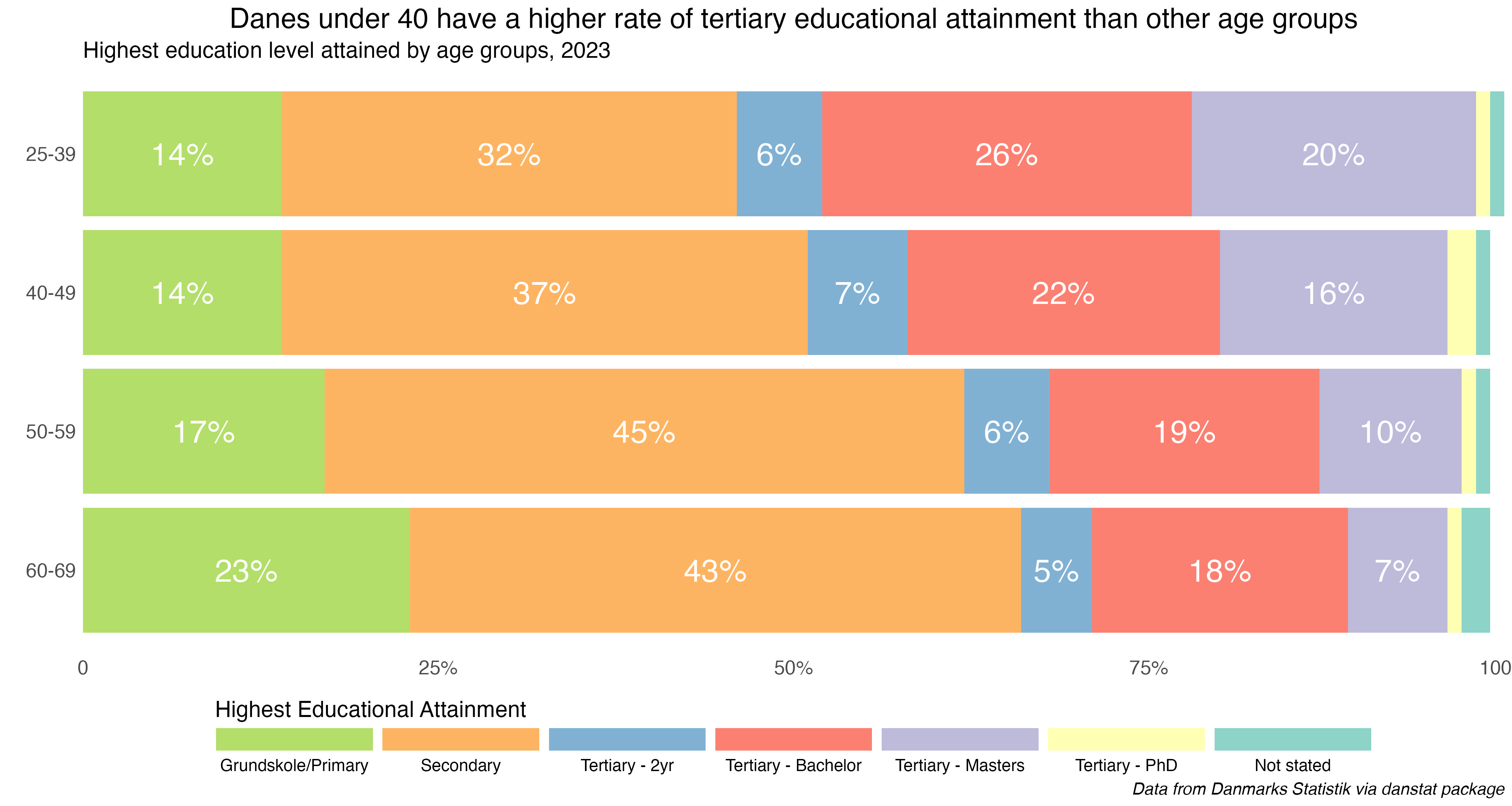
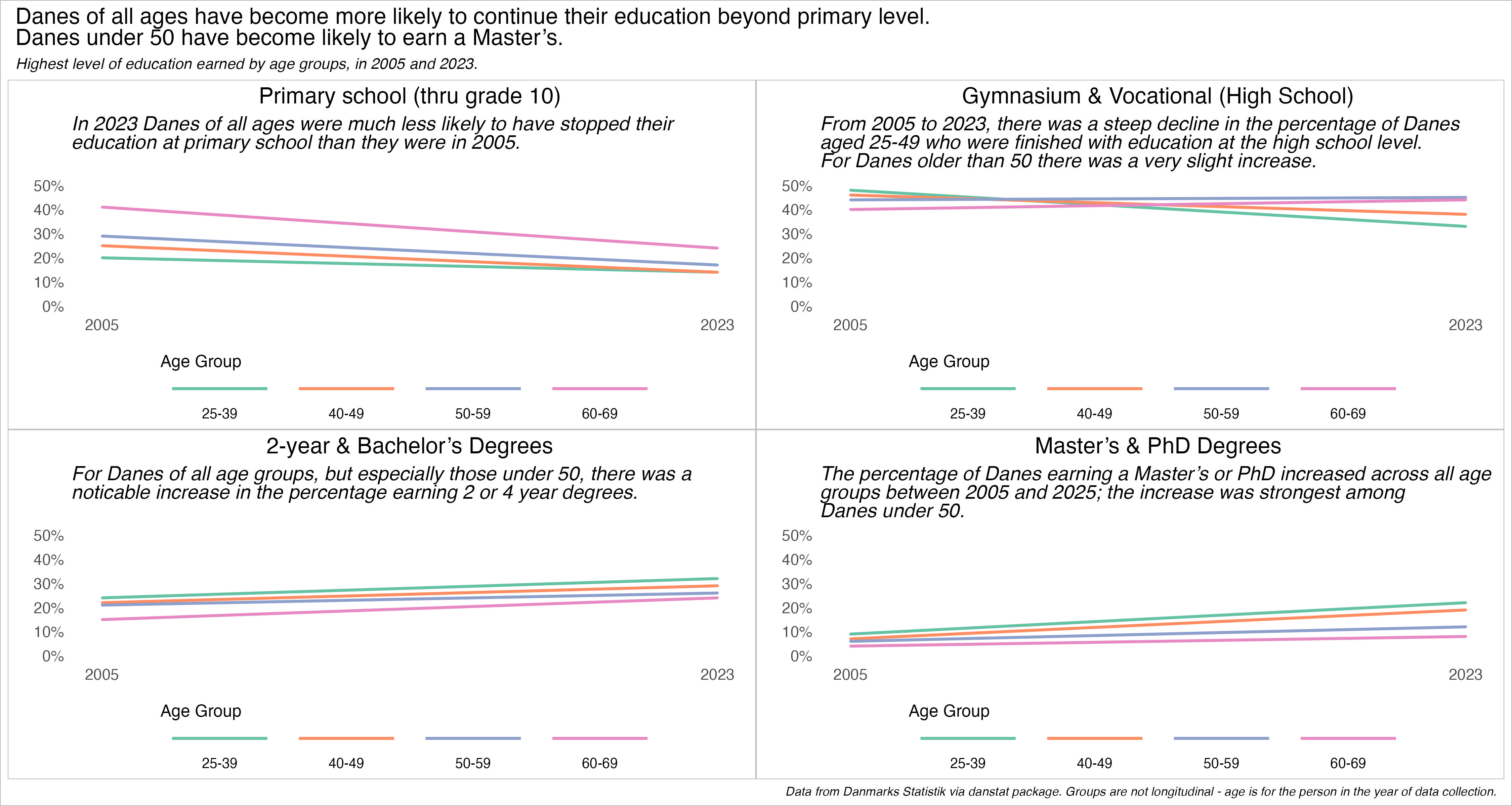
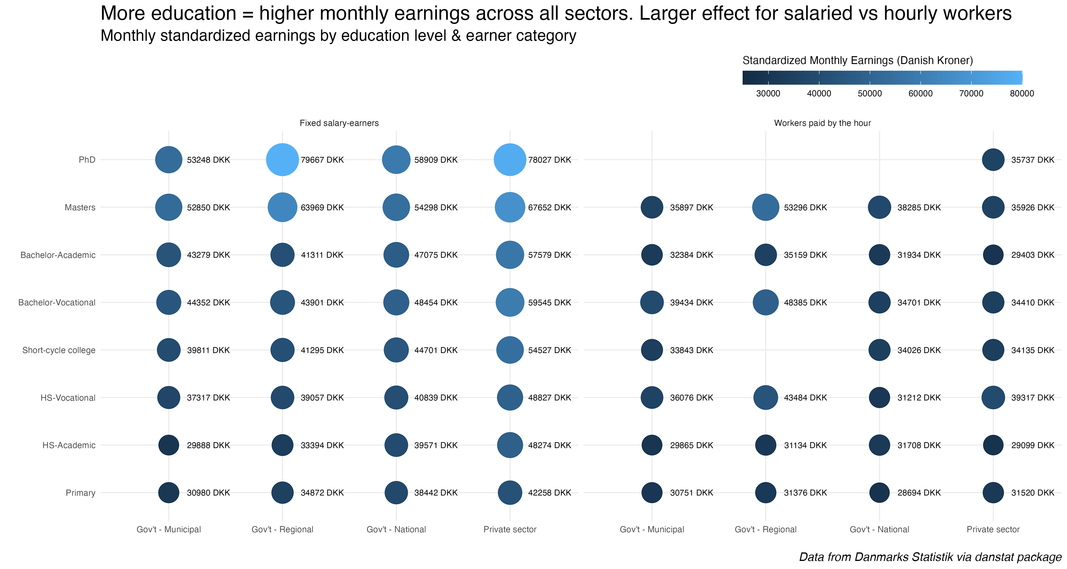
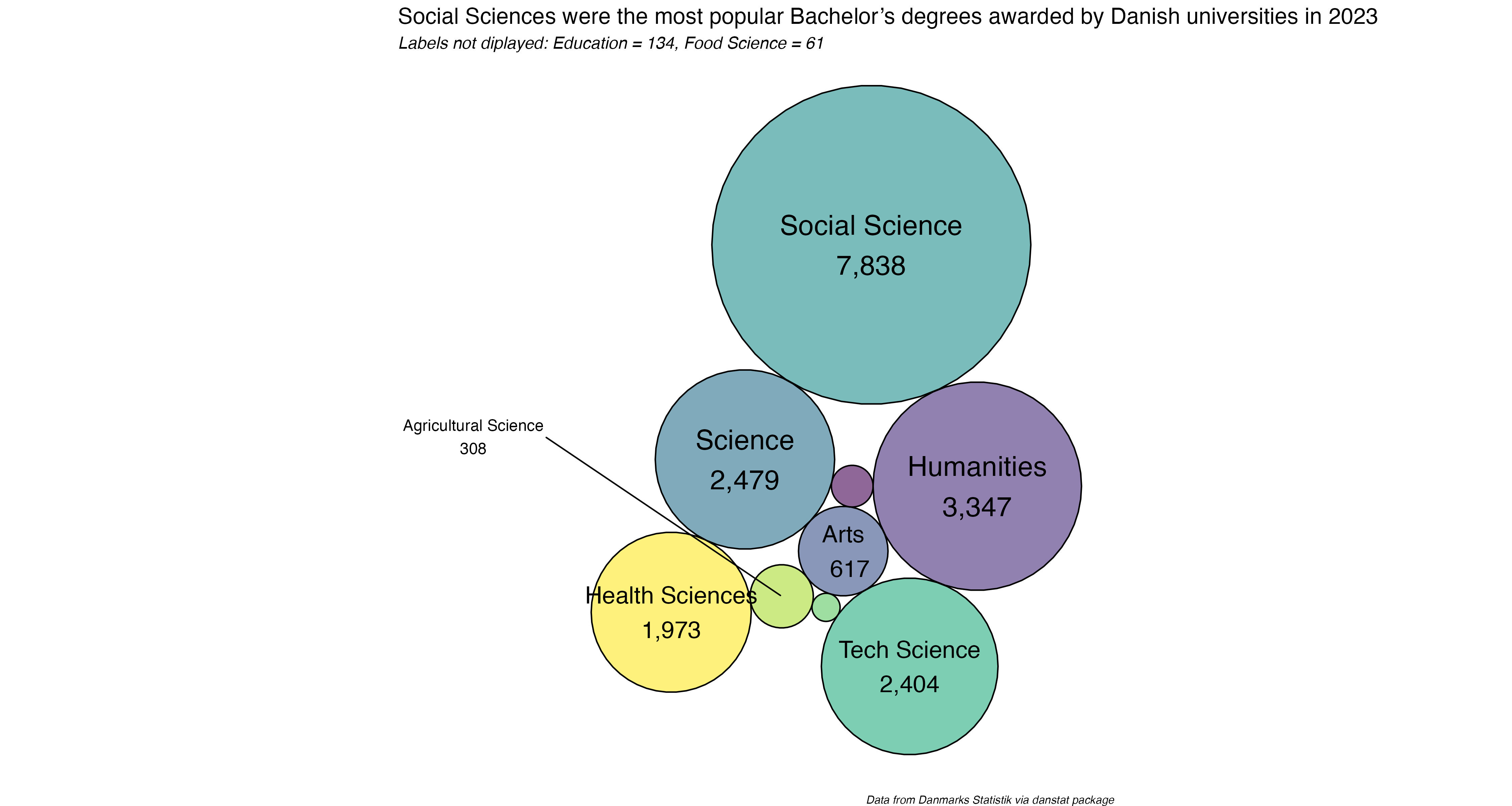
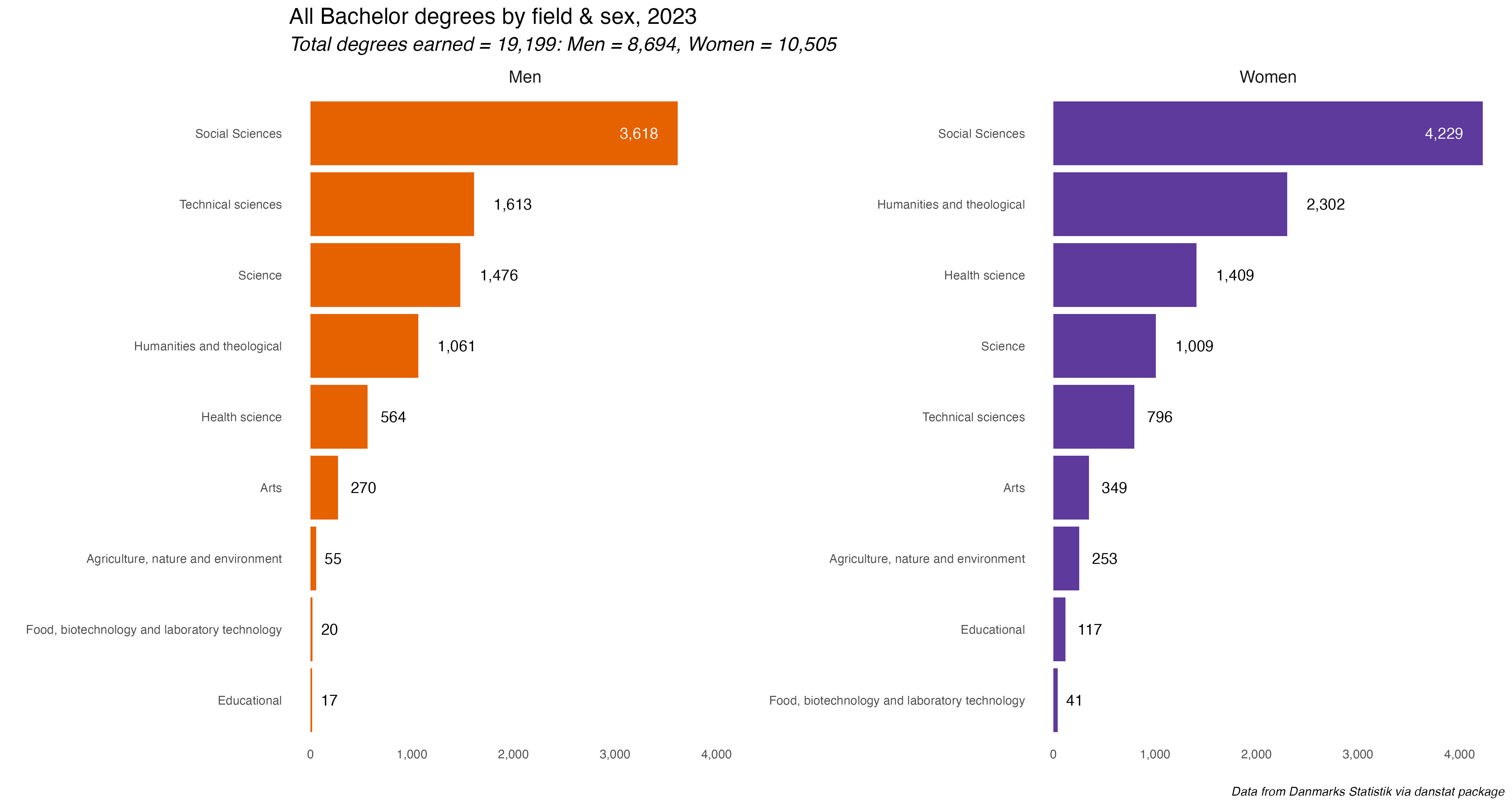
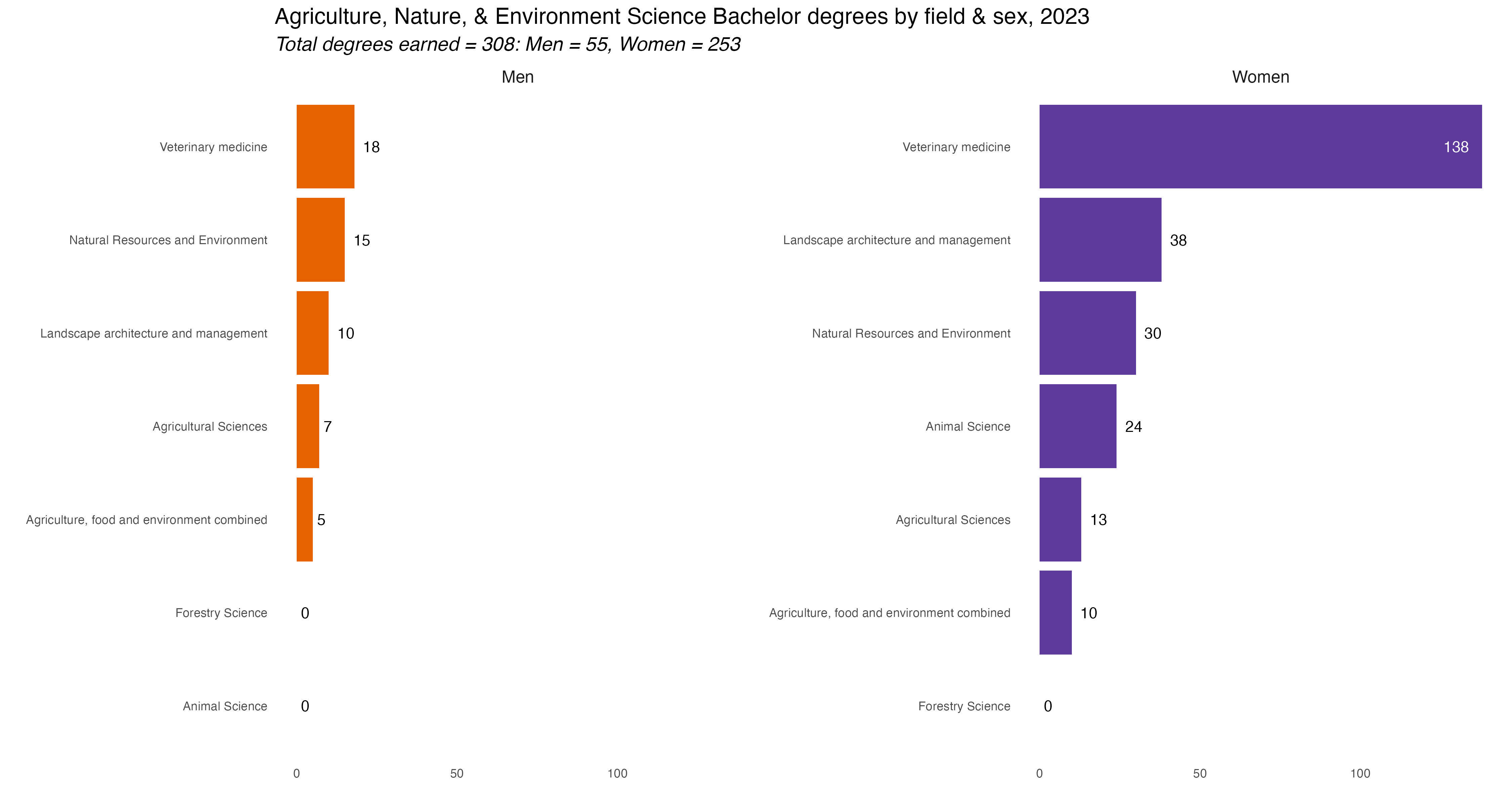
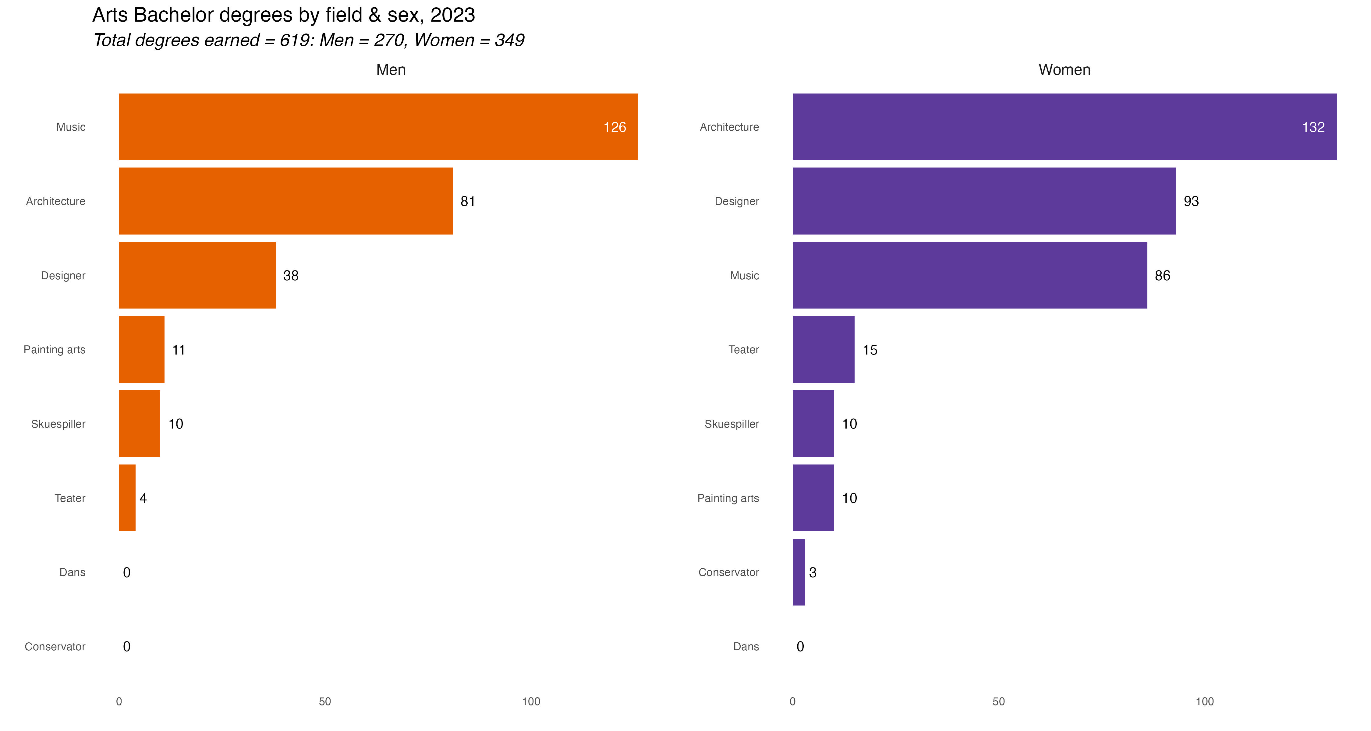

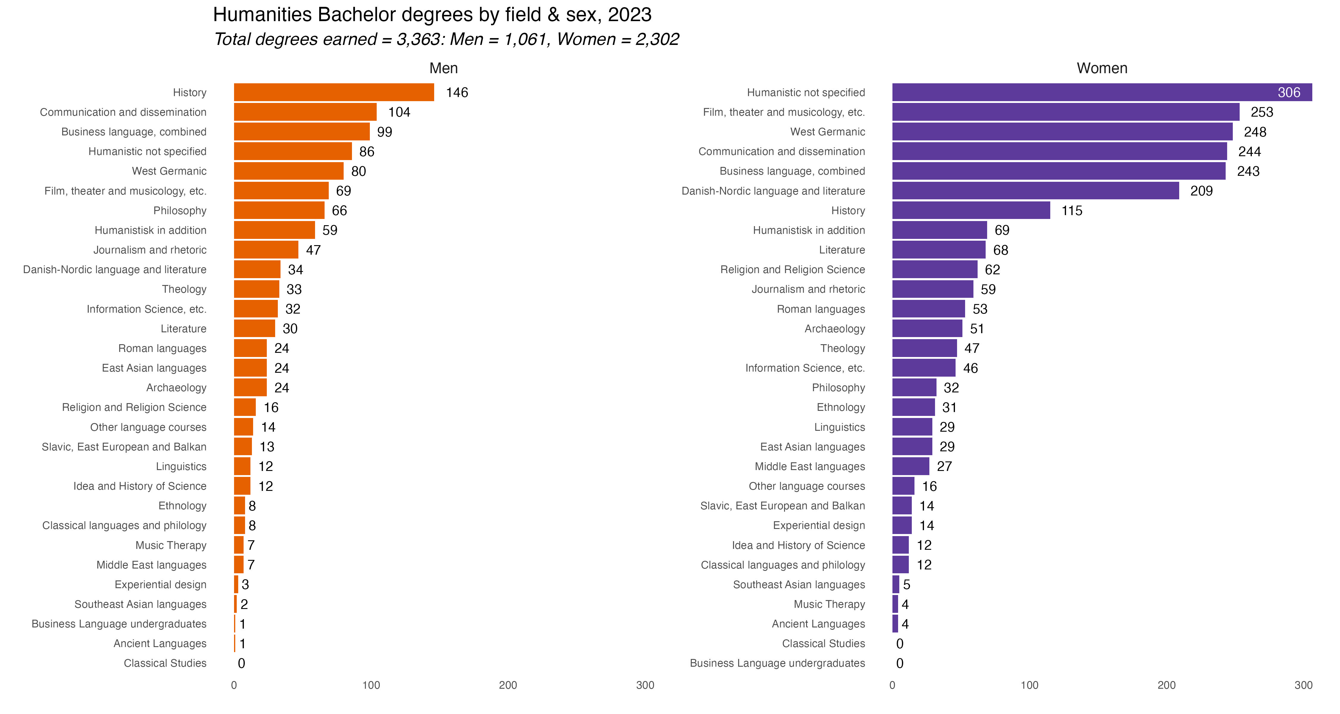
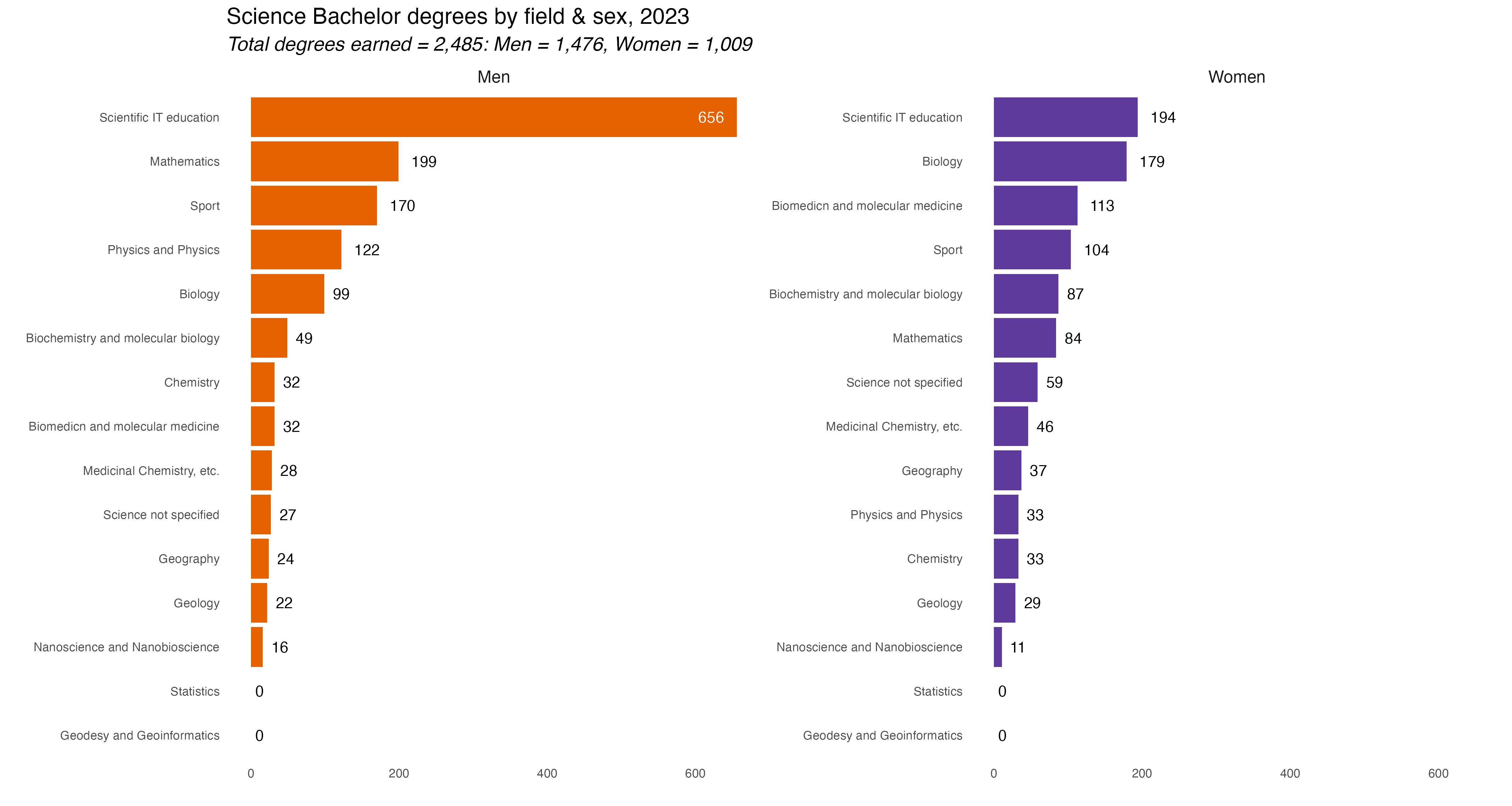
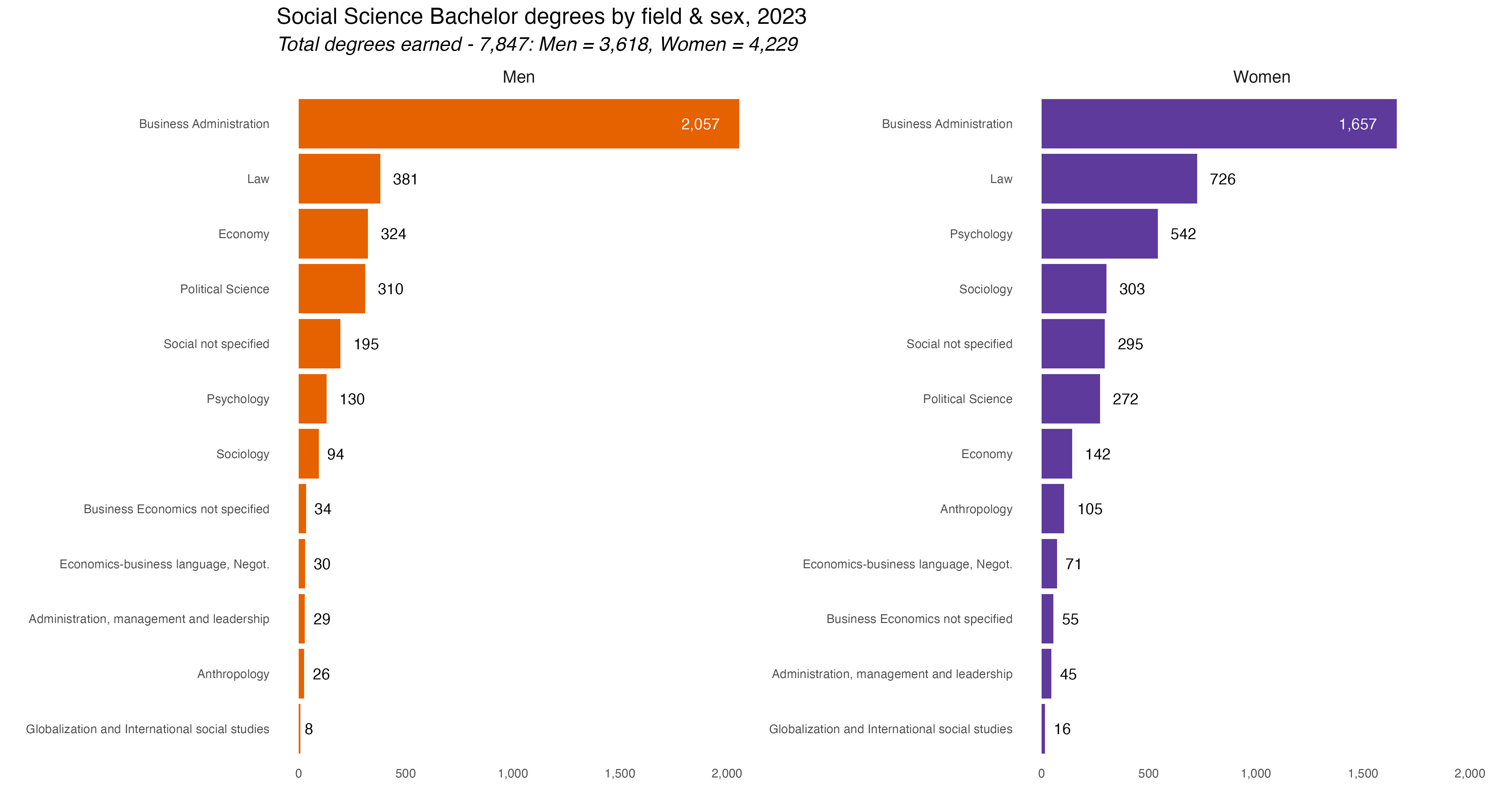
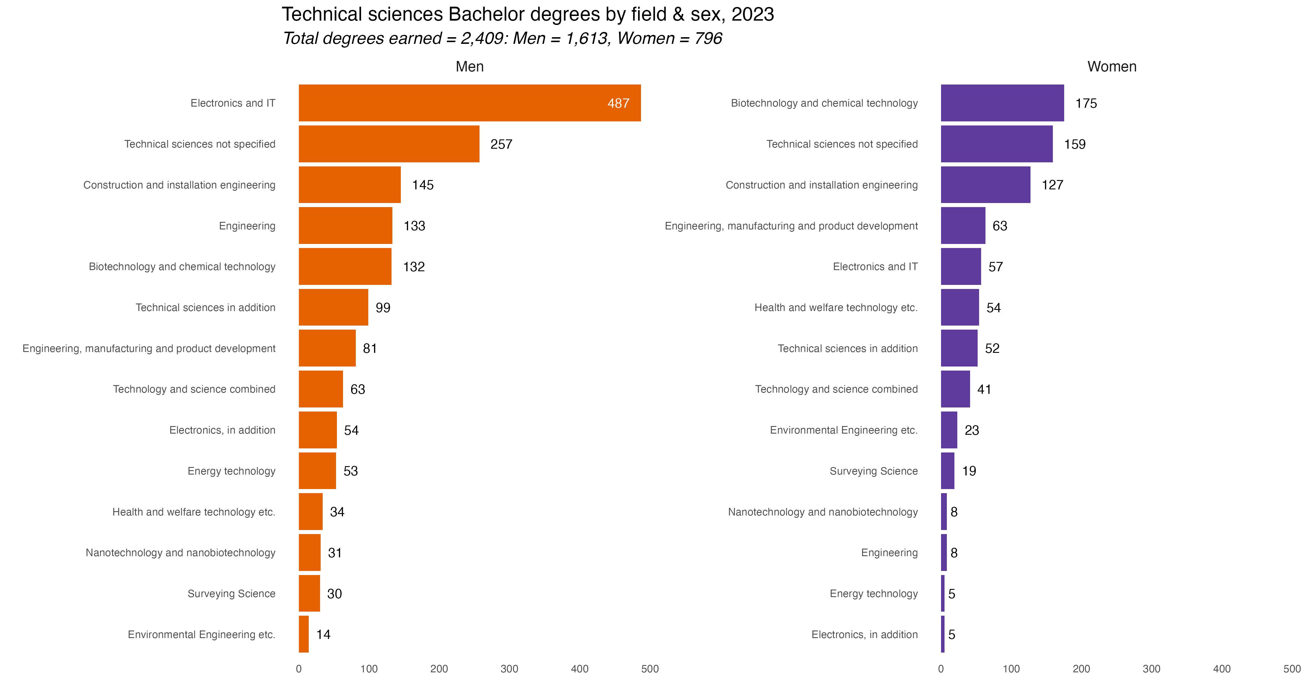
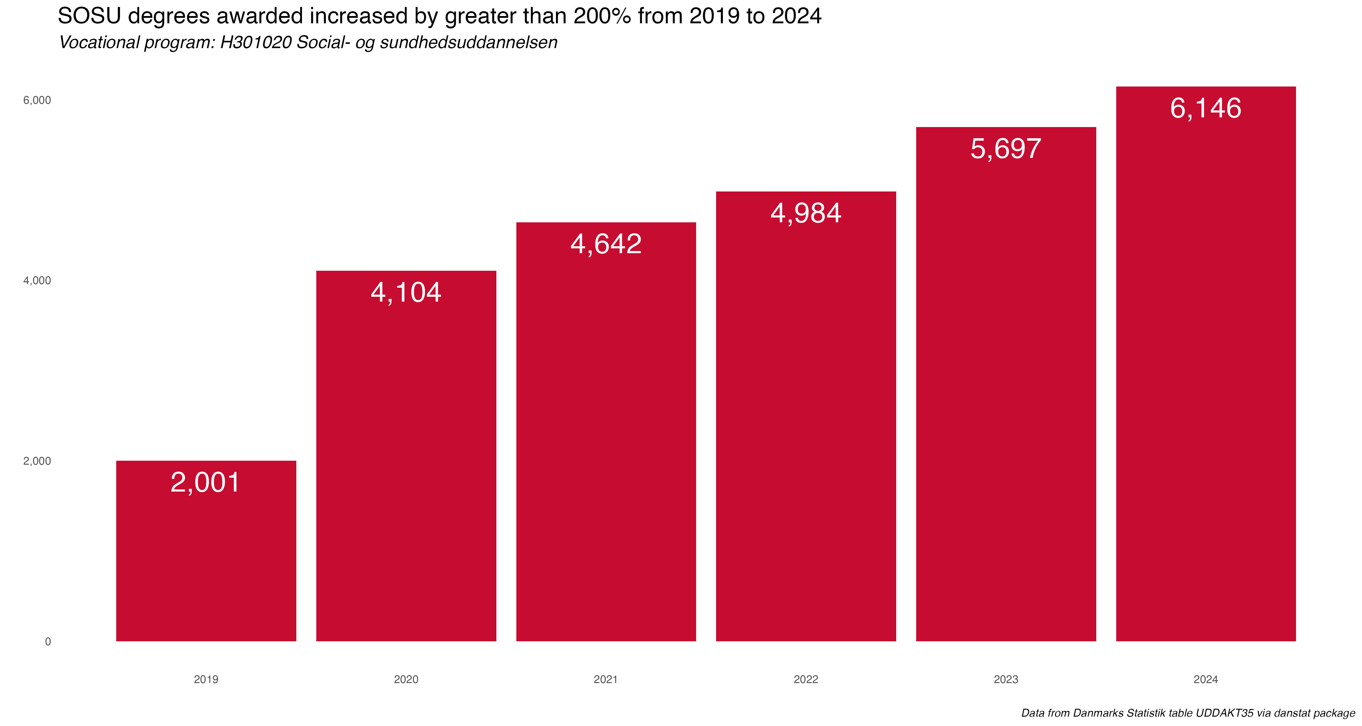
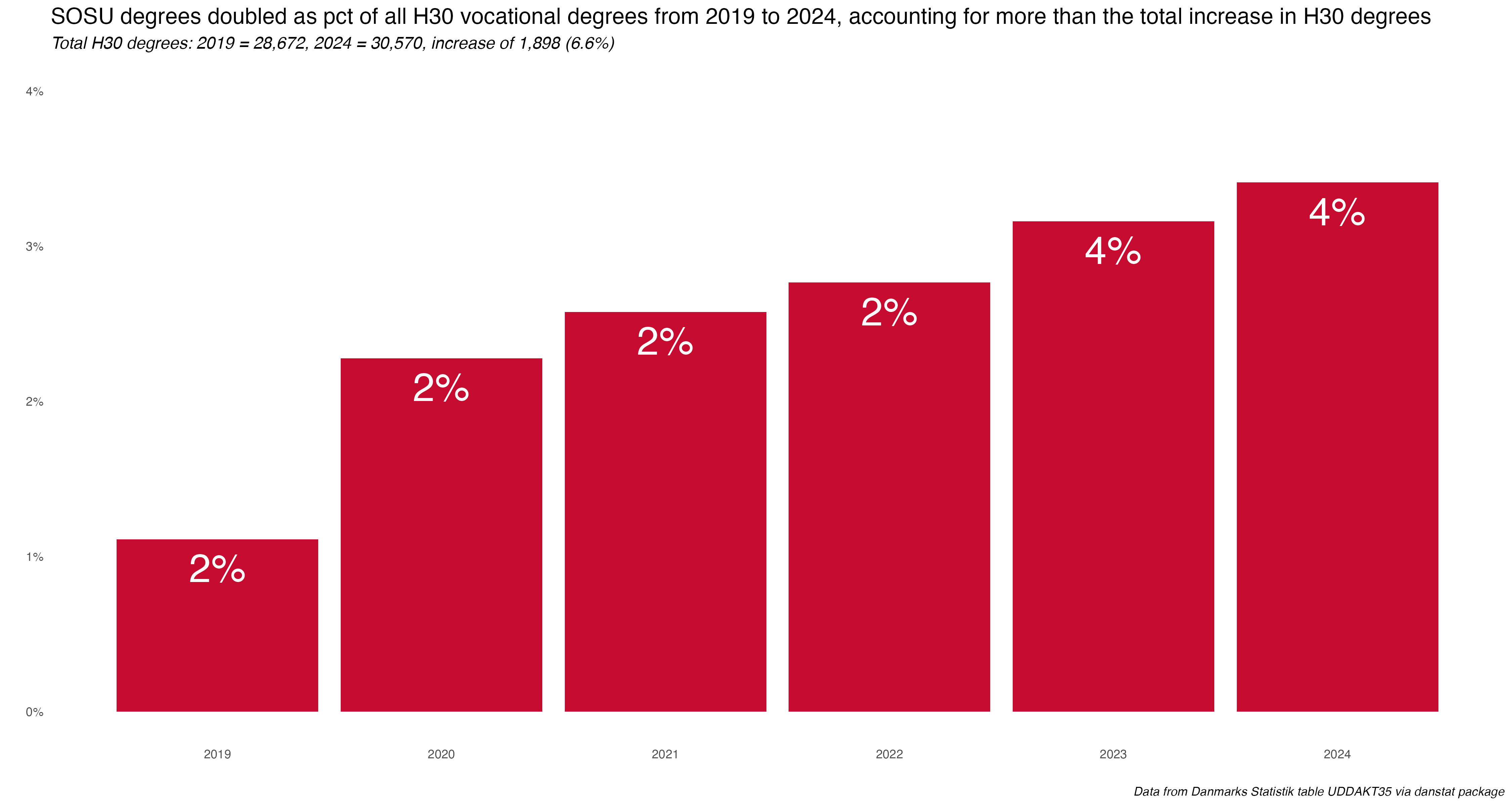
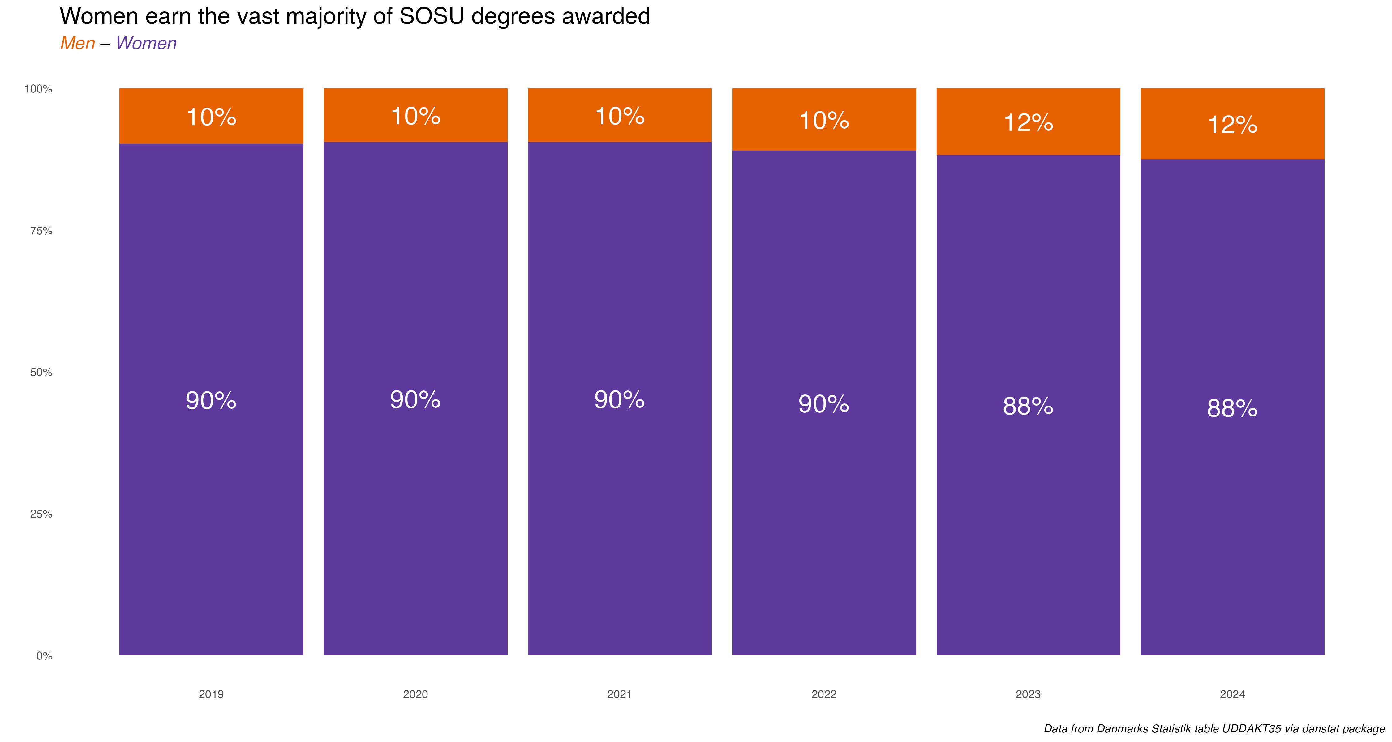
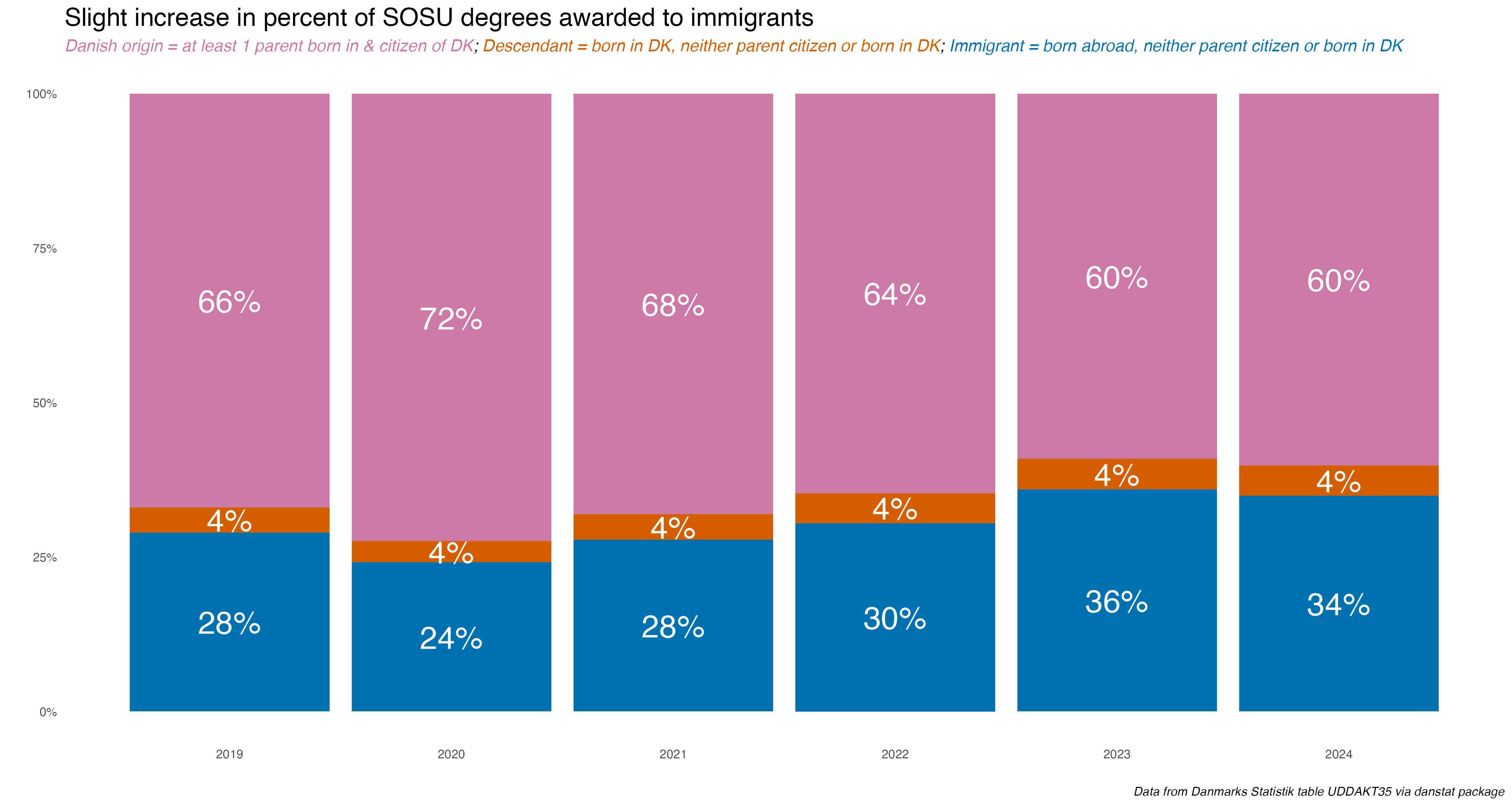
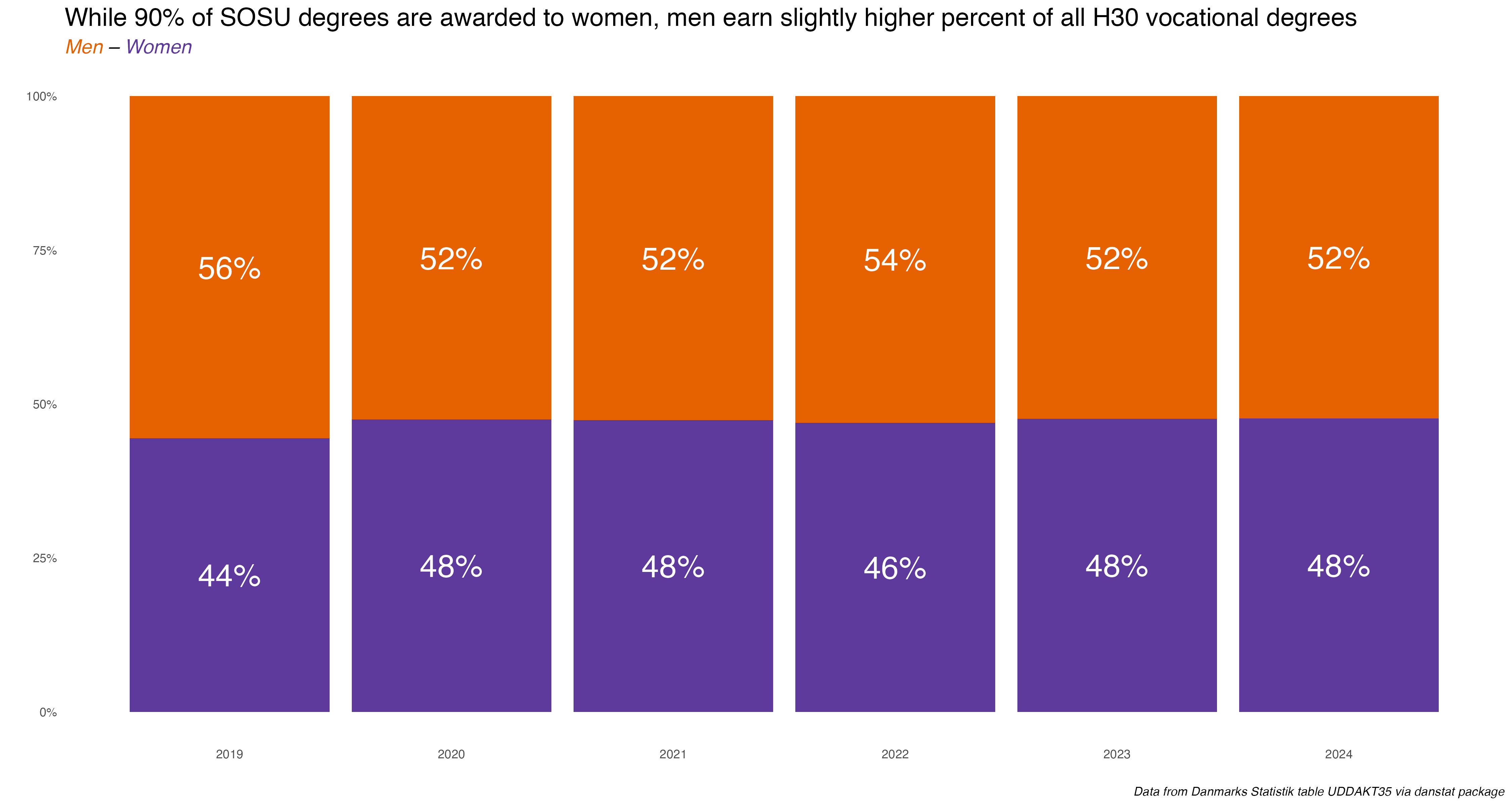
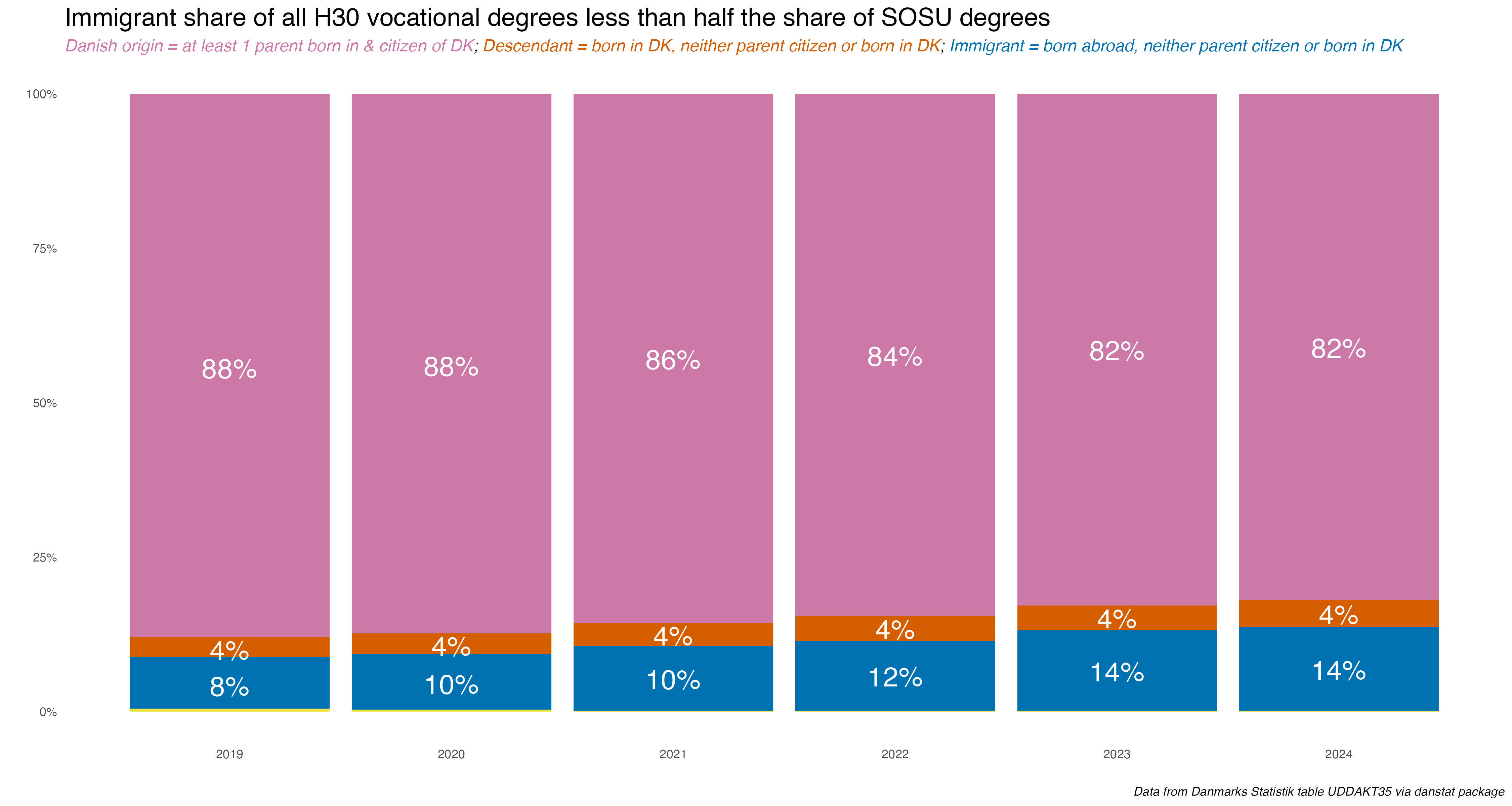
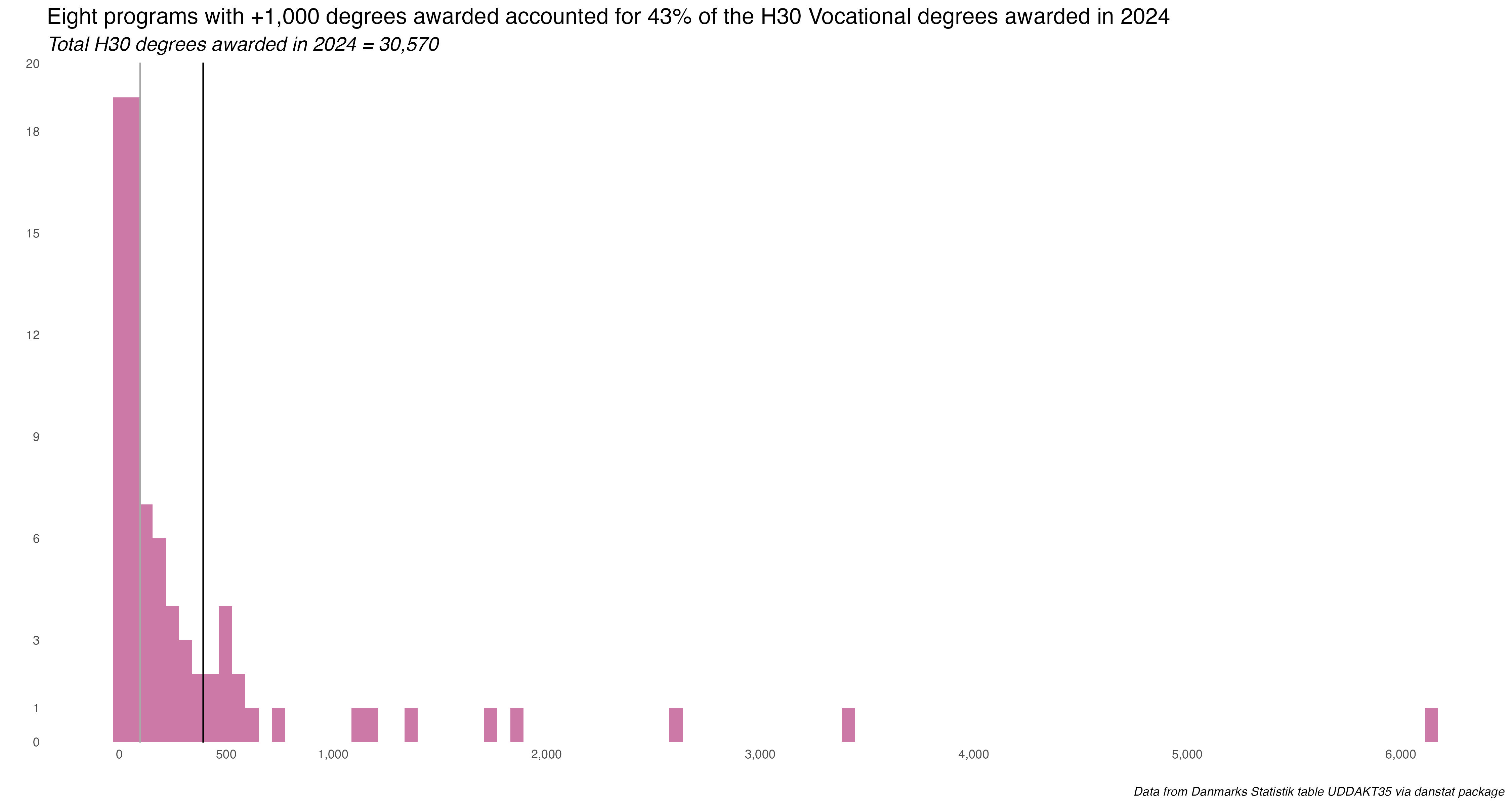
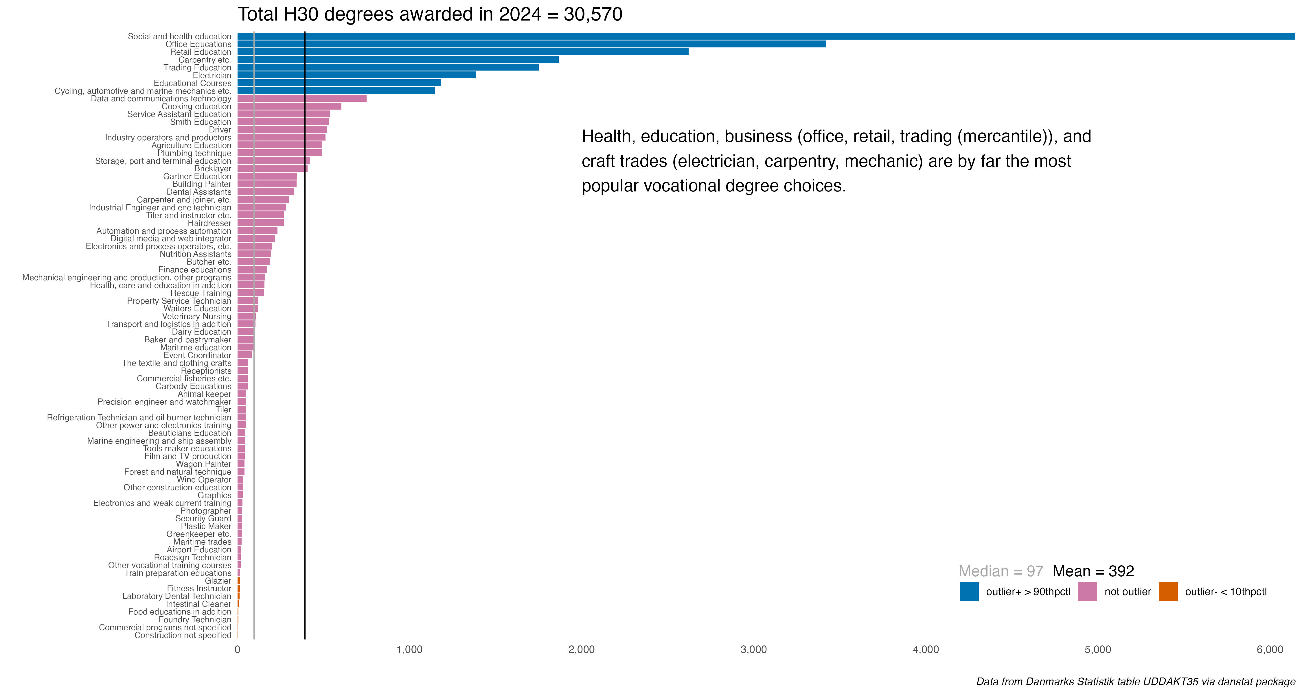
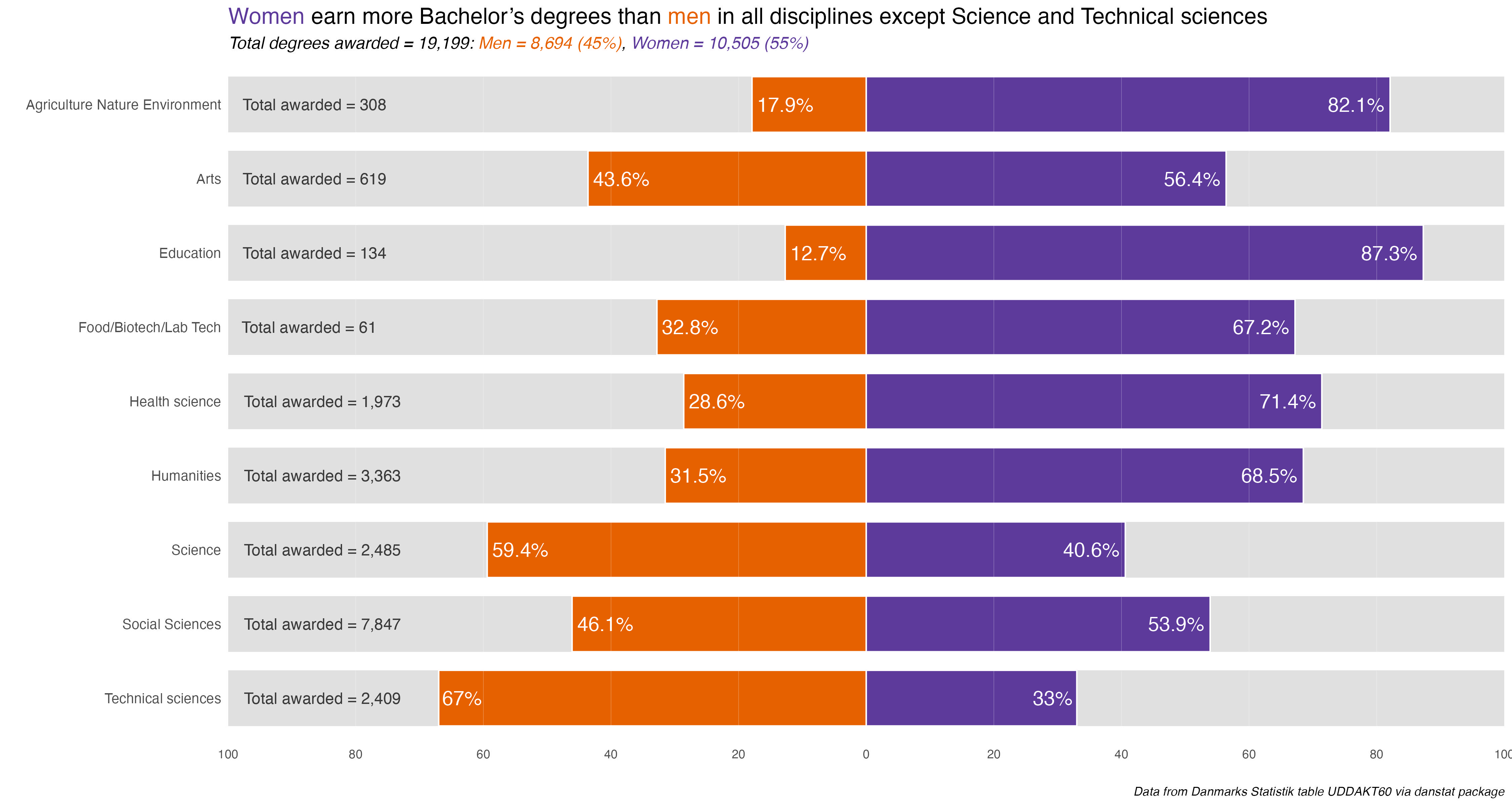
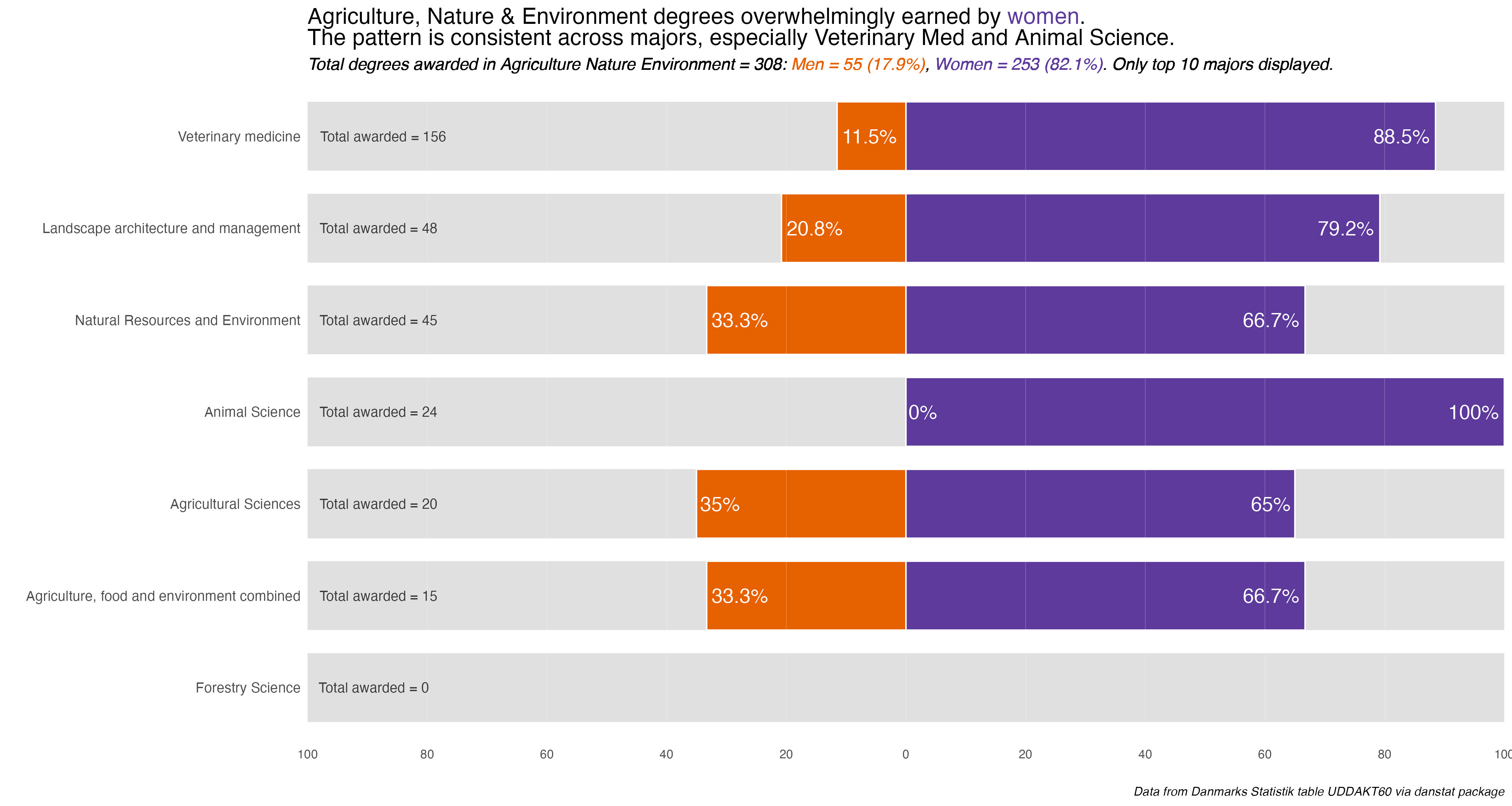
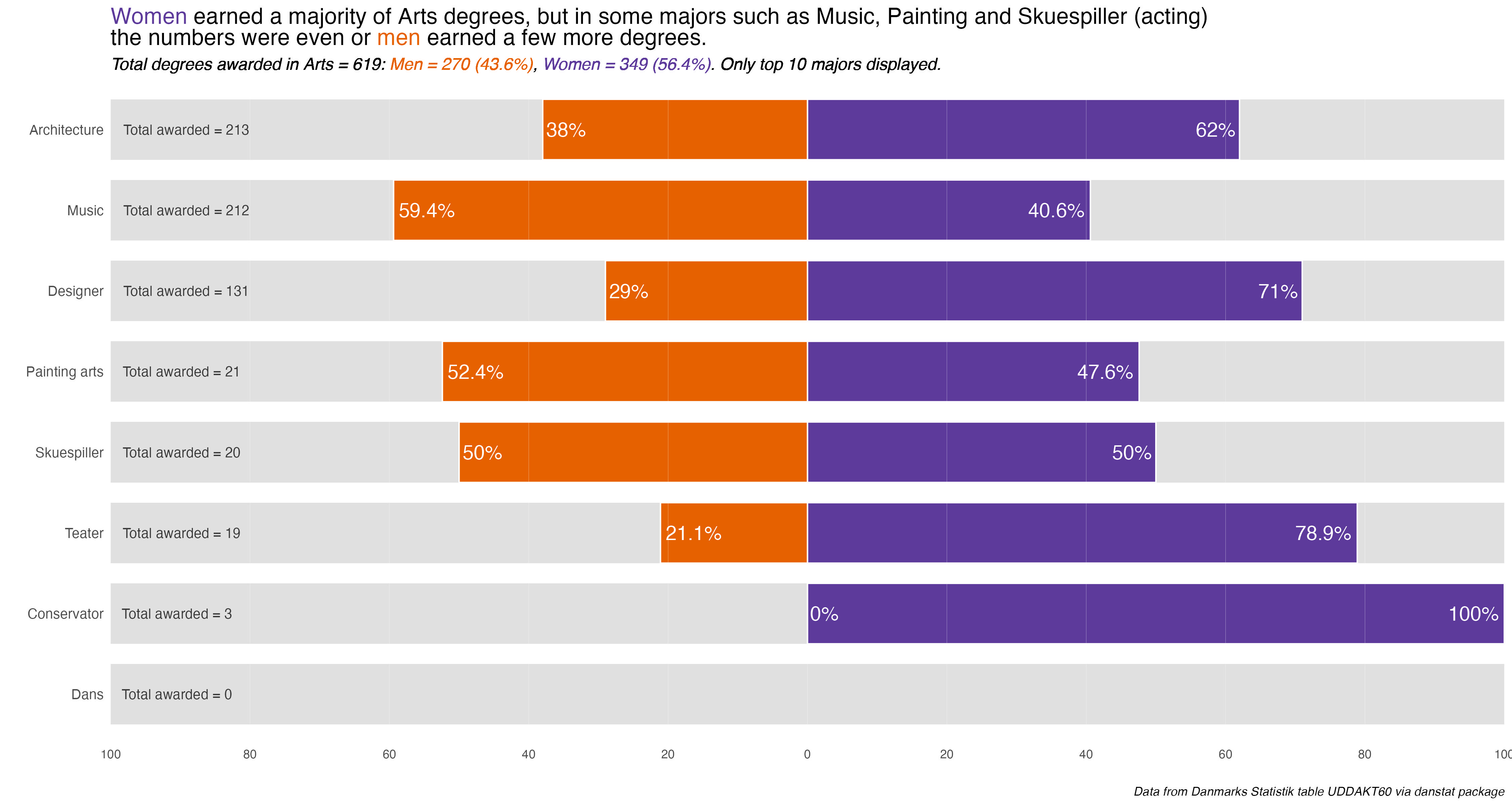
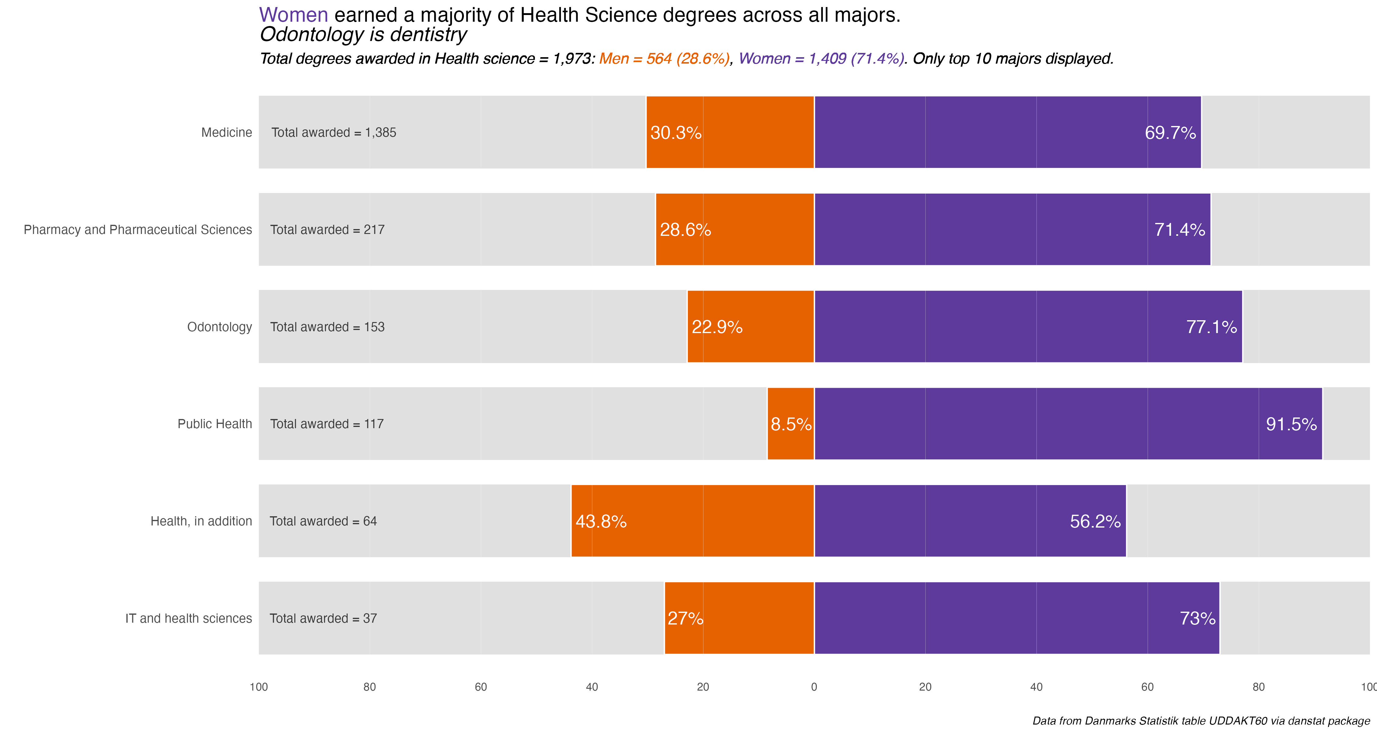
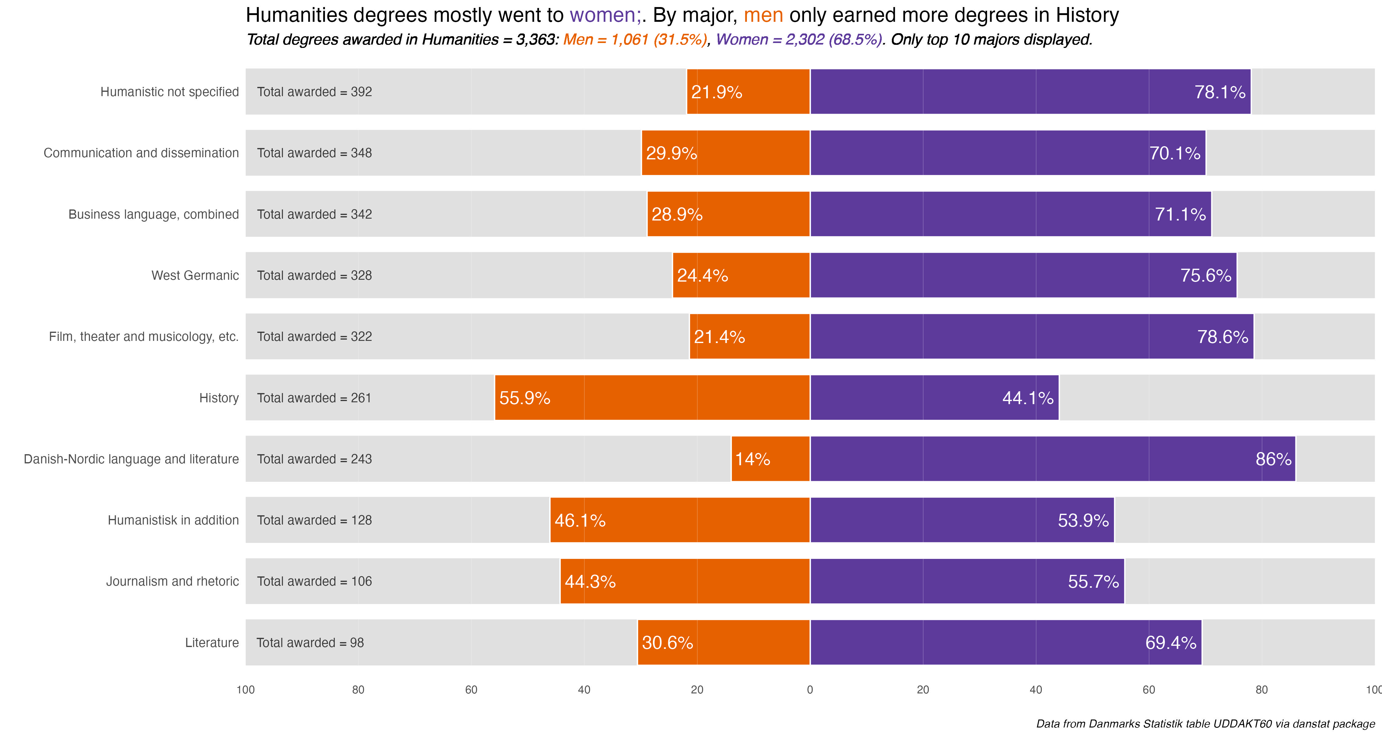
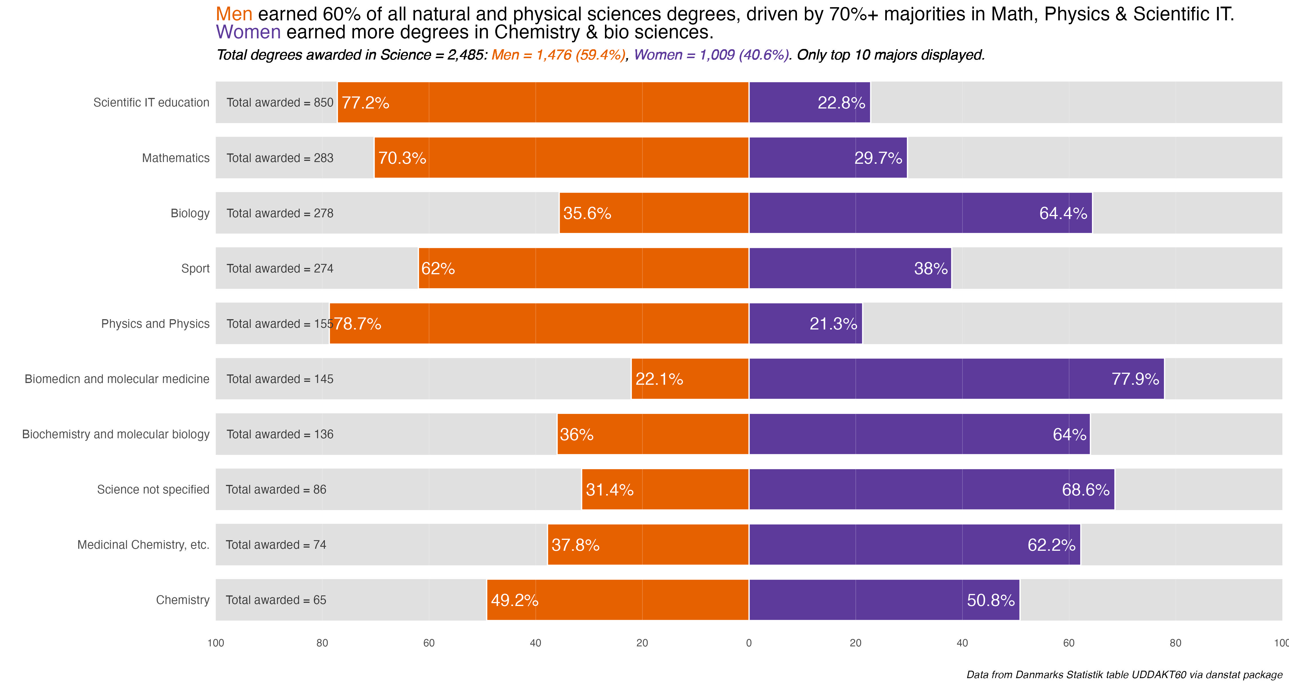
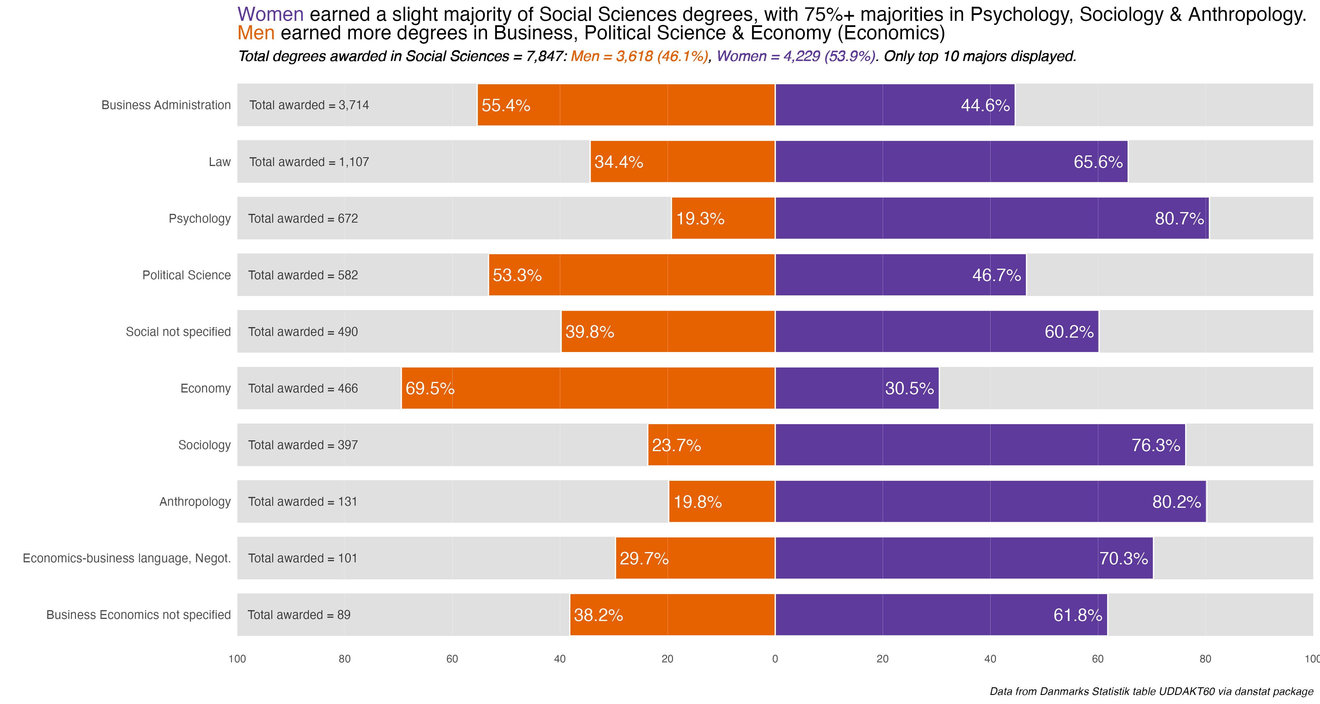
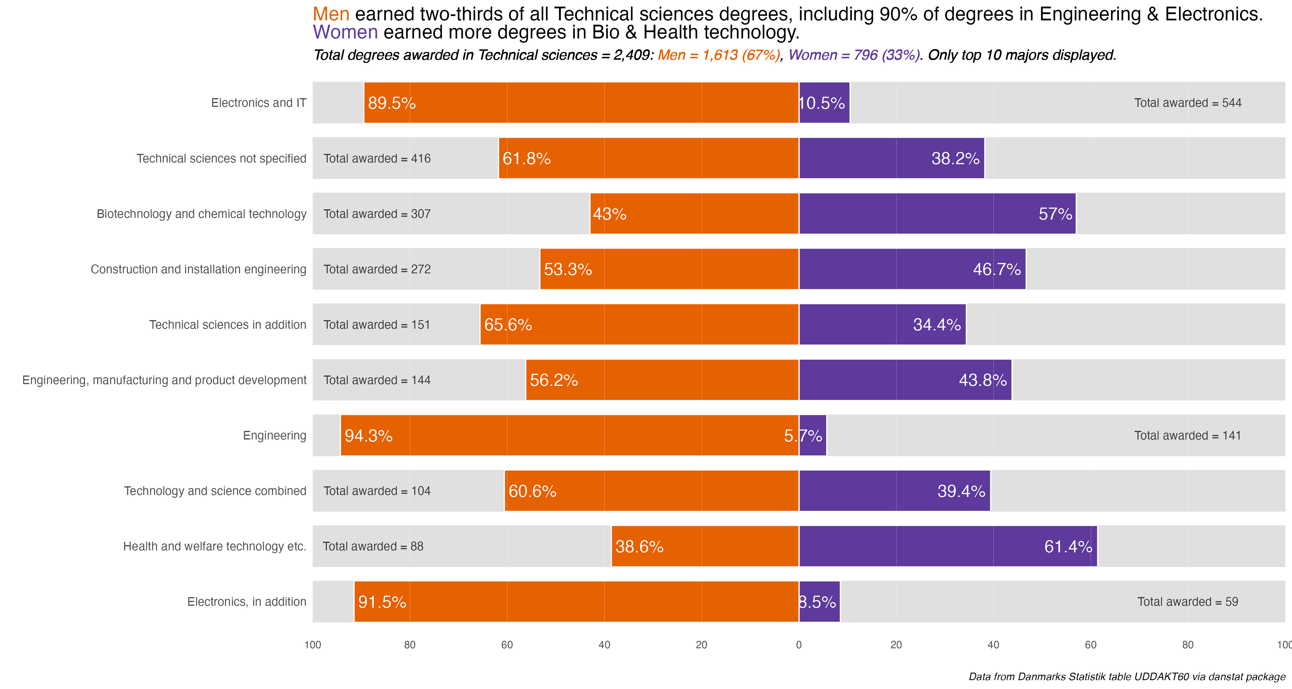
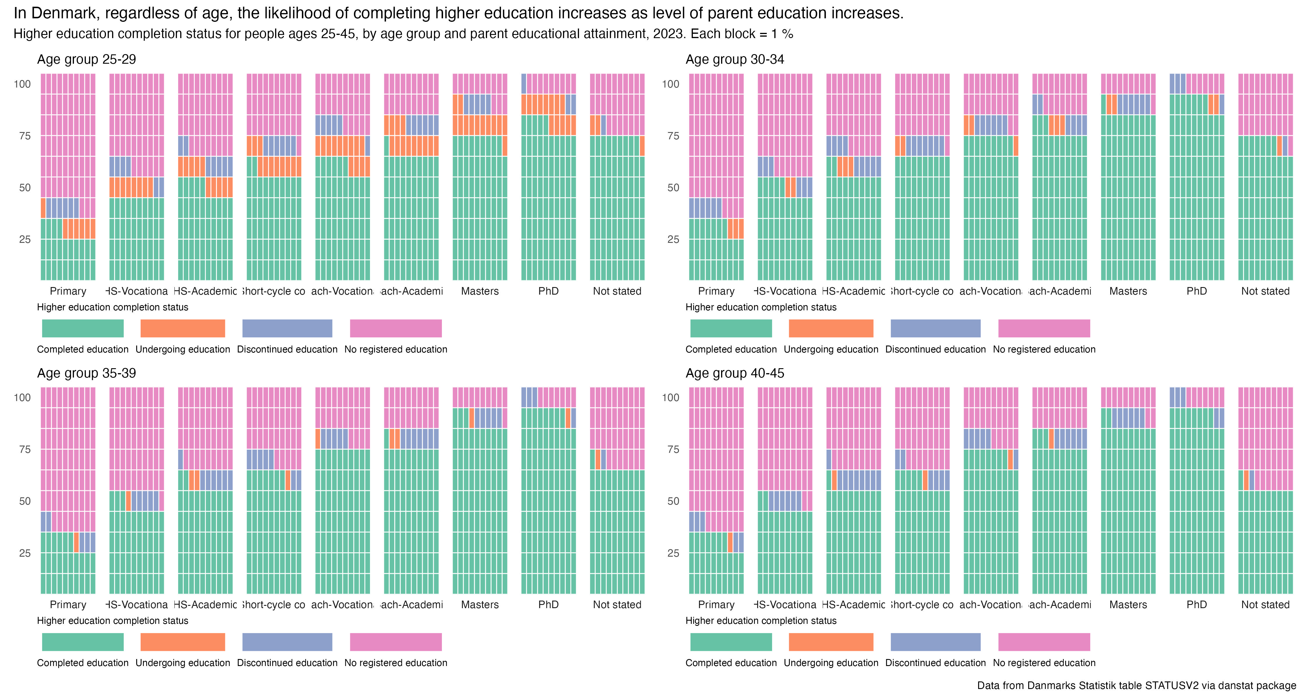
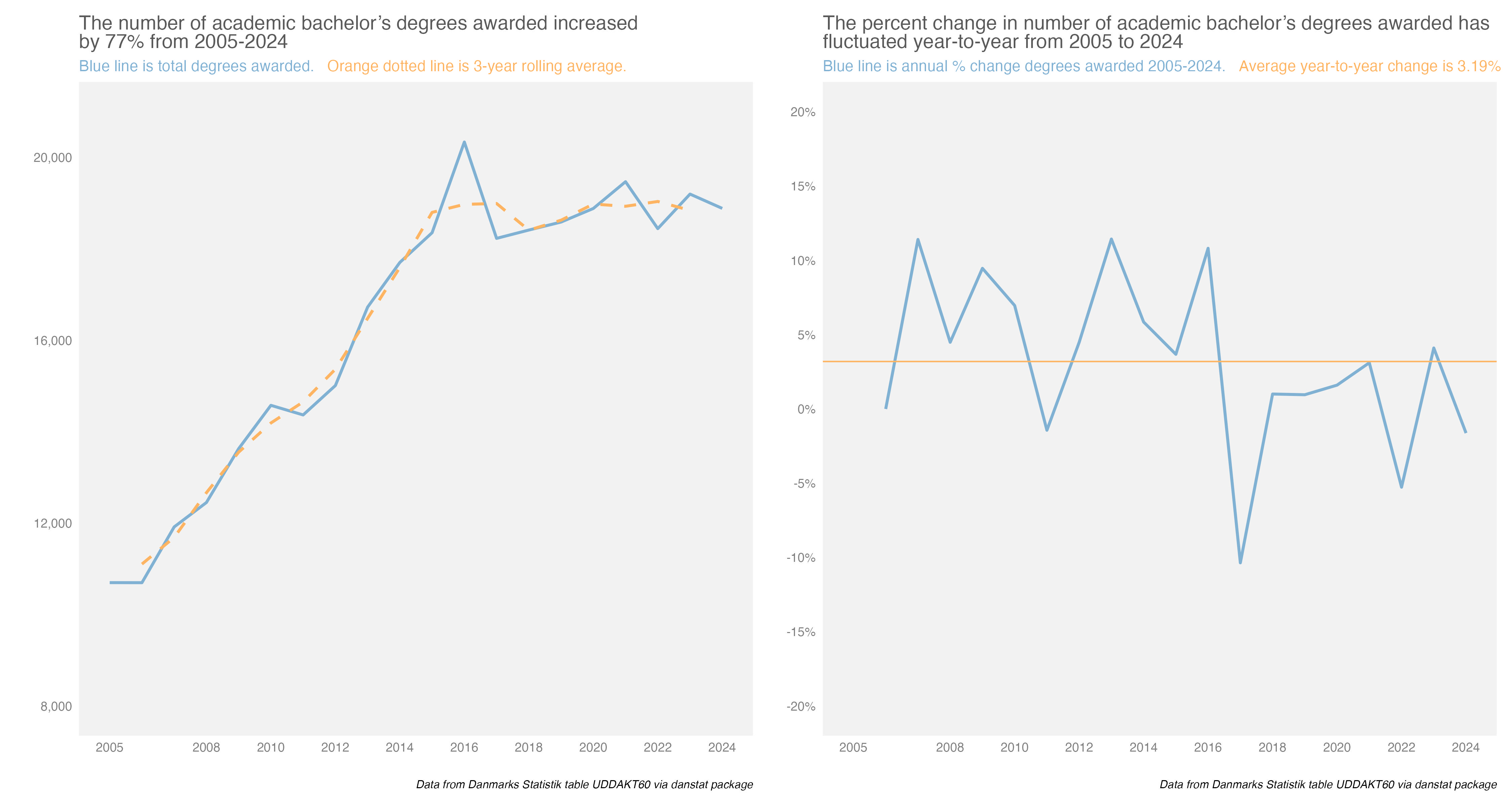
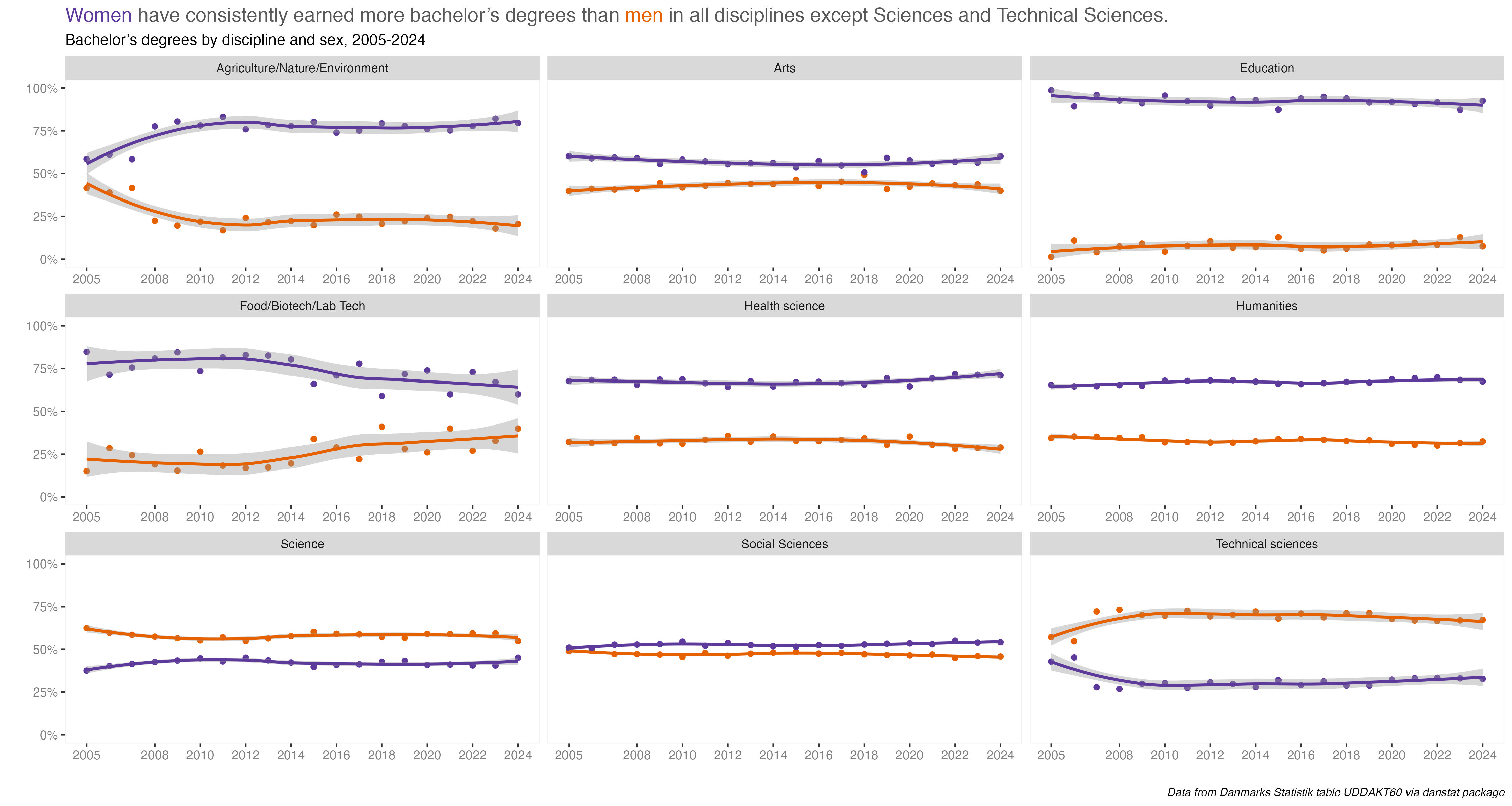
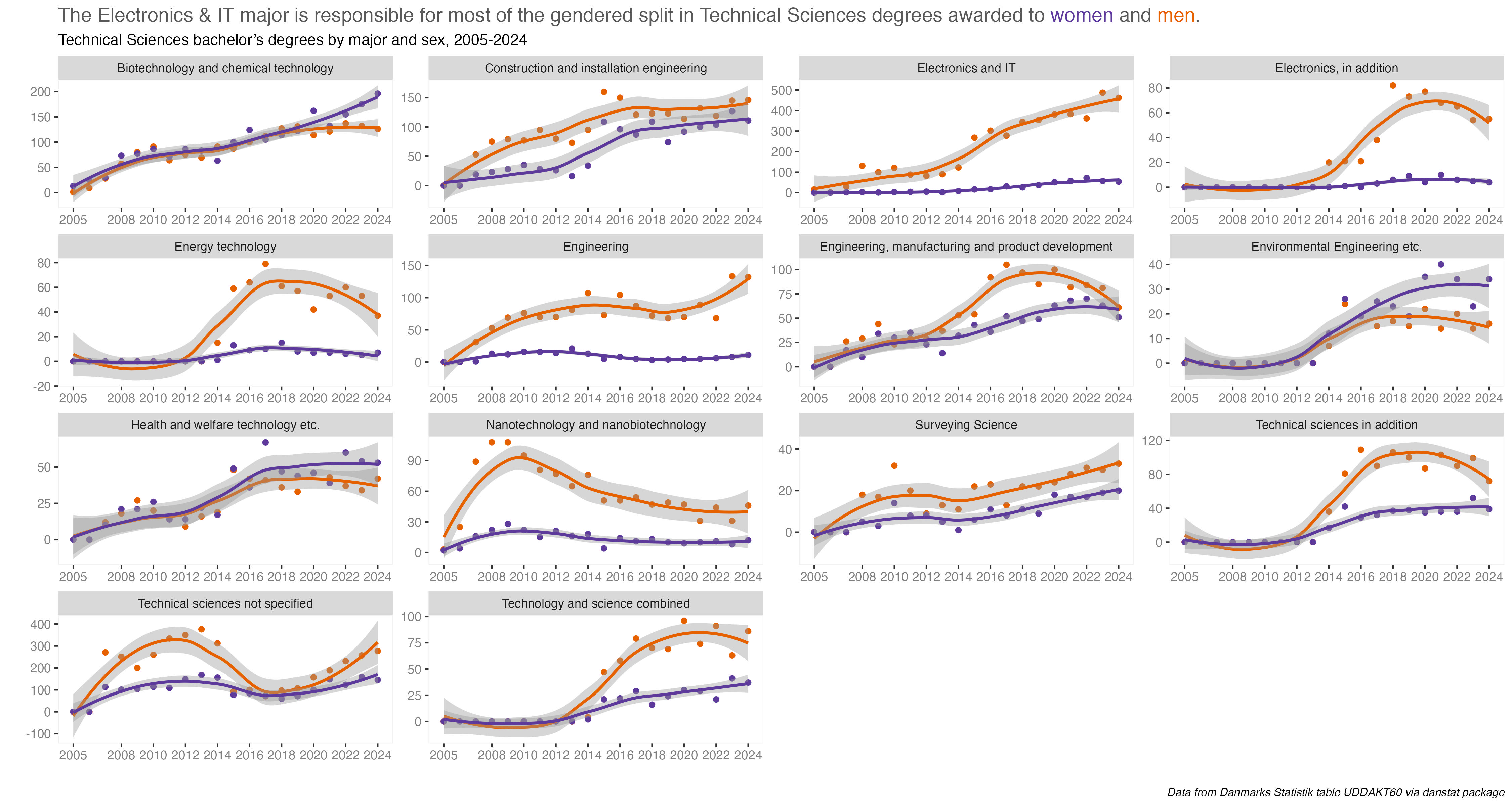
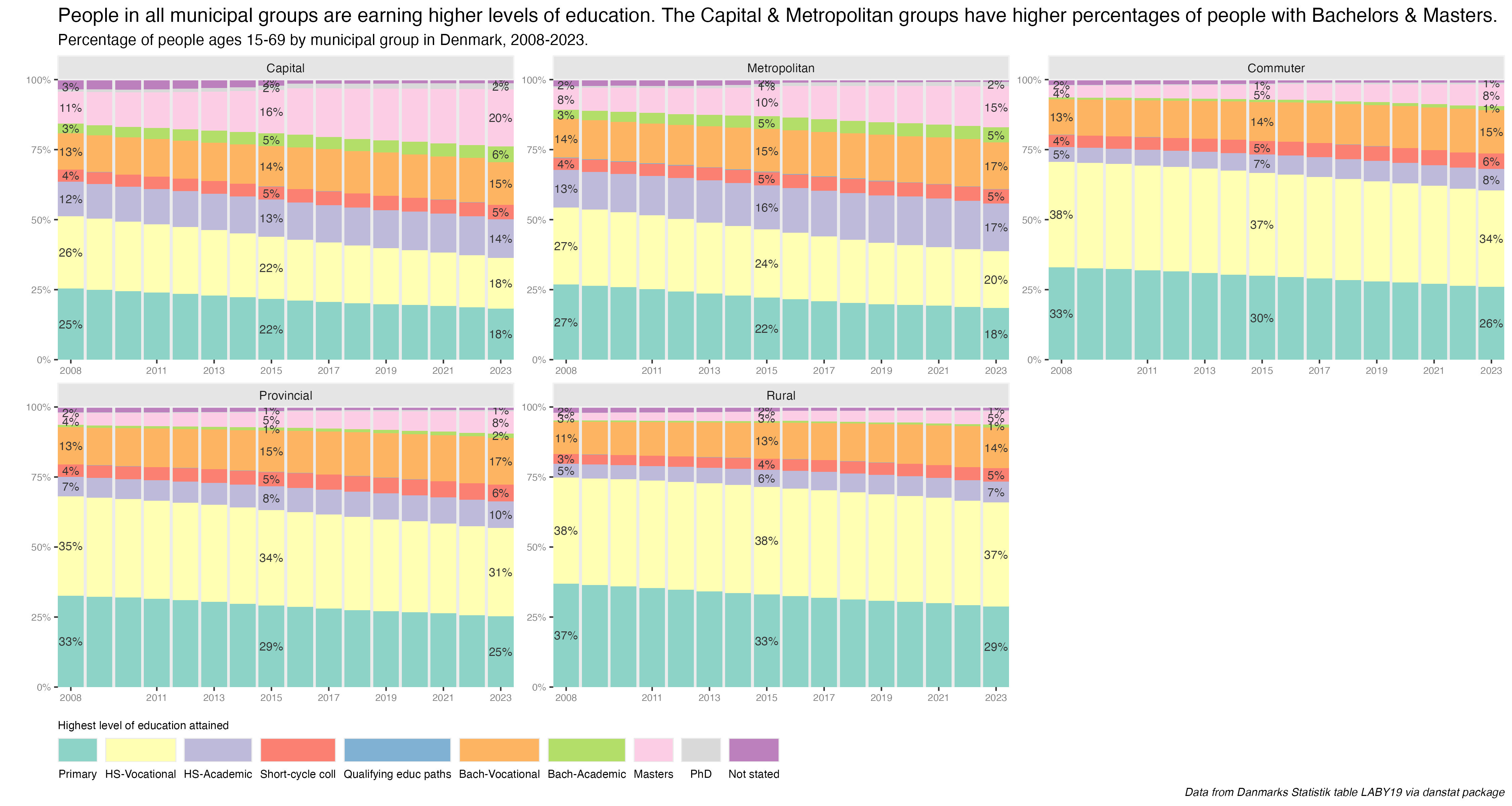

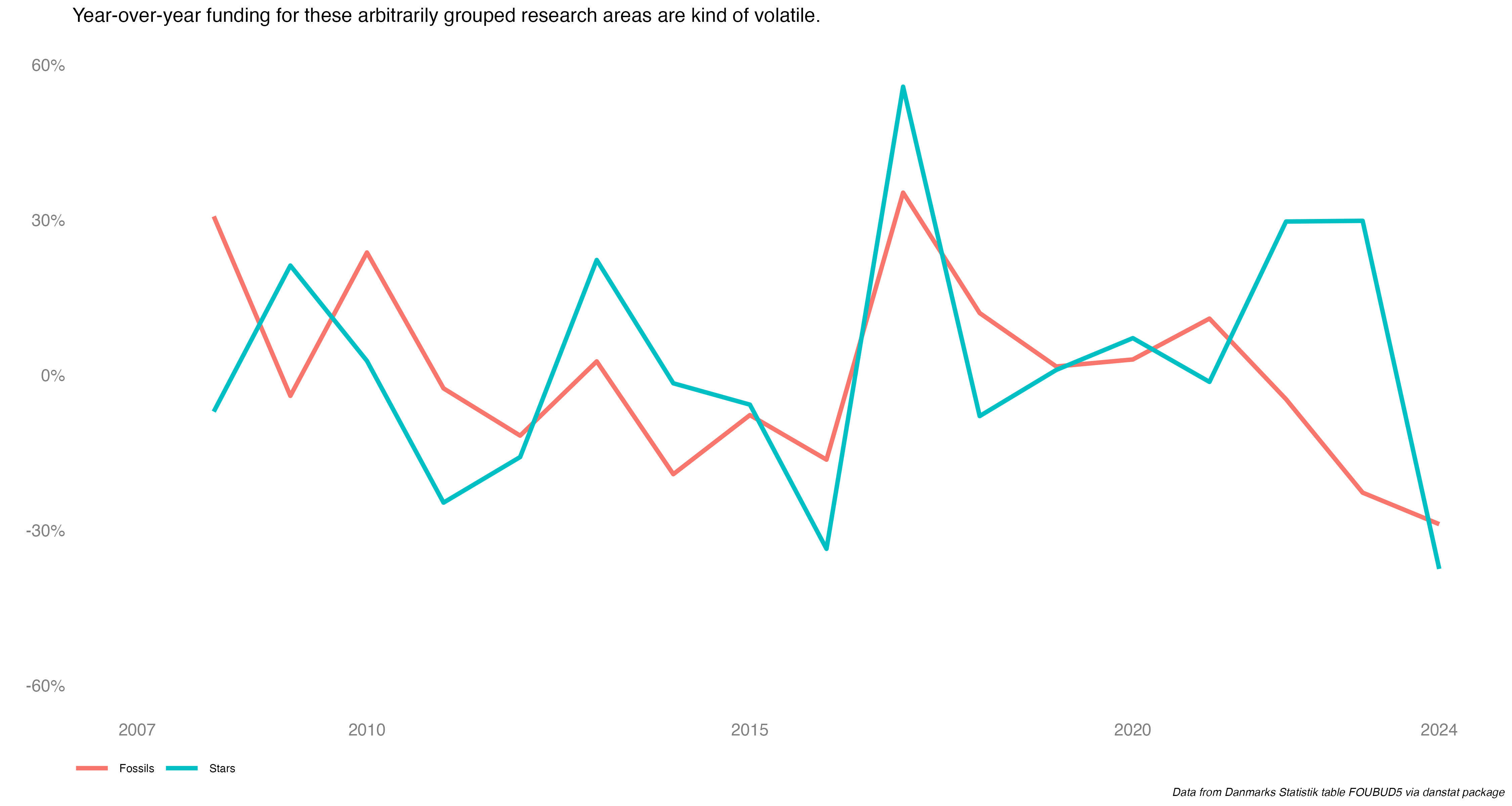
 But for now let’s get back to the log scale prompt we’re here to work on.