waffleplot <- function(plotdf, filter_expr) {

    # Convert the string expression to an actual R expression
    filter_expr <- rlang::parse_expr(filter_expr)
    # Filter the data
    filtered_df <- plotdf %>% filter(!!filter_expr)

    # Create the plot
    ggplot(filtered_df, (aes(fill = child_ed, values = age_par_ed_child_ed_pct2))) +
        geom_waffle(na.rm=TRUE, n_rows=10, flip=TRUE, size = 0.33, colour = "white") +
        facet_wrap(~parent_ed, nrow=1,strip.position = "bottom", scales = "free_x") +
        scale_x_discrete(labels = ) +
        scale_y_continuous(labels = function(x) x * 10, # make this multipler the same as n_rows
            expand = c(0,0)) +
        scale_fill_brewer(palette = "Set2") +
        theme_minimal() +
        theme(legend.position = "bottom", legend.justification = "left",
            legend.spacing.x = unit(0, 'cm'),
            legend.key.width = unit(1, 'cm'), legend.margin=margin(-10, 0, 0, 0),
            legend.title = element_text(size = 8), legend.text = element_text(size = 8),
            panel.grid.major = element_blank(), panel.grid.minor = element_blank()) +
        guides(fill = guide_legend(label.position = "bottom",
            title = "Higher education completion status", title.position = "top"))
}

# create the plots with filters
plot_2529 <- waffleplot(ed_attain_waffle, "child_age_group == '25-29'")
plot_3034 <- waffleplot(ed_attain_waffle, "child_age_group == '30-34'")
plot_3539 <- waffleplot(ed_attain_waffle, "child_age_group == '35-39'")
plot_4045 <- waffleplot(ed_attain_waffle, "child_age_group == '40-45'")

### add titles to the plots
plot_2529 <-
plot_2529 +
    labs(subtitle = "Age group 25-29")

plot_3034 <-
    plot_3034 +
    labs(subtitle = "Age group 30-34")

plot_3539 <-
plot_3539 +
    labs(subtitle = "Age group 35-39")

plot_4045 <-
plot_4045 +
    labs(subtitle = "Age group 40-45")

# stitch the plots together with patchwork
plot_2529 + plot_3034 +  plot_3539 + plot_4045 +
    plot_annotation(
        title = "In Denmark, regardless of age, the likelihood of completing higher education increases as level of parent education increases.",
        subtitle = "Higher education completion status for people ages 25-45, by age group and parent educational attainment, 2023. Each block = 1 %",
        caption = "Data from Danmarks Statistik table STATUSV2 via danstat package")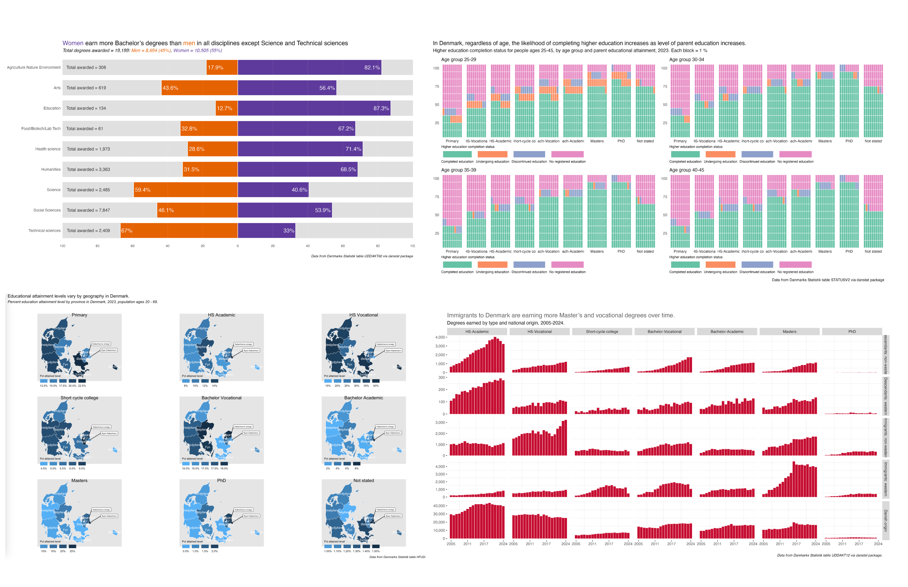
It may seem a bit navel-gazey to look back on the charts I contributed to the 30 Day Chart Challenge a full two weeks after the fact (though there was the mitigating factor of the CopenhagenR meetup talk I had to prepare), but I believe that self-reflection is good for one’s own learning and development. Also, the spirit of this blog is as much about teaching and how-tos as it is a portfolio of my work.
So what’s the plan for this post?
- First I’ll examine why the constraints I set for myself were the right choice.
- Then I’ll write a bit about the value of consistent work.
- After that, a few words on the value of diving deep into one topic over a short period of time.
- And finally, a look at some of my favorite visualizations and some valuable by-products of the work.
The 30 Day Chart Challenge is a social-media-driven project created by Dominic Royé and Cédric Scherer. Cedric’s blog in particular has helped me sort out functional ggplot programming and provided me with some other useful ggplot and r nuggets. Cheers to them for organizing the prompts and boosting contributions on social media. It’s valuable community-sustaining work.
Constraints
Last year I didn’t start my contributions until mid-April, and I found that I was spending valuable time searching for appropriate data to answer the prompts. So this year I decided to only work with Danish education data available from Danmarks Statistik’s data platform and API StatBank, via the danstat package.
There is another r package,
dkstat, maintained by the rOpengov collective. I useddanstatmainly because I had already done some analysis with it, but thedkstatpackage is also robust and easy to use.
Why education data? Well, that’s the world I inhabited for 20 years in the US as a grad student, professor, and institutional policy analyst. I wanted to get a better sense of the education landscape in Denmark and there’s plenty of data available for a deep dive.
The constraint helped me focus on the analysis and visualization. I wasn’t paralyzed by choice, I could get right to answering the main questions I was interested in - educational attainment and demographics. Ask graphic designers, web designers, or other professionals and artisans about the value of project constraints to give you a context for creating. The same condition is helpful for good data analysis.
Consistent Work
I ended up treating my contributions almost like a full-time job for the month of April. This was of course made easy by the fact that I do not have a full-time job right now. Doing so gave me discipline, routine and a schedule for deliverables.
Being consistent helped with with accountability. I had stated my intentions on LinkedIn and Bluesky in late March and wanted to live up to my public promises – not because I was worried about anyone judging me, but because I wanted to keep promises that I made to myself.
Consistency also improved my work. For instance, I now have a much better grasp of functional programming. This wasn’t the first time I’ve written functions to clean and prep multiple versions of similar datasets and make charts, but in doing those things many times in a handful of prompt posts, I’ve internalized the logic more and have more code-base and workflow I can use in future projects, like in the waffle chart function and chart building code shown below.
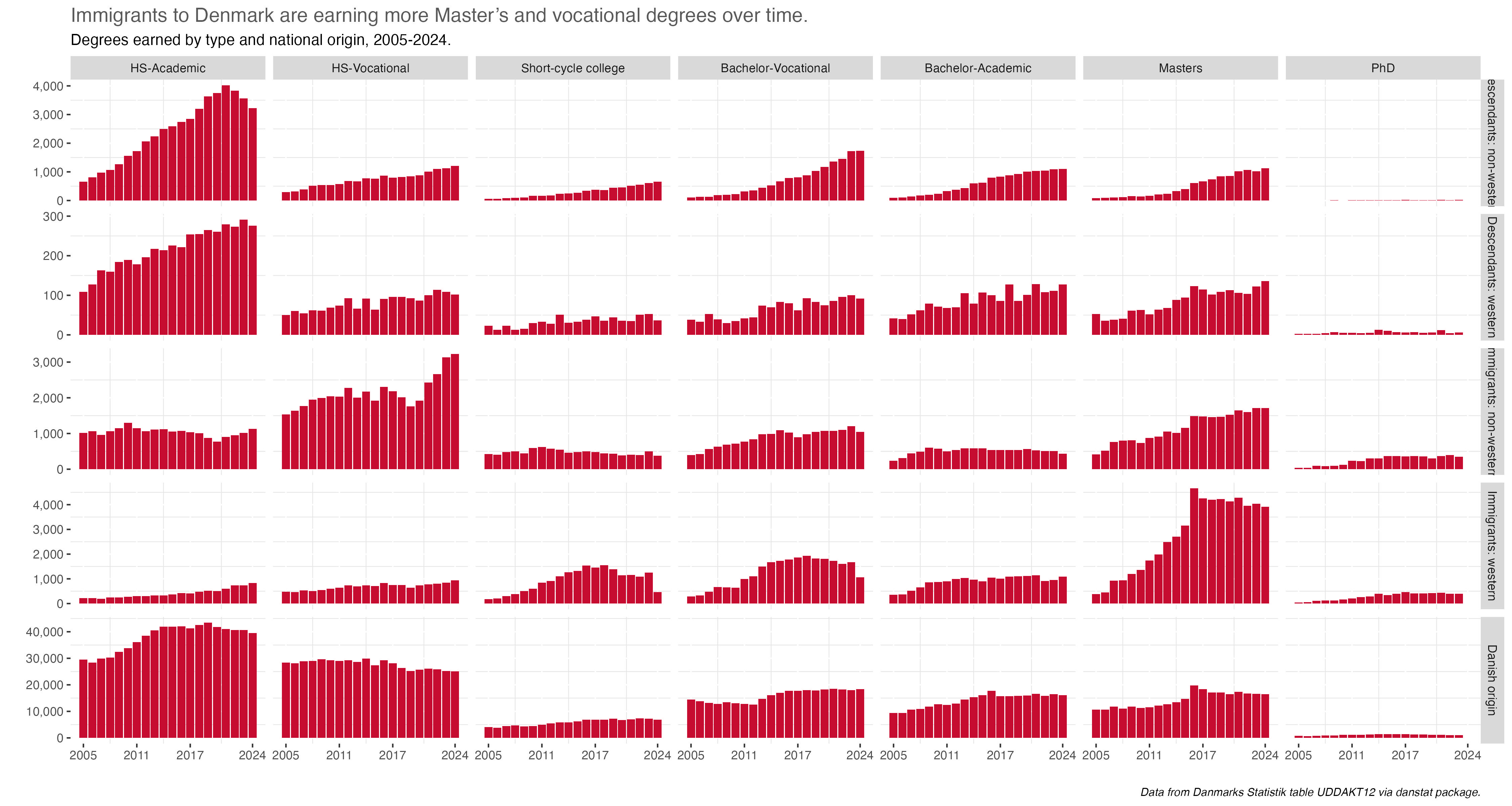
I also tried out some different types of visualizations than those that are in my normal toolkit. Waffle charts are a great example…I’ve used them once before, but after two uses here I now prefer them as displays of percentages by groups.
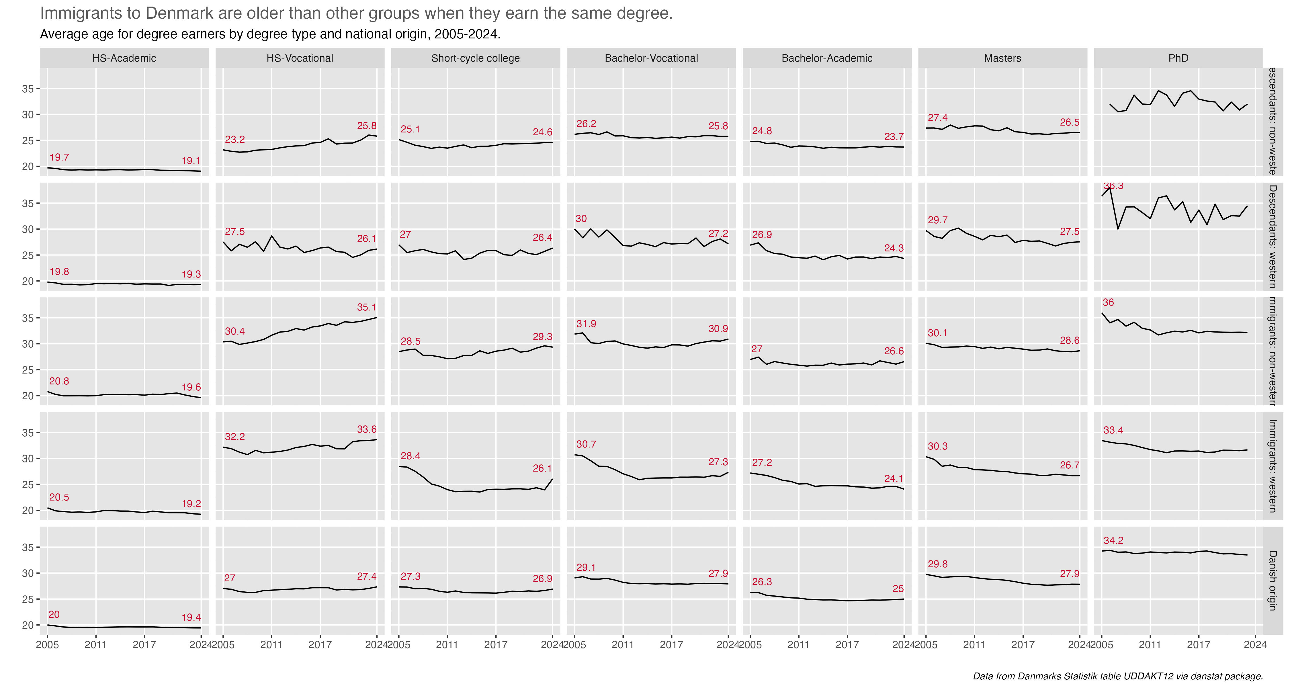
I’ve also reaffirmed my love of small multiple visualizations to see patterns, particularly in prompt 28 (see below)
Did a falter a bit? Yes. There were a few days after a planned shoulder surgery in early April where I knew I’d not be able to be on a computer for hours. There were also a few days mid-month where I needed a break and had a few other things to do.
Deep Dive into one topic
Keeping to one topic and data source enabled me to learn a lot about the Danish educational system. I now have a much better understanding of educational pathways, different types of degree offerings, and the demographics of degree earning.
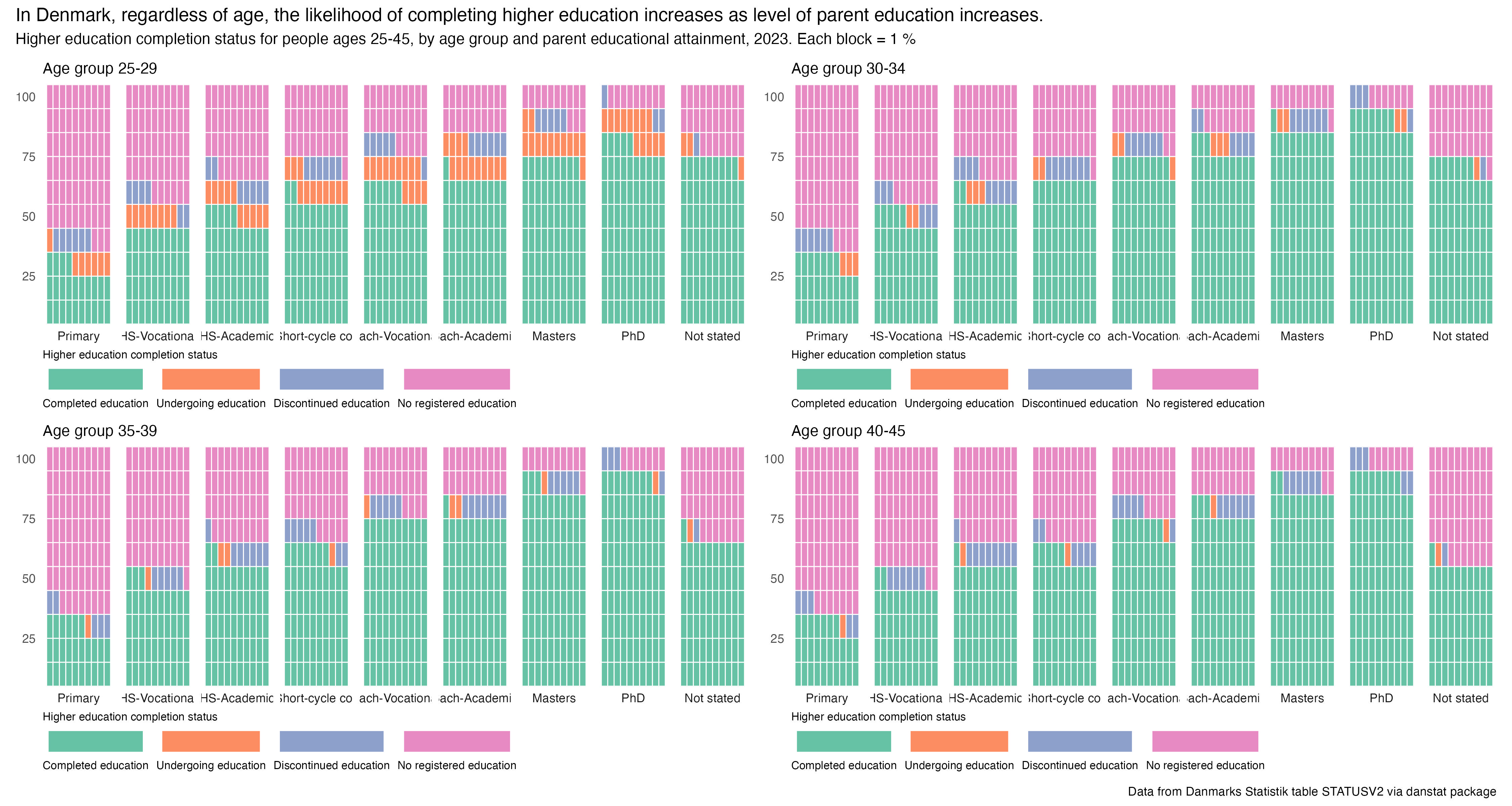
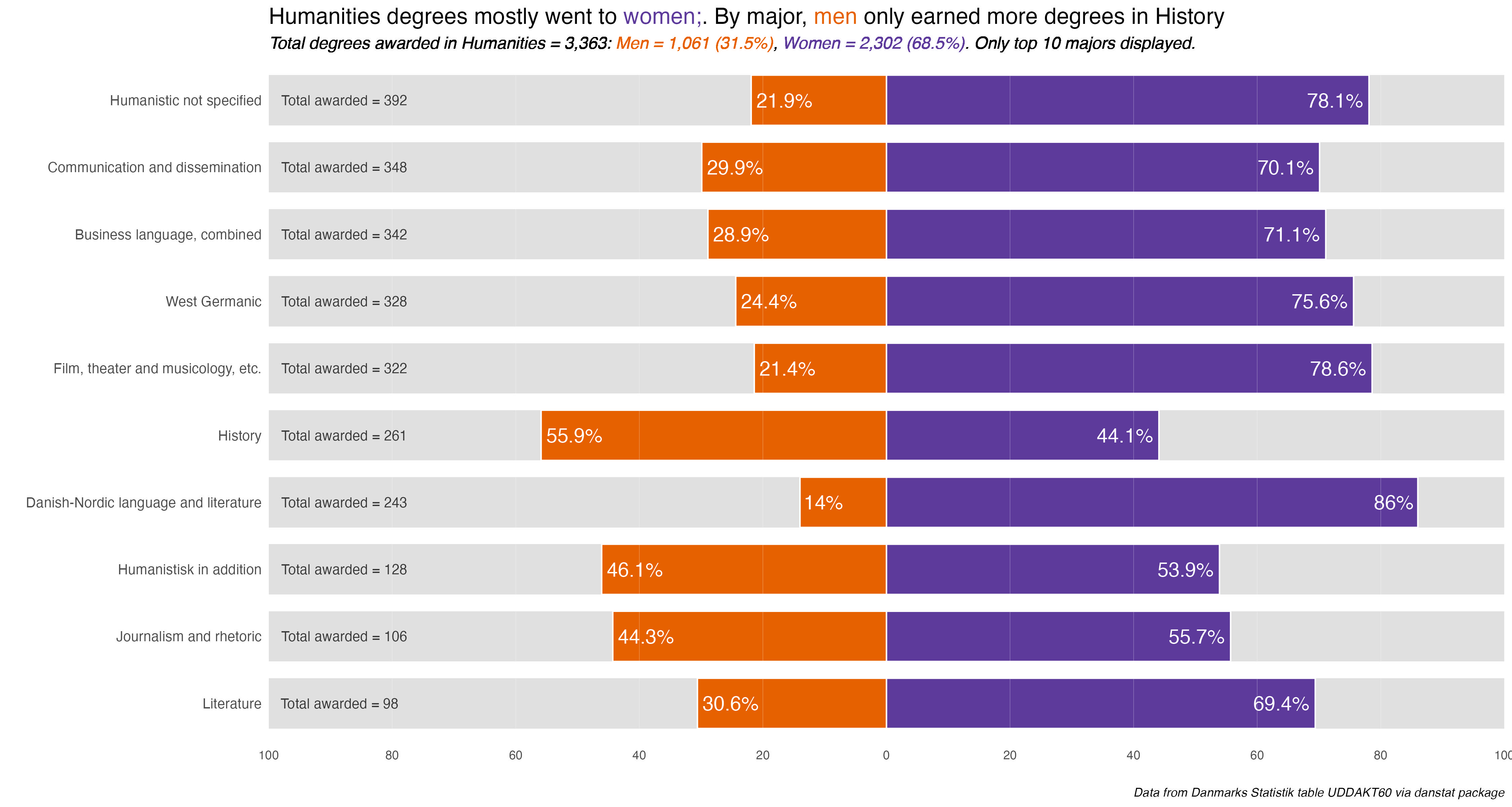
By the end of the month I realized I had made some mistaken assumptions early on, for instance equating secondary vocational education with secondary academic education (the gymnasium system). There were also a few surprises, namely prompt 9 - diverging revealing that degrees by academic discipline are much more gendered than I expected.
The deep digging helped me ask questions I didn’t think of earlier, like average age for degree completion, a question that resulted in the realization of my mistaken assumption about vocational education.
It reminds me of the advice I got my first week of graduate school - Bob Zemsky told us when going to a library we should not just looking for the book we came to get but look at the other books around it on the shelf. Ideas and insights spring from curiosity and an open mind.
The work itself
What were the charts I’m happiest with? Probably prompt 9 - diverging. From a technical standpoint, getting dataframe and chart functions to make the process more efficient, to the design and insights, it was the first where all of that came together.
I was also supper happy with prompt 28 - inclusion. The small multiples told a story, and what I thought was a slight sideline question, average age of degree completion, had me re-think my assumptions about the secondary-level vocational degrees, namely that people who earned them were on average well-above high-school age.
What’s next?
The most impactful by-product of the challenge was as an inspiration for my presentation this week to the CopenhagenR users group. I realized I wanted to talk about the role of my social sciences grounding in data analysis, and used a few prompts as live coding examples.
I also have the basis for a few more blog posts to redo a few charts that could use a bit more attention.
Best of all, I got back into the habit of working with data. I hadn’t done a new blog post for a few months and after a couple of disappointments in the job search didn’t feel like even opening RStudio and working on anything. Working on the challenge prompts put me back in a good headspace about data analysis.
Random observations and advice
Setting the data topic constraint was probably the wisest decision I made. I would encourage it as a way to dive deep into something you’re interested in and save the energy of figuring out what data to use.
Don’t be afraid to make mistakes; that is, do good work, but but don’t try to be perfect. If you take a big swing at a new visualization technique, it’s ok if it falls a bit flat, as long as you learn from the process.
Challenge yourself - maybe identify one or two things you want to get better at. For instance, mine was functional programming.
Contributing to things like the challenge is a good way to help build and sustain the data analysis and visualization community. Your craft and skill improves from doing the work, you pick up tips from what others share, and you hopefully help others learn.
There are other contributions opportunities - Tidy Tuesday, providing feedback on social media, answering questions on Stack Overflow or Reddit, going to and presenting at meetups, blogs, in-house lunch-and-learns or trainings where you work…however you can contribute, do something.
That’s it for the 2025 challenge. I hope to redo a few charts and follow-up on some loose analytical threads in one-off posts. And of course finish up a few half-done posts.